DAX: How to use a slicer to select different measures
DAX (Data Analysis Expressions) is a library of functions used across Microsoft SQL, including Excel and Power BI. These operators can be combined to perform a range of actions, through building expressions and formulas.
Here is how to use DAX in Power BI to create a slicer to select different measures in a chart, using our experience as training providers:
Using a slicer to select different measures on a chart
What if you want to use a slicer to select different measures that can then be shown in a chart? This example will show you how to complete this task.
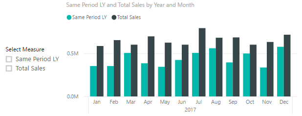
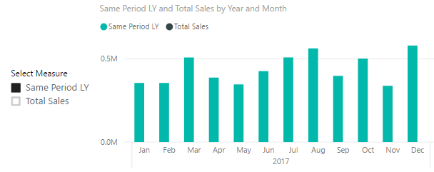
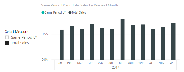
For example, I want a chart to visually show both my Total Sales for this year and my Total Sales for the same period the previous year. At the same time, I also want to be able to choose which I show in the visual, as shown below.
All data
Filtered to Same Period Last Year
Filtered to Total Sales
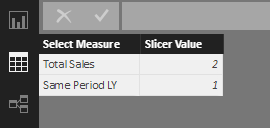
To do this, create a table (using the Enter Data option on the Home tab) and in the first column list the values to show in the slicer. I’ve called this column “Select Measure”.
In the second column just give these values as a number. I’ve called my table “SlicerTable”.
For each measure, you want to filter using the slicer (in my case the measures are called “TotalSales” with no space and “SamePLY”). Create an associated “slicer measure”, using the values you entered in the first column of your table as the measure names, as follows.
![]()
![]()
Now create a slicer that holds the “Select Measure” column from the SlicerTable and use these measures in the Chart Visual.

Want to learn more about using DAX and Power BI?
Advanced DAX functions can be extremely useful to businesses who are looking to get the most out of their data and really understand trends and statistics. Want to learn more? Sign up for our dedicated DAX for Power BI training course where we deep dive into the world of DAX calculations.
We also cover a range of DAX functions in our Power BI courses which allows you to learn the basics of DAX alongside Power BI itself – browse our latest courses here.
Add new comment