The “Strictly” Report: Behind the Scenes
We speak to Alison Box about how she gathered the data to create The Strictly Report.
Contrary to what people might think, I’m not a raving Strictly Come Dancing fan. I find the first weeks of the competition quite entertaining when they stumble around, but when they get good it all gets a bit boring and samey.
However, there’s one question regarding “Strictly” that has always intrigued me; for those that get to the final, how has their “journey” differed from those that didn’t? In other words, in the light of the final results, how can I retrace the weeks backward to see how bad (or not so bad) they started out?
It was this specific question that I thought Power BI might be able to answer for me. Besides, it was August 2018 and gossip of who would be in the next series of Strictly was rife (Chris Evans let slip on 17th August that Ashley Roberts was in the line-up!)
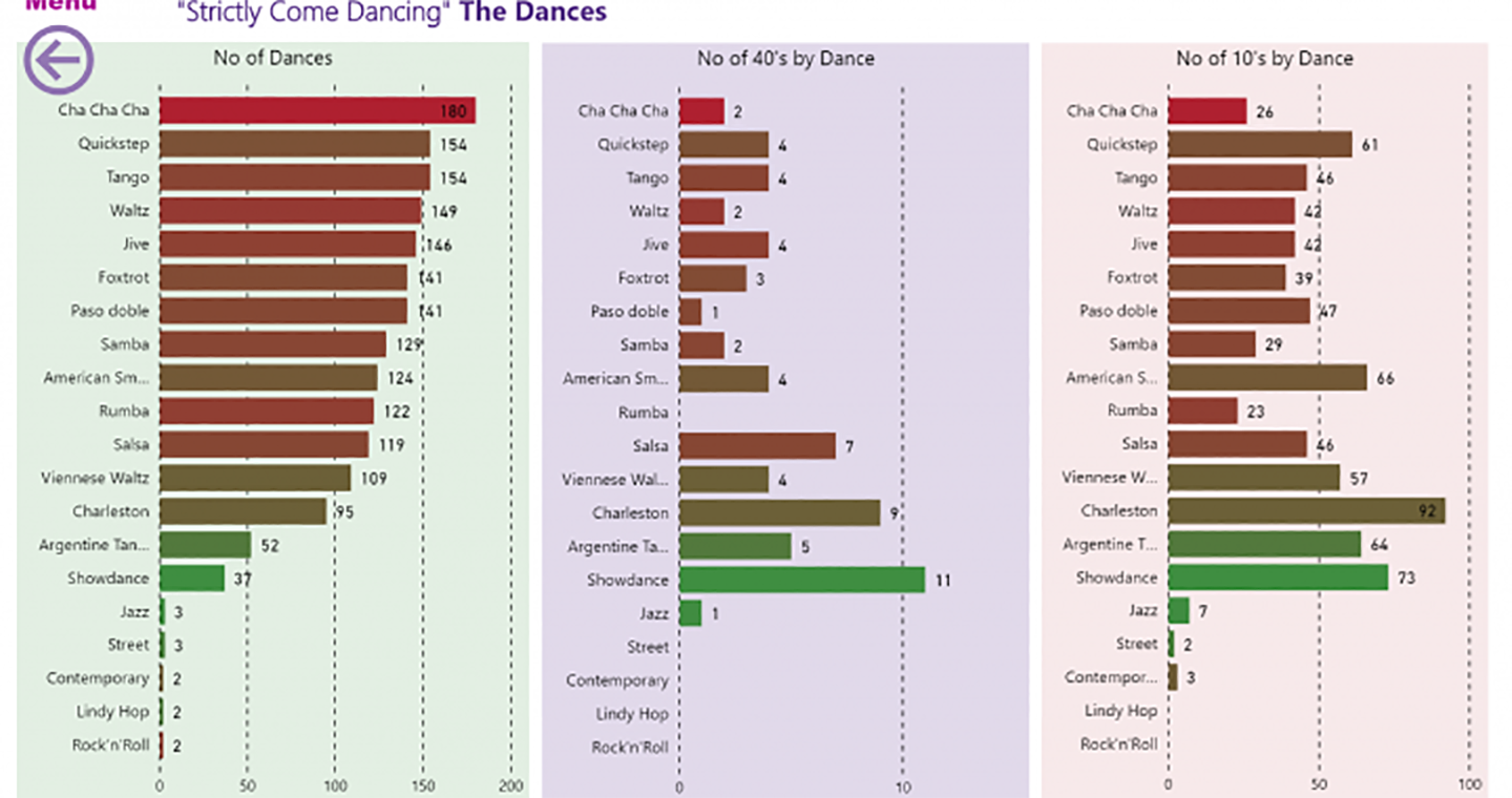
And so began my quest to find the answer to the “journey” question, little knowing that I would become obsessed with the plethora of Strictly facts and figures. Besides which, this data was now ripe for the Power BI treatment; it comprised statistics stretching to 16 series, 192 weeks, 224 contestants and 1,864 dances.
Getting the Data
It didn’t take me long to discover that there were several websites that comprehensively recorded the Strictly results. However, as with all these things, getting this data into Power BI was not straightforward.
Because the data for Series 1 to 15 was spread over different websites, I had to find a way of collating it into one table. I used Excel to do this and it was this table that I imported into Power BI.
When Series 16 started, I imported each weekly result directly into Power BI from Wikipedia. I then appended these weekly tables to the table I’d imported from Excel (in reality, there were a lot more steps than this, but it would be tedious to go into them here).
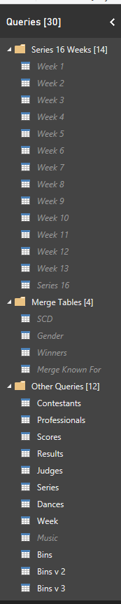
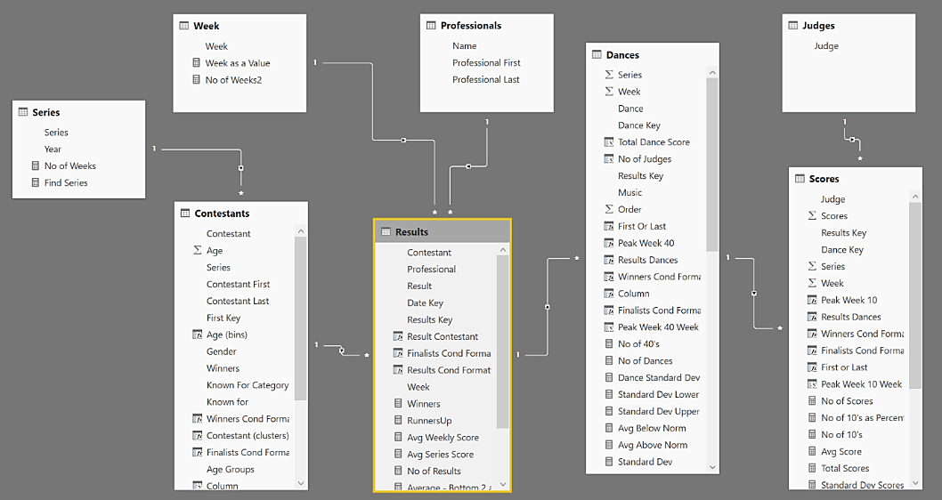
From this one big table holding all the Strictly data from Series 1 to 16, I constructed the individual tables I needed for the analysis. These were as follows; Scores, Dances, Results, Series, Weeks and Judges.
All this was done using Power Query and you can see the final list of tables in the image opposite.
Not Dirty Dancing but Dirty Data!
Of course, if it was all that simple, you would not be impressed at how much work this was, not to mention the hours I spent cleaning and tidying the data. Here is just a taste of some of the problems I encountered.
Misspellings, Typos etc
Not surprisingly, these started to mount up the more I worked with the data and I’ve listed some of them below (note that letter case is important!)
Value Used |
Values that had to be Corrected |
| Zoe | Zoë, Zöe |
| Aljaz | Aljaž |
| Karen Clifton | Karen Hauer (she got married) |
| Cha cha cha | Cha Cha Cha, cha-cha-cha, cha cha cha |
| Paso doble | Paso Doble, Pasa Doble, Pasa doble |
| Raj Singh | Dr Raj Singh, Dr. Raj Singh |
| Richard Coles | Rev. Richard Coles, Rev Richard Coles |
| DJ Spoony | Spoony |
And so on…
Data Anomalies
The next headache? Some weeks there were 5 judges and sometimes only 3 (in series 15, week 5 Bruno was mysteriously missing). In order to have an even playing field for all weeks, I flattened out these irregularities by removing the “Guest” Judges’ scores and “filled in” missing scores for Bruno. I did this by extrapolating the same percentage out 40 as out of 30 (this might seem a bit of a liberty, but the values make up such a tiny percentage as not to be of any real significance).
Wrong Layouts
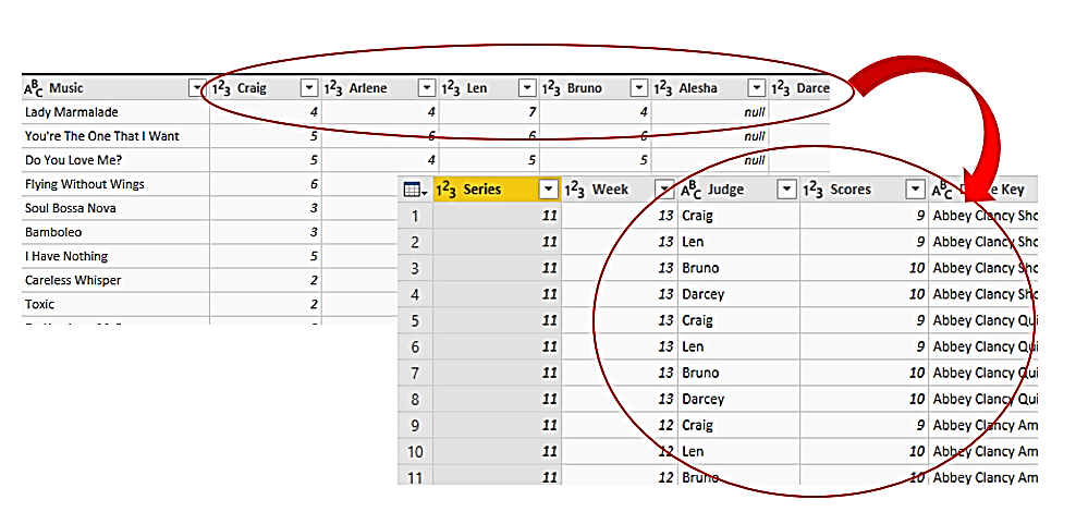
In the table I imported from Excel, the judges scores were listed in separate columns. This layout doesn’t work for Power BI, (the reasons for this being beyond the scope of this blog). Enough to say that it was a big job to “unpivoting” these columns so that in the Scores Table, the Judges’ names appear in a column of their own.
Data Skewing
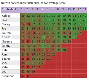
Although not exactly part of the data cleansing, this was a problem with calculating the dance scores. In the final weeks, contestants dance more than once so where a visual shows a comparison of scores across weeks, the final weeks’ scores appeared inflated.
To level the scores for the weeks they danced more than once, I calculated the average dance score, rather than total dance score. This visual opposite shows an example.
Designing the Data Model
By now it was now the beginning of September. I had imported and cleaned all the data and constructed all the tables I would need. It was also nearing the first week of Series 16, to be shown on the 22nd September but I was still no nearer being able to visualise the data. The most challenging part was still ahead of me; constructing the “Data Model”.
Essentially, this was how I was going to organise the tables so I could match the scores to the contestants, judges, professionals etc.
I did at first think that this would be easy. In Excel I had constructed a table holding all the data from Series 1 to 15 to which I then appended Series 16 in Power BI. Couldn’t I just use this one big analysis table?
However, I soon realised it wasn’t going to be quite as straightforward. I realised that the Strictly statistics comprised data that would need to be analysed at three different granularities; the judges’ scores (out of 10), the total dance score (out of 40) and the weekly results i.e. in the bottom two or eliminated. Rather than having just one big table, this gave rise to three separate tables; Results, Dances and Scores.
There were also other anomalies in the data. Contestants could have more than one professional partner (Anita Dobson danced with Brendan rather than Robin in Series 9, week 9). Therefore, Professionals couldn’t be associated with a single Contestant but instead needed to be associated with the weekly Results table.
After a number of attempts and starting over (the Data Model still wasn’t correct by the time Series 16 started), I arrived at my final data model shown below.
The next question was how could I explore all this data to get meaningful insights? Would I ever get to answer the “contestant journey” question that had prompted me to create the report in the first place? Would I be able to breathe life into all the Strictly statistics? For the answers to these questions, you will need to read my next Blog; “The Strictly Report; Insights into the Data”.
Add new comment