Charticulator in Power BI #4.
Using Symbols & Y-Axis Weirdness.
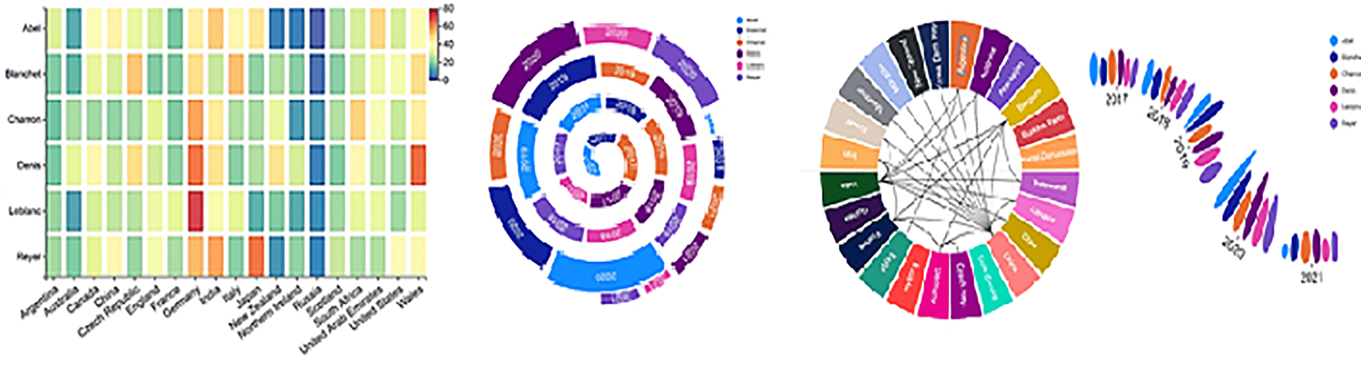
If you’ve been following along with my earlier posts on Charticulator, it may not have escaped your notice that I’ve always used either a Mark or a Line in the Glyph pane. Also, I’ve only ever created Column type charts in my examples. In this post, however, things are about to change because we’re going to turn our attention to creating “Point” style charts, such as Line Charts and Scatter Plots, which use a Symbol in the Glyph pane:-
|
Image
|
Image
|
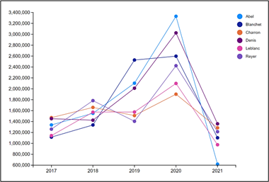
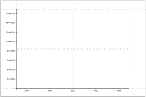
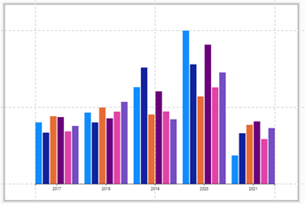
However, we still don’t know how to use a Symbol
as our glyph and get it plotted successfully onto the chart. At the moment if we put a circle Symbol into the Glyph pane we get this:-
|
Image
|
Image
|
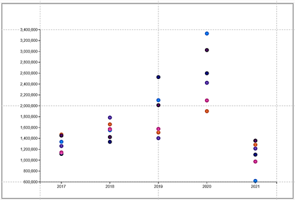
What is particularly peculiar about the chart above is that the position of the symbols bear no relation to the numeric Legend on the left. So what’s going on here? What we have to understand is that with Charticulator there is a difference between a numeric “Legend” which we have here and a “Value Axis“, which is what we need.
|
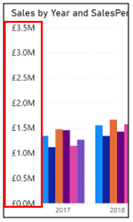
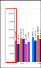
Value Axis in Power BI |
Legend in Charticulator |
|
|
Image
|
Image
|
In Power BI charts we use a “Value Axis” which uses a numeric field on the Y axis to define the magnitude of the units being used.
However in Charticulator when we created the column chart, we used a “Legend” for this purpose. The numeric legend is used to identify the field bound to the Height attribute of the glyph if it’s a Mark (a rectangle, triangle or ellipse) or bound to the Y Span attribute of the glyph if it’s a Line. In either case, what is surprising is that we don’t bind a numeric value to the Y-Axis, which is what would be more intuitive. Clearly, our Symbol has no Height or Y Span attribute and this is why it takes no notice of the Legend in the chart above. |
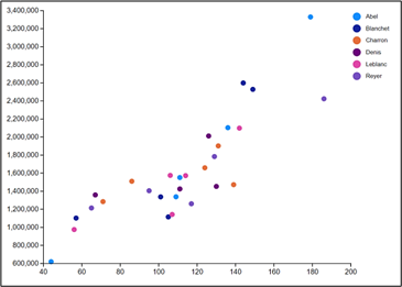
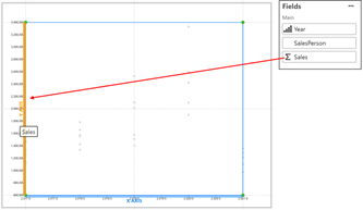
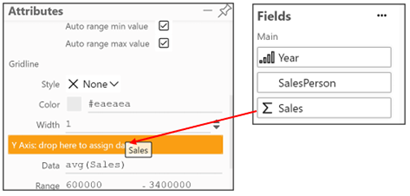
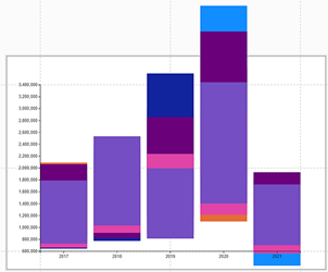
However, if we use a Symbol instead of a Mark or Line in the glyph, we can now bind a numeric field to the Y-Axis and the Symbols will be plotted on the canvas accordingly. To bind a numeric field to the Y-Axis, drag the field either onto the Y axis on the Chart canvas or into the Y axis attribute of “PlotSegment1”. We’ve used the Sales field here:-
|
Image
|
Image
|
Notice that the Y axis value does not appear in the Scales Pane in the same way that the Legend does.
This is because the Sales field is bound to an attribute of the plot segment and not to an attribute of the glyph (we will look more closely at plot segments in the next post).
We can now also put the SalesPerson field into the Fill attribute of the symbol.
Y-Axis Weirdness
You may still be wondering what exactly is the difference between a numeric “Legend” and a numeric field such a Sales bound to the Y-Axis of the PlotSegment. To understand the difference let’s look again at the column chart we created in earlier posts that contains the Legend along the Y-Axis:-
|
Colulmn Chart with a Legend |
Column chart without a Legend |
|
Image
|
Image
|
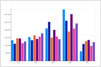
It’s important to note here that it’s not the legend that’s driving the height of each rectangle glyph, but the binding the Sales field to the “Height” attribute of the rectangle shape. We can remove the Legend (using the eraser in the Layers pane), and the columns still present themselves correctly.
In the same chart where we’ve removed the Legend, if we now bind the Sales field to the Y-Axis attribute of “PlotSegment1” we’ll create a “value axis”, i.e. a Y-Axis in the true sense. However, this is where it all goes a bit pear-shaped:-
|
Colum Chart with a Y-Axis |
|
Image
|
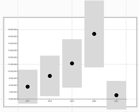
I think you’ll agree that the above chart looks a little weird. What’s happened to all our columns?
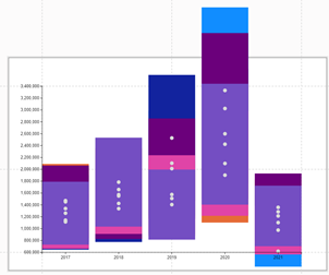
To throw some light on what’s happening in the example above, we can add a Symbol into the Glyph pane on top of the rectangle Mark:-
|
Image
|
Image
|
Do you recognise the pattern of the Symbols on the canvas? The Symbols have been plotted correctly against the Y-Axis just as they did when we didn’t have the rectangle Mark. But what has happened to the rectangles and why do they look so strange? All we need to know at this point is that as soon as we bind a numeric field to the Y-Axis, the glyphs will “overlap”, so the rectangles for each SalesPerson in each Year are sitting on top of each other. We can see now that the rectangles have also been plotted against the Y-Axis using the centre point of the rectangle to plot the value of the Sales. You’ll find this behaviour particularly bizarre when you first start using Charticulator
To understand how the rectangles are plotted more easily, we can remove the SalesPerson field from the chart and just plot Sales for each Year.
You can now see that it’s the centre point of the rectangle that determines the Sales value for each Year.
If you want to plot the rectangles correctly, you will need to remove the Sales field from the Y-Axis attribute of “PlotSegment1”.
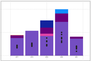
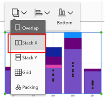
The rectangles are once again being plotted according to their Height attribute but they are still sitting on top of each other i.e. overlapping. To put the rectangles back where they should be, click onto the canvas and then on the first button on the menu bar at the top of the canvas, change “Overlap” to “Stack X”.
|
Image
|
Image
|
And of course, you can now add a Legend back. Notice that the Symbols in the glyph are now simply marking the centre point of the rectangle and are not plotted according to the Sales value. And so we’ve ended up back where we started; with a column chart.
So it would appear that at the moment it’s an “either/or” situation. We can either have a column type chart that uses a “Legend” or we can have a point style chart that uses a Y-Axis. What we can’t yet do is have a Y-Axis that will plot both, for instance in a “Lollipop” chart. This is something we will look at doing in upcoming posts.
And by the way, if you’re wondering; what exactly a “plot segment” is and why do we have just one of them, we will be focussing on “plot segments” in later posts.
Creating a Line Chart
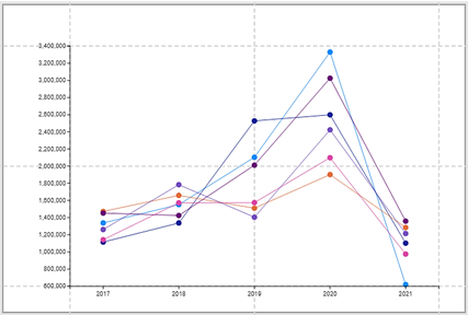
So now you understand that to plot a Symbol onto a chart, you must bind your Y-Axis value to the Y-Axis attribute of the plot segment. Let’s pick up where we left this chart:-

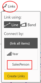
We’ve plotted each Salesperson’s Sales, but the Symbols badly need to be joined up to connect each Salesperson’s value. In other words, we need to turn it into a Line chart. To do this, click on the Links button on the Menu bar and select “SalesPerson”:-
|
Image
|
Image
|
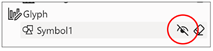
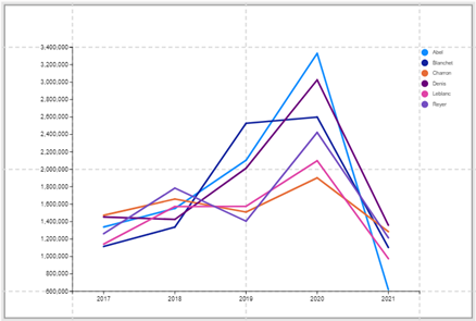
You can then use the attributes of “Link1” to format the line, for example, increase the width and use the attributes of “Symbol1” to format the symbol. What I’ve done below is to hide “Symbol1”
Create a Scatter or Bubble Chart
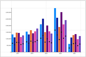
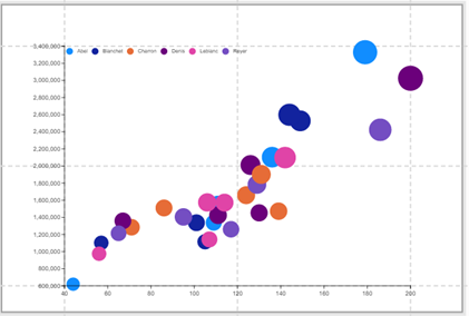
To create a Scatter or Bubble chart we need two more numeric fields. I’ve added “NoOfSales” and “TotalQty” to the fields list:-
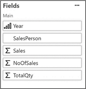
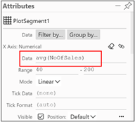
Now we can remove the Year field from the X-Axis attribute of “PlotSegment1” and then simply replace it with “NoOfSales”:-
|
Image
|
Image
|
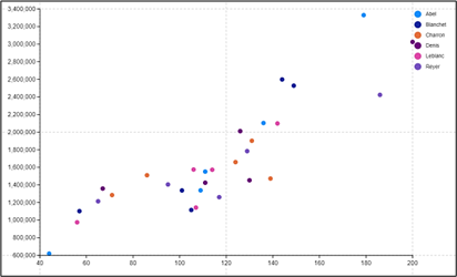
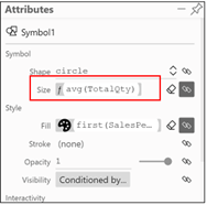
To turn the Scatter chart into a Bubble chart, we can edit the Size attribute of “Symbol1” and bind “TotalQty” to it.
|
Image
|
Image
|
You may notice that I’ve made a few tweaks to this bubble chart to improve its display. I promise you we’ll be learning about these “tweaks” as we progress through Charticulator but for now, let’s leave Scatter and Bubble charts and turn our attention to something we’ve been alluding to in this post, that is “plot segments”. This is the subject of my next post.
And believe it or not, we will also learn how to create a “Bar” chart where the bars sit horizontally as opposed to sitting vertically as in a column chart. Who’d have thought that it would take all of four posts on Charticulator until we learn how to do a simple bog-standard bar chart!
Add new comment