Charticulator in Power BI #1.
Creating a Simple Charticulator Chart
Recently a new custom visual has come into the Power BI world. Charticulator (http://charticulator.com) is a visualisation that lets you build other visualisations. It’s not easy, but the results are beautiful and if you need a particular data visualization you can’t get anywhere else, it’s fantastic.
Note: At the time of writing, Charticulator is still in preview. This means that some aspects of the interface may change and you may find that screenshots shown in these series of blogs may not quite reflect the current state of Charticulator.
When I heard that Charticulator has been called “the DAX of the charting world“, it was like a red rag to a bull. Having managed to almost get to grips with DAX (and I’ve still got lots to learn), I thought this was a challenge I was up for. Making this analogy to DAX implies that Charticulator has a simple interface hiding a complex methodology. We always say to people who want to learn DAX to forget anything they already know regarding programming or query languages. Come to DAX with a clean slate and an open mind. This is also true of Charticulator. Forget everything you know so far about creating charts where you are constrained by the limits of what you can plot on an X and/or Y axes. Instead, think in terms of designing a representation of your data from scratch, where you are no longer restrained by the number of axes, categories and values you want to represent.
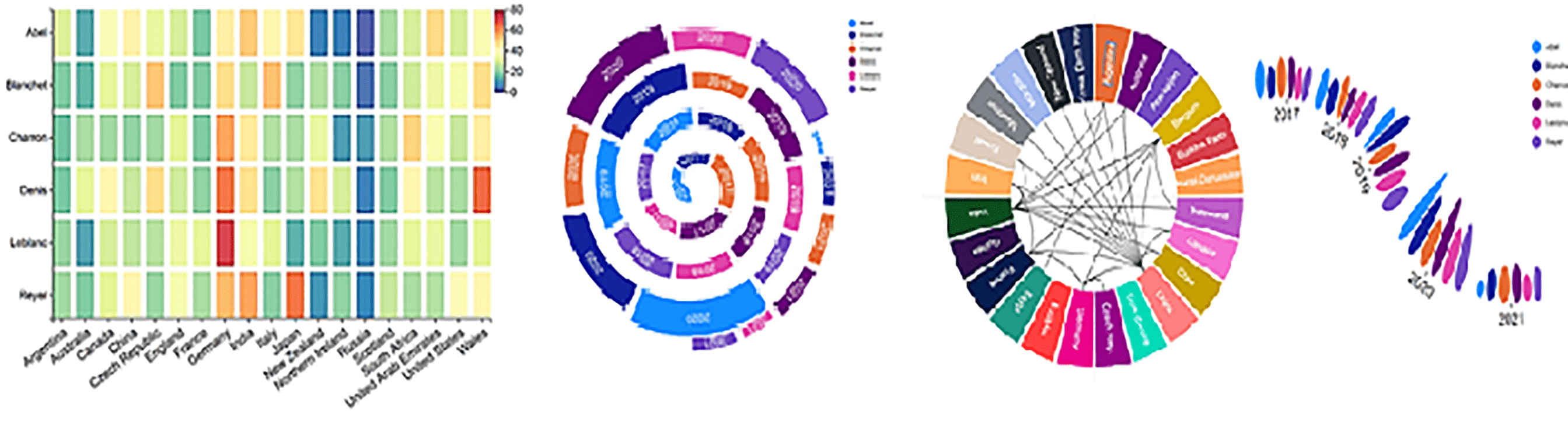
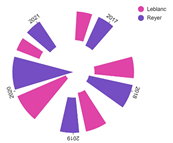
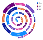
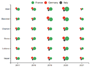
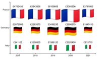
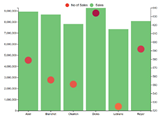
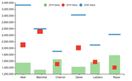
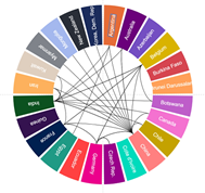
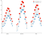
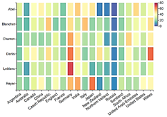
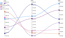
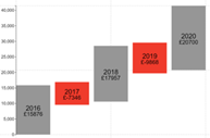
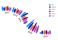
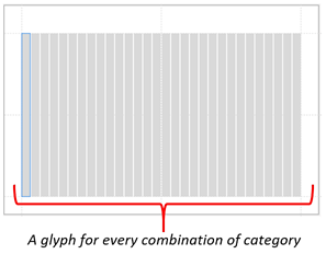
Charticulator is a big topic, so it’ll take more than one blog post to cover it all. I plan a series of Charticulator posts where I’ll show you how you can create charts that would be impossible to create using the default visuals supplied by Power BI. These are the type of charts I’m referring to:-
|
Image
|
Image
|
Image
|
|
Image
|
Image
|
Image
|
|
Image
|
Image
|
Image
|
|
Image
|
Image
|
Image
|
I hope these have whetted your appetite! There may be other custom visuals that can do similar jobs but they are limited by that; just doing one job. With Charticulator, just like DAX, there are almost limitless possibilities only constrained by your knowledge of the product. So why not bite the bullet and come on the journey of discovery with me. You’ll firstly need to load Charticulator into Power BI desktop, see here if you need full instructions. Announcing the new Charticulator visual (Public Preview) | Microsoft Power BI Blog
Create a Charticulator Chart
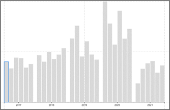
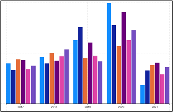
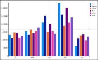
In this first blog, I will show you how to create this very simple clustered column chart:-
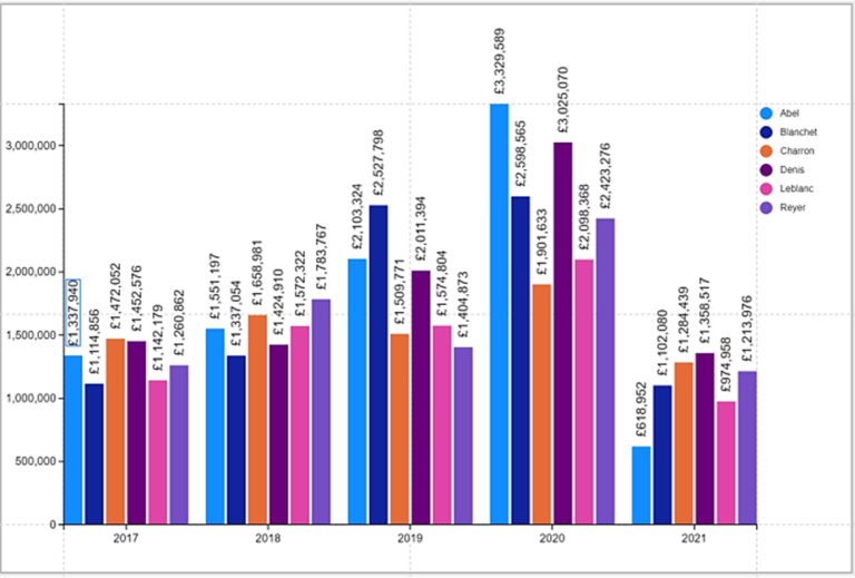
I know you’re thinking this chart could be created very simply in Power BI so why use Charticulator? Point taken, but remember what we said earlier; that Charticulator has a challenging methodology to get to grips with. If we create something we already know how to create elsewhere, it will give us some context on which to hang our learning hats and only then are we ready to explore more challenging areas. After all, if we were learning DAX, we wouldn’t start with context transition!
Also, because of our as yet limited knowledge, we will have to create this chart pretty much “monkey see, monkey do”. Don’t worry, everything will be explained in due course.
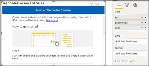
Let’s get to work. If you want to follow along, all you need are three fields from your data model; two text fields and one numeric field, for example, we are using “Year”, “SalesPerson” and “Sales”. The numeric field can be an implicit or explicit measure.
First, select “Charticulator” from the Visualizations gallery.

Next, add all the fields you want to using in your chart into the “Data” bucket of the Visualizations pane.
Now click on the “More Options” button at the top right of the visual (the ellipse button) and select “Edit”
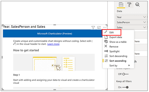
Now select “Create Chart”….
…and this will open Charticulator.
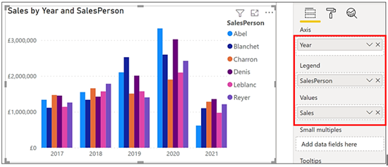
You will notice that the three fields we want to use have all been put into a single “Data” bucket. This is one of the things that first got me puzzled. You might think that all Power BI visuals group and then aggregate data (or just aggregate data in the case of the card visual). Therefore there should always be a “Values” bucket alongside grouping buckets for the categorical fields such as the Axis and Legend buckets. You can see this in the Power BI visual below that plots the same data:-
In Charticulator, there is no concept of the combination of “axis” and “legend” or drilling down through categories and sub-categories, so how does Charticulator know which fields are the “values” and which are the “categories”? I will answer this question in my next blog.
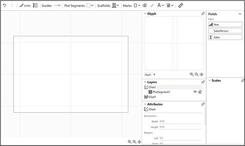
You should now have something similar to this in front of you:-
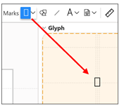
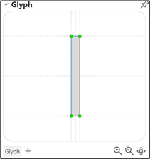
From the menu bar at the top of the screen, start by clicking on the Marks button that shows a rectangle shape. You need to click and release the button. You can then drag and drop the rectangle into the “Glyph” pane. We will explain later exactly what a “glyph” is but for the moment, let’s just say that it’s synonymous with a “column”:-
You will notice on the chart canvas you get a rectangle “glyph” for each SalesPerson, (we have 6 salespeople) in each Year (we have five years) so we have 30 glyphs:-
Note: the default colour for the rectangle mark is now blue, not grey
Now drag the Year field from Fields pane into the X-Axis in the chart canvas:-
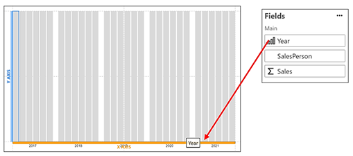
The glyphs have now organised themselves into Years, with a glyph for each SalesPerson.
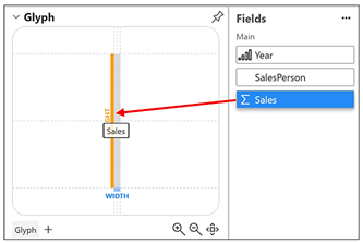
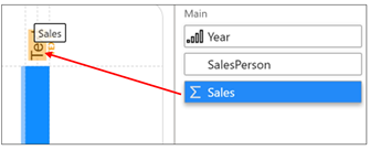
To get the glyphs to reflect the Sales value, drag the Sales field from the Fields pane onto the rectangle in the Glyph pane, dropping it where it shows the “HEIGHT” line:-
|
Image
|
Image
|
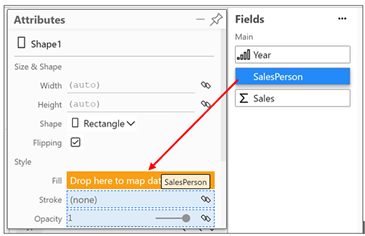
To colour the glyphs according to each Salesperson, make sure you have clicked in the rectangle in the Glyph pane.
In the “Attributes pane at the bottom, you will find a “Fill” attribute. Drag your category e.g. SalesPerson into this attribute. Note you can click on the drawing pin top right of the pane to unpin it from its dock.
You now have a Chart!
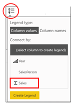
To create the Y-Axis Scale, you need to insert a Legend. Yes, that’s correct a Legend! I know it sounds bizarre that a Y-Axis is referred to as a “Legend” but just stick with it for now. Click on the Legend button on the top menu bar
, select Sales and click “Create Legend”
|
Image
|
Image
|
You can also use this method to create the legend for SalesPerson.
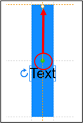
To add the detail labels on the top of each column showing the Sales value of each Year for each SalesPerson, from the Toolbar, drag the Text button
onto the rectangle in the Glyph pane. Don’t worry about where to drop it as it will be placed in the middle of the rectangle by default. To anchor the text mark to the top of each glyph, drag the green dot (i.e. the anchor point) to the top edge of the rectangle and then drag the text box above the glyph and rotate it:-
|
Image
|
Image
|
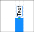
Zoom in on the Glyph pane
and then drag and drop your value field e.g. Sales, onto the Text mark on the rectangle.
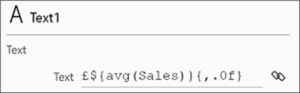
Irritatingly, you will see the value formatted with one decimal place.
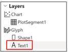
Select “Text1” in the Layers pane:-
Then in the text Attributes pane, edit the “Text” attribute from “{ . 1 f }” to ” { , . 0f }”. If you want, type a currency symbol right at the beginning in front of the “$”. In the Attributes pane, you can also change the font, colour and size of the text.
You’ve now completed your first Charticulator chart!

Remember that creating this chart was just to gain some context. Now we have a chart sitting in Charticulator we can look more closely at the major concepts that underpin Charticulator.
In my next blog, we will explore the Charticulator interface in detail and I will answer the burning question; what exactly is a “glyph”?
Happy Charticulating!
Add new comment