Charticulator In Power BI #2.
Taking a Tour Around the Screen
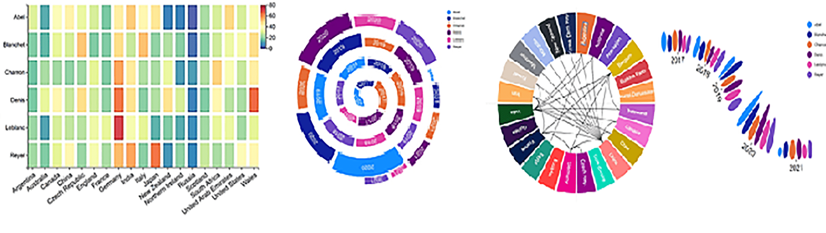
Since my last blog post, I’ve been looking more closely at some of the resources “out there” if you want to learn about Charticulator, particularly the YouTube videos. I hope at this point you’re not interested in seeing people showcase their amazing talents at using Charticulator; “Hey presto!” and it’s done! “Here’s an amazing chart I’ve created in Charticulator and here’s the complex DAX I’ve used to do it! Oh, and I’ll just use Tabular Editor to show you my wonderful DAX“.
So rather than feel inadequate, which let’s face it, that’s what these resources achieve in doing, I’ve made the decision to continue ploughing on through my own series of blogs. I’ll be approaching Charticulator in a methodical and systematic way, starting with simple stuff and building up our knowledge as we go with no “abracadabra!”, no complex DAX and no need to use third party Tools, just Power BI Desktop and the Charticulator custom visual.
In this blog we will take a tour around the Charticulator screen and in doing so will answer two burning questions:-
- What is a Glyph?
- What are those Scales about?
If you haven’t read my 1st post in this series, “Creating a Simple Charticulator Chart” you’ll probably want to go and read that now.
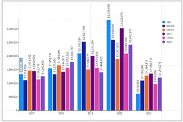
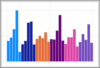
So now let’s resume our journey through Charticulator by picking up where we left off. We had just created this chart:-
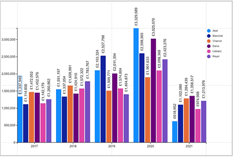
We did this pretty much “parrot fashion” with little explanation of exactly what we were doing. There was method in my madness because now we have a chart to look at inside Charticulator, we can take a trip around each of the panes of the screen. However, please understand that we are only at the very tip of the iceberg. Most of the elements of Charticulator that we meet now we will re-visit in much greater detail in later blogs.
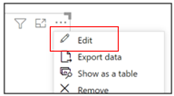
We will start by moving back into Charticulator from Power BI. Use the “More Options” button top-right of the visual and select “Edit“:-
Your screen should look much like this. These are the panes and parts of the screen that we will explore:-
|
Image
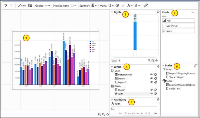
|
Image
|
Chart canvas |
|
Image
|
Fields | |
|
Image
|
Glyph | |
|
Image
|
Layers | |
|
Image
|
Attributes | |
|
Image
|
Scales |
You can click on the pushpin top right of any pane to undock the pane
The Chart Canvas
On the left of the screen is the chart itself sitting on the chart canvas.
You can resize the canvas by dragging on the edges of the canvas.
Notice the faint grey lines, known as “guides” that define the margin space and centre lines. We will be looking at using guides in more detail in later chapters but for now, if you want to change the margin space drag on one of the margin guides.
You will also find that in the Attributes pane of the canvas you can change the background colour
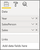
The Fields Pane
This lists the fields you are using or want to use in your chart. If you click on the ellipse top right, a table is displayed that shows the data that Charticulator will use in the construction of your chart:-
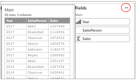
It’s important to understand here how Charticulator views the underlying data. Nearly all Power BI chart visuals contain a “Values” bucket where you put numeric fields to be aggregated alongside “Axis” and “Legend” buckets that contain text fields that categorise the data. However, with Charticulator, you put all your fields into a single “Data” bucket, just like you do if you were constructing a “Table” visual.
|
Power BI Chart |
Charticulator |
|
Image
|
Image
|
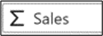
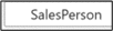
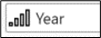
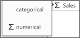
With this in mind, how is Charticulator going to treat your data? It’s not always the case that you want the numeric data to be the “value” (for example you don’t necessarily want to sum a field that holds peoples’ ages) or you may want a text field to behave like a value and be counted. Well, Charticulator makes a number of assumptions about your data and you can see this from the symbol that sits beside the field name in the Fields pane as follows:-
|
Image
|
Numeric type fields, either implicit or explicit measures, will provide the values that will be associated with numeric “attributes” (more on this later) |
|
Image
|
Text type fields will provide the categories |
|
Image
|
Ordinal field types, such as Year and Month, when put into a chart will be ordered ascending accordingly, although you can change this (see sorting below). These fields again will allow you to categorise your data |
If you need to change the behaviour of the field, you can click on the field name in the Fields pane and select a different field type (for example, a field containing “age” may need to be changed to categorical):-
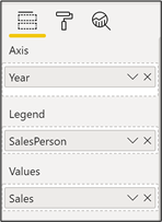
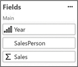
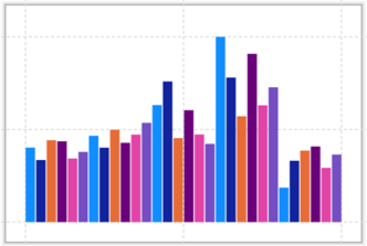
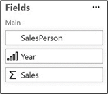
The order in which the fields are listed in the Fields pane can be important. If you don’t have a category on the X-axis, the first field is taken as the main category and subsequent fields are sub-categories:-
|
Each year and the sales for each salesperson |
|
|
Image
|
Image
|
|
Each salesperson and their yearly sales |
|
|
Image
|
Image
|
The wonderful thing is that with Charticulator you don’t start off by dictating where a field will be placed in a chart, whether it’s on the axis or legend for instance. This means that we have the freedom to choose, change our minds and try things out. This is what gives Charticulator its great flexibility.
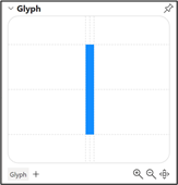
Glyphs
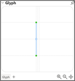
Next up, the Glyph pane. You will see the glyph that we are using in the Glyph pane, in our case a rectangle Mark (for simplicity we’ve removed the text label)
|
Image
|
Image
|
Well, what exactly is a “glyph”? A glyph represents a single row of data
Note: this isn’t strictly true because if we “group” a field, the glyph will represent the grouped data. We’ll look at grouping data in later posts.
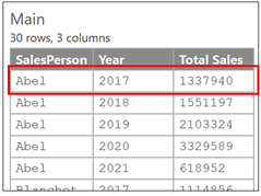
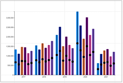
On the chart canvas, the glyph is repeated for every row. In our data, we have six salespeople and five years so we get 30 glyphs in our chart, each representing the sales for each salesperson in each year:-
A glyph can comprise any or all of these:-
- Mark (rectangle, ellipse or triangle)
- Symbol (circle, square, cross, diamond etc)
- Line
- Text
- Icon
- Image
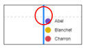
The glyph in the Glyph pane always represents the values in the first row of the underlying data, in this case, Sales for SalesPerson “Abel” in 2017. This is why in our case, the rectangle mark is coloured blue and is sized according to Abel’s 2017 sales.
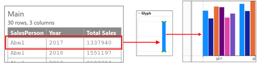
This is why you need to be vigilant if the first row contains very small values in relation to the other values or even contains zero. In this scenario, the glyph in the Glyph pane will be so small, it may not even show.
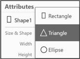
If you are using a Mark
as your glyph, you may prefer an ellipse or a triangle rather than a rectangle. You can change the shape by first clicking on “Shape1” in the Layers pane. Then in the Attributes pane, edit the “Shape” attribute to a Triangle or Ellipse (we look at “attributes” in more detail later):-
|
Image
|
Image
|
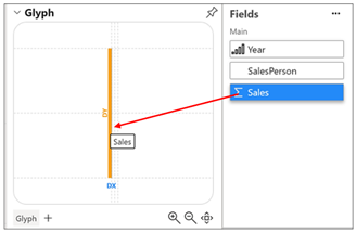
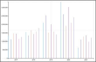
Or we could replace the Mark with a Line and drag the Sales field onto the “Y” dimension to define the height of the Line:-
|
Image

|
Image
|
Image
|
Image
|
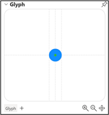
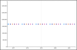
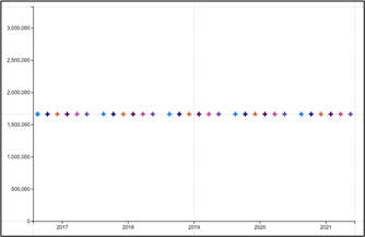
Perhaps you might want to use a Symbol instead……
|
Image

|
Image
|
Image
|
Don’t worry that the symbol sits stubbornly in the middle of the canvas. We will learn later how to plot the symbol to reflect the Sales value.
If you’re using a symbol and prefer a cross, diamond etc as your glyph, you can change the symbol in the “Shape” attribute of Symbol1
|
Image
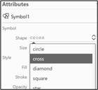
|
Image
|
You can also mix and match Marks, Lines and Symbols in the same Glyph
But again, we will look more closely at how the Marks, Lines and Symbols are plotted on the chart canvas in later posts.
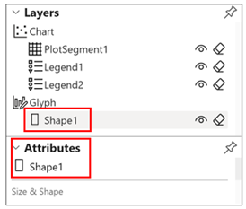
The Layers Pane
The Layers pane lists every element that currently comprises the Chart and the Glyph.
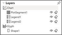
It can contain some or all of these elements and you can have many of each
|
|
You can hide and/or delete each element by using the “eye” and/or “eraser” buttons
The order of the elements in the Pane is important because it determines the stacking or “Z” order of the elements on the canvas or in the Glyph pane. You can change the “Z” order by dragging and dropping an element to change its position in the list. This is synonymous with “send backward” or “bring forward”.
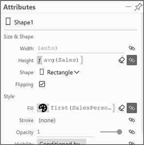
The Attributes Pane
The Attributes pane shows the attributes of the currently selected Layer. For example, to show the attributes of the rectangle mark of the glyph, select “Shape1” in the Layers pane and the Attributes pane will show the attributes for “Shape1”.
|
Image
|
Image
|
For instance, a rectangle Mark has attributes such as height, width, length, fill colour etc. We will be looking more closely at the attributes of each chart and glyph element in upcoming posts.
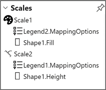
The Scales Pane
The Scales Pane lists all the “scales” used by the chart.
Mostly (but not always) scales are created for you, then if required, you will need to create a legend explaining the scale. Because you have no control over the generation of the scale, you can take the option of not bothering about what happens in the Scales Pane. This is what I did when I first started using Charticulator and it didn’t do me any harm. Any editing of the “scales” can be done elsewhere, so for the moment, you really can just pretend the Scales pane isn’t there. However, there will come a time when we will need to pay attention to it.
The problem is (and this is why I have put quotes around the word “scales“) you may think that a scale is something that describes the magnitude of the units being used in the chart. This is not the case in Charticulator. A “scale” has a much wide interpretation.
A “scale” is automatically generated when a field is associated with any “attribute” of a shape, symbol or line that comprises the glyph (called “data binding“). For example, we have associated the Sales field with the Height attribute of the rectangle shape and this has generated the “Shape1.Height” scale in the Scales pane. We have also associated the Salesperson field with the Fill colour attribute of the rectangle, and this has generated the “Shape1.Fill” scale. If we had a circle symbol as our glyph, and we associated the Size attribute of the circle with the Sales field, this would also generate a “Scale”, and so would associating a field with Fill or Stroke attribute of the circle.
Scales normally have a legend added to explain the scale. Because of this, you can think of “Scales” in Charticulator as any attribute of the glyph that needs an explanation in a Legend.
There are three types of scale in Charticulator; numeric scales
, colour scales
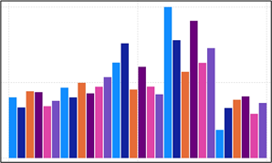
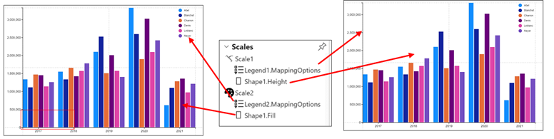
and scales that map icons to categories. You can see below that in our chart, we have two Scales. “Scale1” is a numeric scale identifying the height of the rectangles with a Legend added on the left that explains the height of the glyphs. “Scale2” is a colour scale that represents each Salesperson and again a Legend has been added to explain the colours.
I think that’s enough information on Charticulator scales for the moment. We will explore in later posts how to edit Scales and Legends.
So this ends our tour of the Charticulator screen. We’ve created a simple chart and now know what Glyphs and Scales are. In my next post, we will discover what “data binding” is all about.
Happy Charticulating!
Add new comment