Charticulator In Power BI #3.
Binding Data.
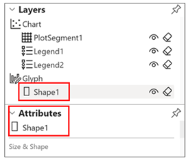
In my last post, we took a tour around the Charticulator screen and learned about the Attributes pane which lists the attributes of the currently selected Layer. For example, to show the attributes of the rectangle mark of the glyph, select “Shape1” in the Layers pane and the Attributes pane will show the attributes for “Shape1”.
|
Image
|
Image
|
In Charticulator, you can associate a field with an attribute by “binding data” to it and this will drive the behaviour and/or format of the attribute.
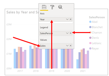
It’s the binding of data to attributes that is the key to creating adventurous charts. In Power BI, the equivalent is dragging fields into the buckets of the visual where you are restricted to the buckets you are presented with; Axis, Legend, Values etc. (admittedly conditional formatting gives you an additional way to show values). However, in Charticulator there is an extensive choice as to which part of the chart you want to reflect your data, either categorical values or numeric values.
|
Charticulator |
Power BI |
|
Image
|
Image
|
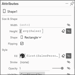
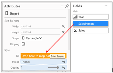
Any attribute to which you can bind data has this bind data button next to it.
Clicking on this button allows you to select the field you want to bind to the attribute. Alternatively, you can drag and drop a field onto the attribute, as shown here where we’ve bound the SalesPerson field to the “Fill” attribute
In the following examples, we’re using the chart we created in my first post
Binding Categorical Fields
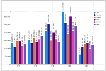
Binding categorical fields to attributes determines the colours you want to use to identify each member of the category. It will create a colour scale
in the Scales pane. In our chart, we’ve bound the SalesPerson categorical field to the Fill attribute of the rectangle shape
But we could bind the Salesperson field to the Stroke attribute instead and remove the SalesPerson field from the Fill attribute. We will also need to edit the Fill attribute to grey:-
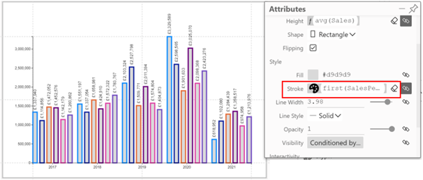
If you want to edit the colours being used, click on the bind data button and in the dialog click on a colour to change it
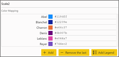
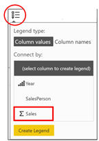
Notice that you can add a Legend from here rather than use the Legend button on the Menu bar
Binding Numeric Fields
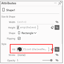
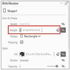
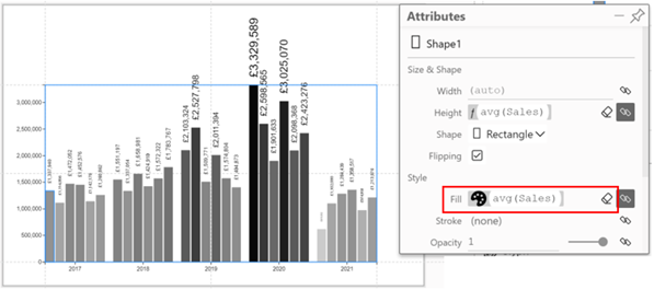
You can bind numeric fields to any numeric attribute such as e.g. height, width, length, shape size, font size etc., in which case that attribute reflects the magnitude of the numeric value bound to it. For example, we have bound the Sales field to the Height attribute of “Shape1”
But we could also bind Sales to the Size attribute of “Text1”
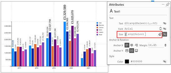
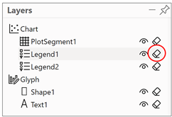
Just make sure that you delete “Legend1” in the Layers pane before you do this:-
Doing this ensures that the Font size attribute for “Text1” will have its own scale and won’t be added to the scale for the Height attribute of the rectangle. You can then re-insert the Legend from the Legend button on the menu bar
after you have bound Sales to “Text1”. Quirky I know but we will look more closely at Legends and Scales in later posts.
What is interesting and may also seem strange is that when you bind numeric data to an attribute, you will notice that the average function is used on the numeric value e.g. “avg ( Sales )”. However, remember that the glyph represents a single row in the underlying data and therefore there is also only a single value. The average of a single value is that value. In other words, this is simply the value itself. The function used in the binding becomes more important when we group data, which we will look at in later posts.
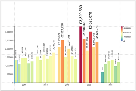
If attributes that define a colour such as the “Fill”, “Color” and “Stroke” (i.e. the shape border) have a numeric field bound to them, this will create a gradient “colour scale”.
For example, we’ve bound the SalesPeople categorical field to the “Fill” attribute of the rectangle shape but we could equally put the Sales numeric field in there instead. In this case, we would get a gradient grey scale
Editing Colour Scales
If you want to edit the colour scale, just click into the attribute or click on the “bind” button.
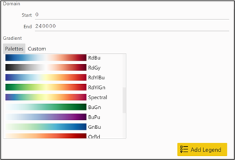
As with categorical colours, notice that you can also add a legend from this dialog.
|
Image
|
Note: Inserting the Legend from the data binding button is important. If we try to use the Legend button from the menu bar, we will see that the Sales legend has already been used as the number scale on the left. But we need another Legend for Sales that explains the colour scale, so we need to use the bind data button. We look more closely at Legends and Scales in later blog posts. |
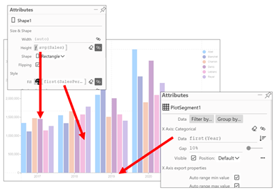
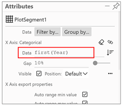
It’s not just attributes of the glyph that have data bound to them. In the attributes of “PlotSegment1” you will see that we have bound the Year field to the X Axis.
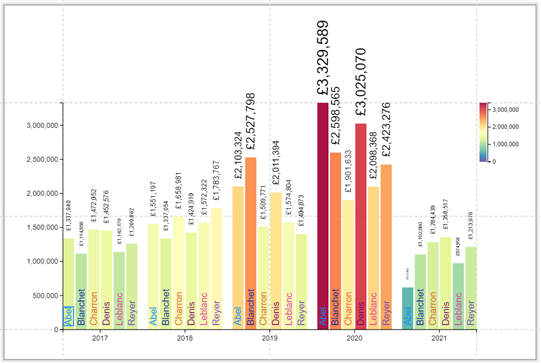
So we are making good headway in our journey through Charticulator. Just by binding data to different attributes, our chart is a looking a lot more appealing than it started out. Notice that I have added another text mark to the bottom of the rectangle glyph that has the Salesperson field bound to it in order to label the columns accordingly.
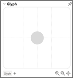
However, great as this chart my look, we still don’t know how to successfully use a symbol
as our glyph and get it plotted onto the chart. At the moment if we put a circle symbol into the Glyph pane we get this.
|
Image
|
Image
|
Whacky or what! Don’t worry though, all will be revealed in my next post.
Add new comment