Charticulator in Power BI #5
2D Region Plot Segments Part 1 – Sub-Layouts.
In my last post I showed you how to create a line chart using a symbol as your glyph. You also learned something more important; that if you bind a numeric field to the Y-Axis you will create a “numeric” axis, a value axis in the true sense. Glyphs will then be plotted against this axis according to their value despite the shape of the glyph.
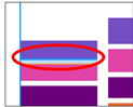
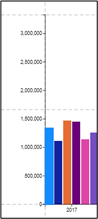
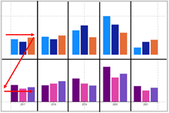
However, you may be a little perturbed that as yet you don’t know how to create this simple bar chart where the glyphs sit horizontally:-
In this post, we return to working with categorical axes and at long last learn how to build a bar chart. Along the way will also learn how to create stacked bar and stacked column charts and “cloud” type charts.
You may be wondering why it’s taken four blog posts about Charticulator before we finally get to this point. Let me be very presumptuous and compare my series of posts on Charticulator with “The Principia Mathematica” where Alfred North Whitehead and Bertrand Russell take over 360 pages to prove definitively that 1 + 1 = 2. So I’m in good company with taking a long time to explain what should be simple. There might also be some debate also as to which is more challenging to understand.
The problem is that before you can create this bar chart, you need to understand what drives the layout of the glyph in the chart and that’s all to do with “plot segments” and their attributes. It’s the attributes of the plot segment that determine how the glyphs will be laid out, for instance, whether you want a column or bar chart, whether they’re stacked or clustered and the spacing between the glyphs.
You can probably suspect from the title of this post that plot segments have quite a few attributes. So many in fact, that it will take me two posts to take you through all of them. In this one, we look at the attribute that will give you your bar chart and that is the “Sub-layout Type” attribute. In the second post of plot segments, I’ll be covering the more mundane attributes such as those concerned with spacing, sorting and aligning glyphs in the plot segment.
What is a 2-D Region Plot Segment?
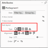
There are two different types of plot segment in Charticulator; “2D Region” and “Line”. In this post, we will only be considering the “2D Region” plot segment. You can think of a 2D Plot Segment as synonymous with a “plot area”. If you click on “PlotSegement1” in the Layers pane, the plot segment will be selected on the chart:-
If you delete a plot segment, or you want to create an additional plot segment (for example for a secondary value axis), you can use the “2D Region” plot segment button on the menu bar.
You can then draw your plot segment onto the canvas, ensuring you anchor the plot segment to the guides of the canvas (we look at working with additional plot segments in later posts).
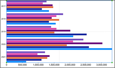
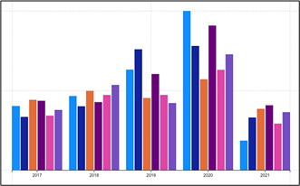
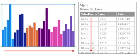
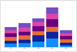
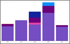
In this post where we look at plot segment sub-layouts, we’ll use the column chart we’ve created in earlier posts as our example:-
|
Image
|
Image
|
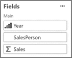
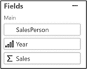
In the chart above, we’ve bound the following fields:-
- Year to the “X-Axis” attribute of the plot segment
- SalesPerson to the “Fill” attribute of the shape
- Sales to the “Height” attribute of the shape
Using Plot Segment Sub-Layouts
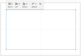
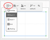
To find the plot segment sub-layouts, make sure that you have a “PlotSegment1” selected in the Layers pane and then you can either use the Attributes pane or the plot segment menu bar:-
|
Image
|
Image
|
The default sub-layout is “Stack X” but you can choose one of four other layouts:-
- Overlap
- Stack X (the default)
- Stack Y
- Grid
- Packing
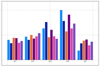
The first question here is that if these are referred to as “sub-layouts” what is the “main” layout? The “main” layout of the plot segment is driven by the fields you’ve bound to the X or Y-Axis (and also Scaffolds which we meet later). So in our example, the “main” layout is determined by the Year field sitting along a categorical X-Axis and the sub-layout is “Stack X”
Sub-layouts are applied on top of the field that is currently driving the layout of the X-Axis or Y-Axis. This means that sometimes the sub-layout will be negated by the field bound to the X or Y-Axis. For instance, using the “Stack X” sub-layout in conjunction with a Y categorical Axis would result in a grid layout and therefore applying a “Grid” sub-layout would have no effect. For this reason, when looking at the results of applying a sub-layout, I use two scenarios; the first where we have no field bound to the X or Y axis and the second where we put the Year or SalesPerson field onto the X-Axis or Y-Axis.
Let’s start by looking at the default sub-layout, “Stack X”.
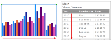
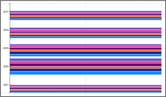
Stack X
With this sub-layout, the glyphs are stacked vertically along the X-Axis, ordered by the values in the first field of the underlying data, in our case “Year”:-
|
Image

|
Image

|
Image
|
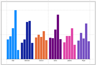
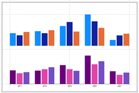
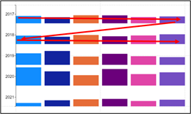
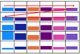
Notice what happens if we change the order of the fields, so SalesPerson is now first:-
|
Image
|
Image

|
Image
|
When we bind the Year or Salesperson field to the X-Axis, the layout changes to group the glyphs accordingly.
|
Image
|
Image
|
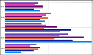
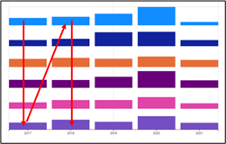
Y Categorical Axis With ” Stack X”
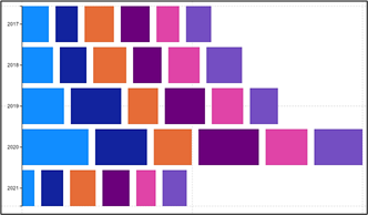
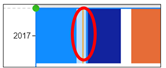
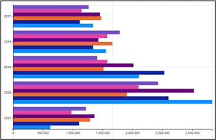
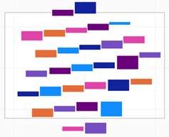
But look what happens if we use Stack X and move Year to create a categorical Y-Axis. The glyphs are still stacked side by side for each Salesperson:-
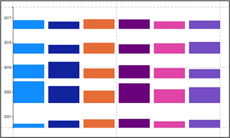
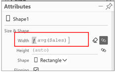
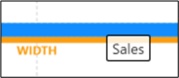
Looking at the chart above, you might think that it adds little information. You can’t clearly see the SalesPeople’s performance because the Sales value is bound to the “Height” attribute. If we put the Sales field into the “Width” attribute instead this looks more promising (don’t forget that you can also drag and drop the Sales field onto the glyph). Then on the canvas, you can drag between a glyph to close the gap.
|
Sales field bound to “Width” of glyph… |
…make the gap narrower… |
…and you have a stacked Bar Chart |
|
|
Image
|
Image
|
Image
|
|
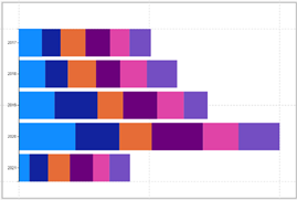
Stack Y
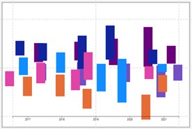
With this sub-layout, we can see that with no field bound to the X-axis, the glyphs are stacked horizontally down the Y-Axis. If you then put Year on the X-Axis, the glyphs for each Salesperson are stacked on top of each other for each Year. Just like with “Stack X”, you can drag between a rectangle shape in the chart to close the gap between the glyphs and create a stacked column chart.
|
No field bound |
Year Field Bound to X-Axis |
|||
|
Image

|
Image

|
Image
|
Image
|
|
If you close the gap between the glyphs…
…you have a stacked column chart.
|
Image
|
Image
|
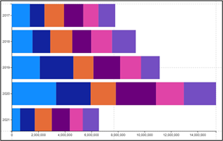
Y Categorical Axis with “Stack Y”
We’re almost there in our quest to build a bar chart. All you need to do is apply a “Stack Y” sub-layout and then put a categorical field such as Year on the Y-Axis. Then make sure that you have bound the Sales field to the “Width” attribute of the rectangle shape:-
|
Stack Y with a categorical Y-Axis |
Bind your numeric field to the “Width” attribute |
|
|
Image
|
Image
|
|
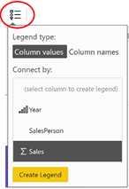
Adding an X Axis Numeric Legend
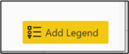
However, if you remember when we created our column chart, we used a “Legend” on the Y-Axis to show the Sales value. To do this we used the Legend button on the top Menu bar:-
|
Image
|
Image
|
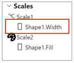
This won’t work for our bar chart. Try it and see. What you need to do is click on “Shape1.Width” in the Scales pane and in the dialog that pops up, click “Add Legend”
|
Image
|
Image
|
|
Image
|
Image
|
|
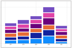
And that’s it. That’s a bar chart and a stacked bar chart! Hooray! We’ve finally got there. Don’t get too excited yet, because we still have to get to grips with the gruesome “Grid” sub-layout.
Grid
The reason I’ve rudely called this sub-layout “gruesome” is that it is perhaps the most challenging to understand. The reasons for this are twofold. Firstly the layout will be very different depending on how you have bound your fields to the X and/or Y-Axis. Secondly, this sub-layout is really only successful when you have both an X Categorical and a Y Categorical axis, not just either. We explore working with two categorical axes in later posts.
Notice the difference in the layout depending on whether you have a field bound to the X-Axis.
|
No field bound |
Year field bound |
|||
|
Image

|
Image

|
Image
|
Image
|
|
With the Grid sub-layout, you may well ask; what on earth am I looking at? To answer this question there are two things to note. Firstly, you can change the Grid direction and secondly, you can change the Grid size.
Grid Direction
Notice that you have two additional buttons on the plot segment menu; “Grid X” and “Grid Y”. These determine whether the glyphs within the grid are arranged horizontally from left to right or are arranged vertically down and then up:-
|
Image

The glyph for each SalesPerson lies horizontally across for each Year |
Image

The glyph for each SalesPerson lies vertically down for each Year |
|
Image
|
Image
|
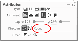
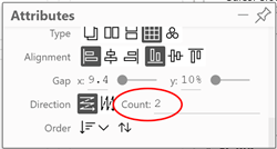
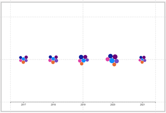
Note: In the above examples, I’ve re-introduced the Year field on the Y and X-Axis so it’s easier to see what’s happening and changed the grid “count” attribute to 6 – see below
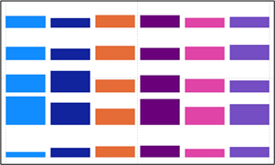
Grid Count
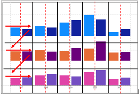
The second thing to appreciate is how you can control the size of the “grid”. In the examples below, to clarify what’s happing to the glyphs, I’ve superimposed a “grid”. You can now see that by default, Charticulator will create a grid that best fits the number of glyphs. However, you can change this by using the “Count” attribute. I’ve changed it to “2” which means that without a categorical X-Axis, the glyphs arrange themselves in two columns but when we put Year onto the X-Axis, the glyphs are arranged two side by side within the Year category.
|
No “Count” Attribute |
Default Grid with no Axes Glyphs arranged Left to Right |
Default Grid with Categorical X-Axis Glyphs arranged Left to Right |
|
Image
|
Image
|
Image
|
|
Count Attribute of 2 |
Grid containing 2 “Columns” Glyphs arranged left to right |
Grid containing 2 “Columns” within the X-Axis categories. Glyphs arranged left to right |
|
Image
|
Image
|
Image
|
As previously alluded to, these grid type charts don’t seem to show anything insightful. What use is the “Grid” sub-layout you may well ask? Just think on this; in Power BI the only equivalent visual, where we get a grid-like structure is the Matrix visual. You can only put numbers into the grid of a Matrix, not shapes. Hopefully, I’m whetting your appetite for this sub-layout and in future posts, we will put it to spectacular use, I promise you.
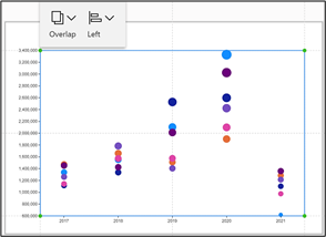
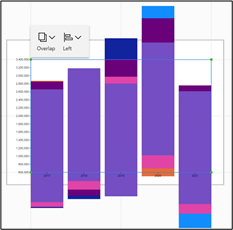
The Packing Sub-Layout
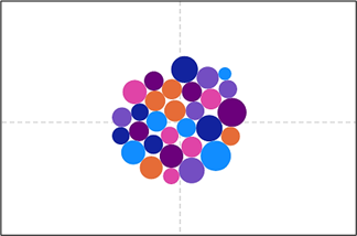
If you have no fields on the X or Y axis, the Packing sub-layout will pack the glyphs into the centre of the canvas. What is important to understand is that the Packing sub-layout uses the existing sub-layout of the glyph. We have just used the Grid sub-layout so this is what the chart should look like:


But if you try the Packing sub-layout from a Stack X or Stack Y sub-layout, your chart will look very different. If the glyph is arranged as bars or columns, these won’t pack successfully but if they are more “box” like as in the Grid sub-layout, these can be packed. On the whole, Packing works best with the circle Symbol. For instance, in our data, we’ve put the Sales field into the “Size” attribute of a circle. This can provide the basis of a “cloud” type chart.
|
Image
|
Image
|
|
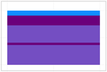
The Overlap Sub-layout
This sub-layout looks very peculiar!
|
Image

|
Image
|
Image
|
It simply stacks the rectangle shapes, one on top of the other to take up the full canvas. We have met this sub-layout before. Remember in my previous post on “Y-Axis Weirdness”, we explored binding a numeric field to the Y-Axis in conjunction with a Symbol glyph? If you do that, you will automatically get an “Overlap” sub-layout.
|
Notice the Overlap Sub-Layout used with a numeric Y-Axis |
If you then replace the symbol with a rectangle, the sub-layout does not re-set itself |
|
Image
|
Image
|
So the Overlap sub-layout is important when you use a numeric Y or X-Axis.
It may have taken us four blog posts to get to the point where we can build bar charts but hopefully, it was worth the wait. I think you can appreciate that with Charticulator, to achieve the chart you want, it’s all to do with how you combine your X and Y axis fields with a specific plot segment sub-layout. This has been the most important lesson in managing plot segments. In my next post I will just finish off all the other bits and bobs surrounding plot segments and these will be a lot easier to understand.
Add new comment