Charticulator in Power BI #6
2D Region Plot Segments Part 2 – Sorting, Spacing, Aligning etc.
In my last blog post, we delved into the mind-bending world of plot segment sub-layouts. Also at long last, we learned how to build a simple bar chart in Charticulator. However, are you still asking yourself; so what? What is the benefit of using Charticulator over using the default visuals installed with Power BI? After all, most of the charts we’ve created so far; column, bar and line charts we can easily create in Power BI. What is Charticulator’s USP? It’s in this post that we first start to answer that question and really from now on, a lot of what we do in Charticulator would not be possible, or certainly not easy, to re-produce in Power BI.
In this blog post, we continue our foray into 2D Region Plot Segments, this time looking at more mundane matters surrounding plot segments such as sorting axis labels and spacing out the glyphs, amongst other things. Simple and mundane as these are, what we’ll appreciate is that in Charticulator we have a lot more control over how and what we sort, space and align than we would using a Power BI chart.
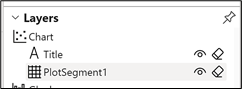
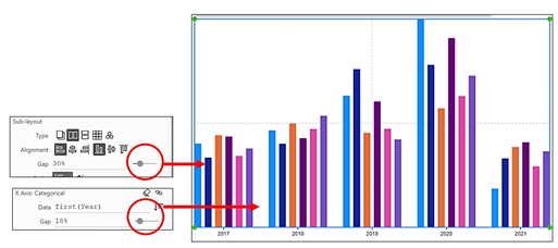
Let’s get back inside Charticulator and start by reminding ourselves what a 2D Region plot segment looks like by selecting “PlotSegment1” in the Layers pane:-
|
Image
|
Image
|
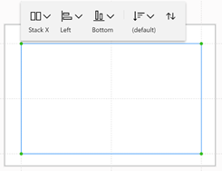
You’ll see that the plot segment has its own menu bar. Previously we focussed on the first button on the menu, which allows you to change the sub-layout of the plot segment. This time we explore the options on the other buttons which are all about aligning (horizontal and vertical) and sorting elements of the chart. We’ll also look at the options for spacing and formatting X and Y axes labels in the Attributes pane of the plot segment.
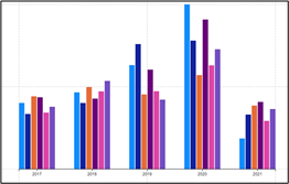
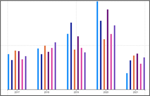
This is the Charticulator chart we’ll be using in most of our examples.
|
Image
|
Image
|
Image
|
Note: In the examples below we work exclusively with a Categorical X-Axis. Please understand that all the options are equally applicable to a Categorical Y-Axis.
Sorting
The attributes of the plot segment we’re going to explore here are those concerned with sorting the elements of the chart. To appreciate how Charticulator deals with sorting, it might be a useful exercise to compare sorting in Charticulator with sorting elements in a chart generated in Power BI. What we’ll learn is that firstly Charticulator approaches sorting in a completely different way and secondly that Charticulator gives us a lot more control over what and how we sort the data.
Sorting Data in a Power BI Chart
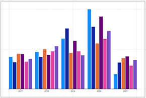
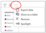
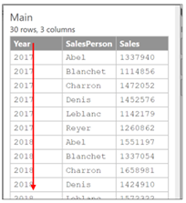
Let’s re-create the column chart above using a Power BI clustered column chart. There are two ways of doing this. Firstly, we can put the Year field into the “Axis” bucket, the Salesperson field into the “Legend” bucket and Sales goes into “Values”:-
|
Power BI Chart |
||
|
Image
|
Image
|
Image
|
But notice that if we do this, we have no ability to re-sort the columns.
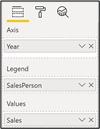
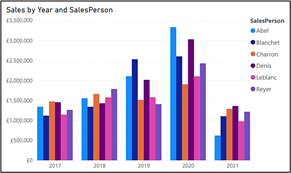
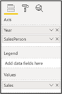
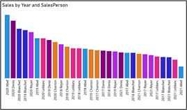
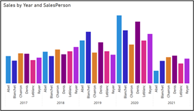
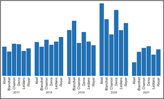
The second way to construct the column chart in Power BI would be to put both Year and Salesperson into the Axis bucket and use “Expand all down one level in the hierarchy”. Notice that I’ve also coloured the columns by Salesperson so we can make a better comparison.
|
Power BI Chart |
|
|
Image
|
Image
|
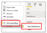
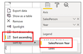
What we will notice here is that like all Power BI visuals, the columns are sorted descending by “Value”. If we want to sort by an “Axis” category, we can use the “More options” button and will then find that the sort order is determined by the order of the fields in the Axis bucket.
|
Power BI Chart |
|
|
Image
|
Image
|
To change the order of the categories, you need to change the order of the fields in the Axis bucket.
|
Power BI Chart |
|
|
Image
|
Image
|
So there are a number of frustrations here. Firstly in order to do any sorting, we have to use a hierarchical structure and one of the drill-down options. Secondly, we can’t sort by the Sales value within a category. For example, we can’t sort Abel’s sales ascending by Sales value, we can only sort by Year. There are a number of other frustrations not necessarily to do with sorting but to do with controlling X-Axis labels and being able to show legends.
Sorting Data in a Charticulator Chart
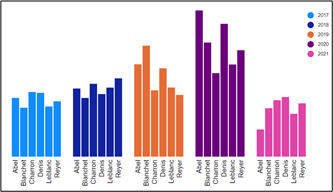
So we’re done with looking at Power BI and have concluded that the sorting options are pretty limited. And we’re not here to look at Power BI charts. Let’s instead look at how Charticulator manages the sorting. One approach is to use the “More options” button on your Charticulator chart in Power BI. Doing this we can at last sort by the Sales field within the Year category:-
|
Charticulator Chart in Power BI |
|
|
Image
|
Image
|
However, Charticulator has its own sorting options and once you start using these, they will override Power BI’s sorting options. In short, it’s best to use the sorting options inside Charticulator to sort chart elements. So how do you use Charticulator to do the sorting? The first thing to understand is that, unlike Power BI where you either sort the categories or you sort the value, in Charticulator you either sort the glyphs or you sort the axis labels. Let’s now look at these two different kinds of sorting.
Sorting the Glyphs
In the absence of a field bound to the X-Axis, Charticulator uses the order of the fields in the Fields pane to determine the default sort of the glyphs. For instance, in our Charticulator chart, the glyphs are sorted ascending by Year:-
|
Image
|
Image
|
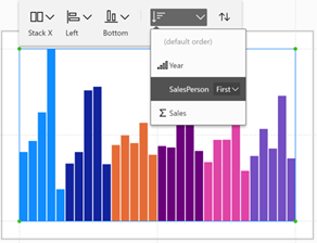
To re-sort the glyphs you can use the “Order of elements” and “Sort direction” buttons on the plot segment menu or you can use the “Order” attribute in the Attributes pane. For instance, we’ve sorted by the SalesPerson field
|
Image

|
Image
|
Image
|
However, once you have bound a field to the axis, the “Order of elements” and “sort direction” buttons will restrain the sorting to just within each category bound to the axis.
|
Sorting the Sales value with no field bound to the axis |
Sorting the Sales value with Year bound to the axis |
||
|
Image
|
Image
|
Image
|
|
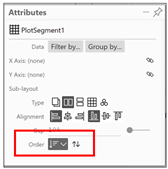
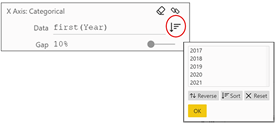
Sorting the Axis and Axis Labels
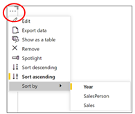
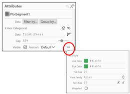
To do this, using the plot segment’s Attribute pane, click on the sort button
to the right of “Data” under “X Axis Categorical”. In the sorting dialog that opens, you can reverse the sort and also note that you can drag and drop the items in the list to create a custom sort. Don’t forget to click OK in the sorting dialog:-
|
Image
|
Image
|
|
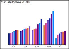
Wow! how easy is custom sorting! No “sort by columns” needed!
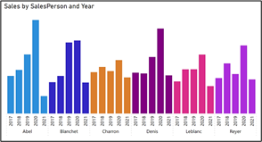
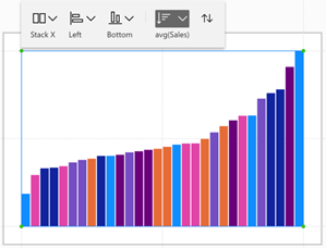
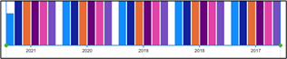
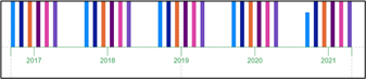
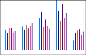
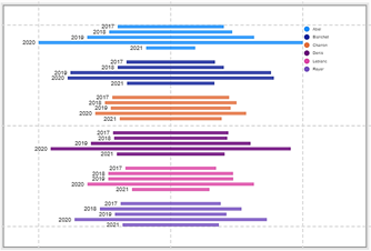
So to conclude how sorting works in Charticulator, I’ve shown you below the two different elements being sorted; the glyphs and the axis labels. I’ve sorted the X-Axis labels descending by Year and the glyphs ascending by Sales.
Spacing
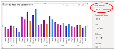
With regard to spacing out elements in your chart, again we can compare the limited options in Power BI to the richer selection of options in Charticulator. In Power BI, the only option available is the “Inner padding” formatting option on the X-Axis card:-
|
Power BI Chart |
|
Image
|
But in Charticulator, we have a lot more control over the spacing of the elements. The spacing options are similar to the sorting options in that there are two different spaces that you might want to change; the gap between the axis labels and/or the gap between glyphs.
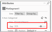
Spacing the Axis Labels
Use the “Gap” attribute under “X Axis Categorical” of the plot segment…
|
Image
|
Image
|
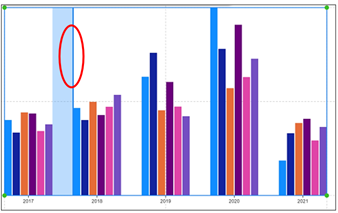
…or you can simply drag between the categories in the chart:-
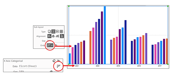
Spacing the Glyphs
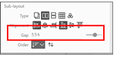
To change the gap between the glyphs, use the “Gap” attribute under the Sub-Layout attributes.
|
Image
|
Image
|
You can also just drag between glyphs to change the gap.
You can see below that the “Gap” attribute under “X Axis Categorical” changes the gap between the X-Axis labels, whereas the “Gap” attribute under the sub-layouts changes the gap between the glyphs.
Format Axis Labels and Tick Marks
This brings us to look at the formatting attributes of the plot segment. Remember that the formatting of the glyph depends on the attributes of the shapes and symbols that comprise the glyph. The only elements that you can format in the plot segment are the axes labels and the tick marks. To change the look of these, click on the ellipse at the very bottom corner under “X Axis Categorical” and you’ll get options to change the colour of the tick line and the tick label and to increase the length of the tick line (amongst other options).
|
Image
|
Image
|
|
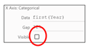
Hiding X or Y-Axis Labels
Once you have bound data to the X or Y axis, you can hide the labels.
|
Image
|
Image
|
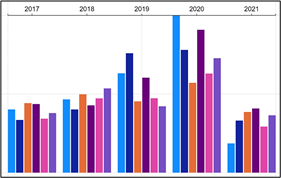
Doing this allows you to control which “labels” show on the X (or Y) Axis. For instance, in the example on the left below, I’ve created a “clustered column chart” in Charticulator that mimics a clustered column chart generated in Power BI. To do this in Charticulator, I bound the Year field to the X-Axis and bound the Salesperson field to a Text mark, anchored to the bottom of the glyph. In the example on the right, I’ve checked off the Visible attribute for the X-Axis so only the “labels” for the SalesPeople show.
|
Year field bound to X-Axis and SalesPerson |
Hide the X-Axis Label for Year and bind |
|
|
Image
|
Image
|
|
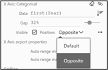
Move the Axis Labels to the Opposite Side
You can put the Axis labels on the opposite side of the plot segment by using the “Opposite” attribute. And of course, you can also move the Y-Axis labels to the right of the chart.
|
Image
|
Image
|
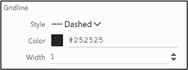
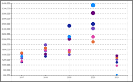
Gridlines
Gridlines are normally associated with a numeric axis. In Charticulator, you need to bind a numeric field to either the X or Y-Axis to create a numeric axis and then you can show the gridlines. Remember also that if you are using a numeric axis, you should use a Symbol as your glyph.
To show the gridlines, change the “Gridline Style” attribute of either the X or Y axis from “none” to “solid”, “dashed” or “dotted” and use a darker colour:-
|
Image
|
Image
|
Aligning the Glyphs
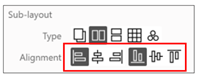
Also can also change the alignment of the glyphs by using the alignment options under the Sub-layout attribute or using the plot segment menu bar:-
|
Image
|
Image
|
|
Image
|
Image
|
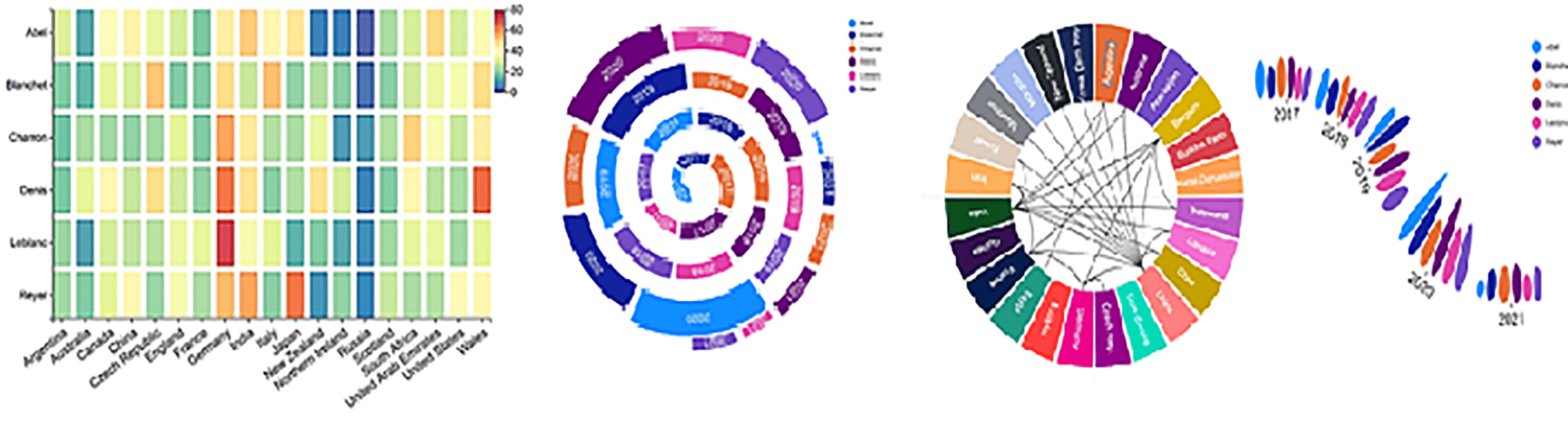
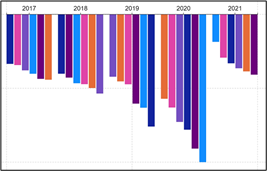
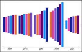
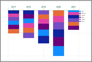
Putting It All Together
Being able to successfully apply the attributes of the plot segment means that slowly but surely you’re moving forward in understanding Charticulator. To prove this is true, why don’t you use your newfound skills in Charticulator, to create these charts:-
|
|
|
|
|
Image
|
Image
|
Image
|
|
You may think that the charts above are pretty cool, but to be quite honest up to now our charts have been at best conventional. We’re still stuck using a single categorical axis with a single value axis, albeit it masquerading as a “legend”. What we have yet to explore is one of the great advantages of creating charts in Charticulator and that is the ability to use two categorical axes. Like the idea of this? Then read on…
Add new comment