Charticulator in Power BI #7
Using Two Categorical Axes.
In my very first post on Charticulator, I urged you to forget everything you currently know about creating conventional charts. Instead to think in terms of designing a representation of your data, where you’re no longer restrained by the number of axes, categories and values you want to represent. Yet so far in this series of blog posts, we’ve been very unambitious in our chart designs. All the charts we’ve created have been variations on standard visuals such as bar, column and line charts.
In my last post, I showed you how Charticulator gives you more control over sorting and spacing chart elements than you can achieve in charts generated in Power BI. However, I still may not have convinced you that creating charts in Charticulator really reaps any benefits and so left you still wondering why I was so gung-ho in that very first post.
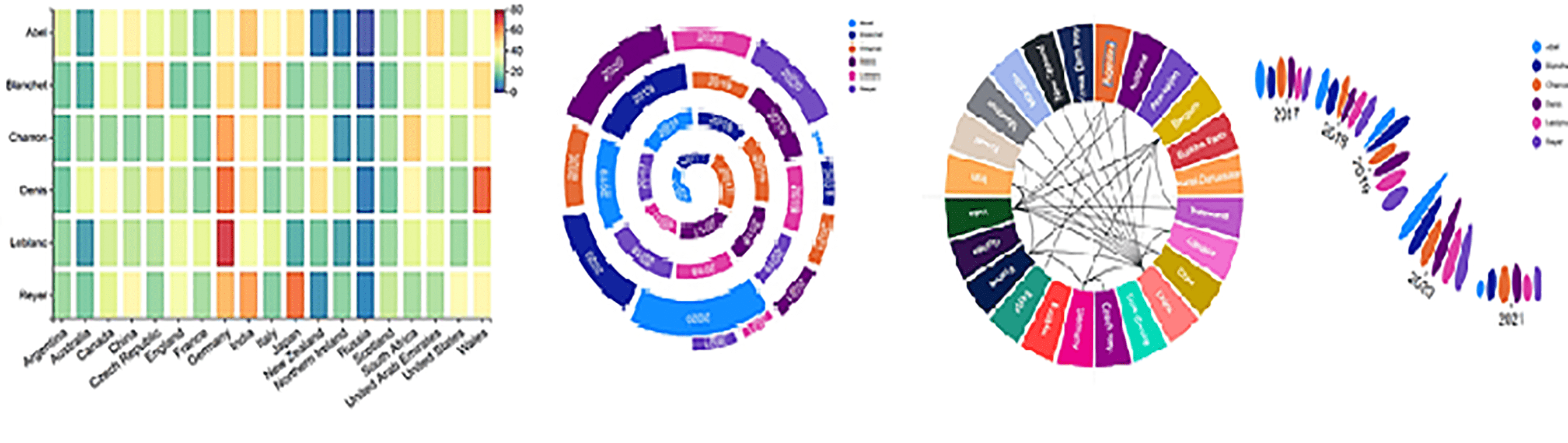
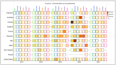
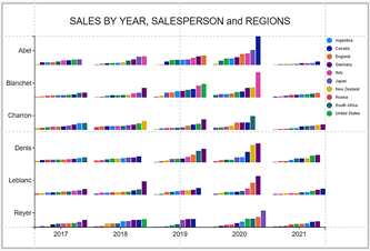
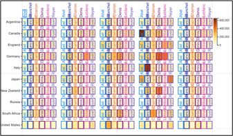
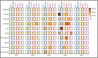
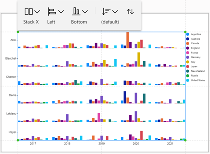
o remedy this situation, let me ask you this question: what do you think about the Charticulator charts below? Could you construct them using default Power BI visuals?
|
“Matrix” style chart |
“Small multiples” style chart |
|
|
Image
|
Image
|
|
You might get frustratingly close using a Matrix visual and using “small multiples” but that’s just it, they’ll be close but not as good. Why was Abel’s sales in Canada so exceptional in 2020?
In what follows, I’ll show you how you can create these charts. We’ll explore the possibilities open to us when wanting to plot multiple categories and how in Charticulator unlike Power BI we can use both a categorical X and a categorical Y-Axis in the same chart. You’ll also pick up some tips and tricks along the way like learning how to display only certain elements of the chart while hiding others, using the “Conditioned by…” attribute.
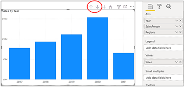
Before we do this, however, first we need to dismantle the mindset of feeling confined by the conventional chart layout, which is a single categorical axis with a single value axis. In charts generated by Power BI for instance, because we are constrained by a single categorical axis, if we want to manage multiple categories, we have to use one of four methods:-
- Clustering
- Stacking
- Drill down on a hierarchy
- Expand all down one level on a hierarchy
|
Power BI |
||
|
If you have more than 1 category, you have to drill down…. |
…or you can use “expand all down one level”…. |
….or you use stacking or clustering with a Legend. |
|
Image
|
Image
|
Image
|
In Charticulator, we don’t have the same restrictions and there are almost limitless ways to plot multiple categories. In doing so there are essentially two directions to go in. Firstly you can create a “matrix” style chart where the “value” for each combination of X and Y category can be expressed in a colour scale. Or secondly, you can use “small multiple” style charts where you have a separate mini chart for each combination of X and Y category. Let’s take a closer look at each of these options.
Designing “Matrix” Style Charts
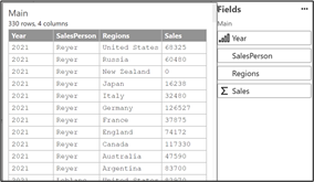
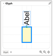
We will start with a very simple example using the data below with a rectangle Mark as our glyph:-
|
Image
|
Image
|
Note: The default colour for shapes is now blue not grey.
We can bind Year to the X-Axis and bind Salespeople to the Y-Axis to create two categorical axes.
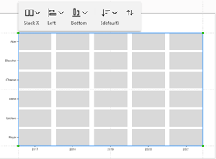
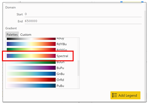
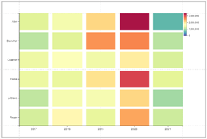
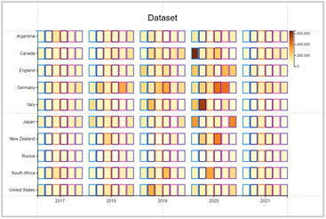
Notice how we get a “grid” layout dictated by the X and Y categories and have a “Stack X” sub-layout. The chart above doesn’t tell us much about our sales. What we can do here is bind the Sales field to the “Fill” attribute of the shape, select a “spectral” colour scale and add a Legend. We can now see our SalesPeople’s performance and see that the best year was 2020;
|
Bind the Sales field to the |
…apply a “Spectral” gradient fill |
…and we can see that 2020 was |
|
Image
|
Image
|
Image
|
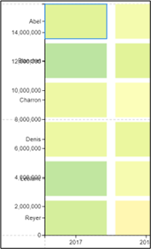
With regard to adding the Legend, you must click into the “Fill” Attribute. Remember that you can’t use the Legend button on the menu bar
because that creates a numeric legend on the Y-Axis on top of the field that is already bound to the Y-Axis, in this case, SalesPerson and this would look very strange:-
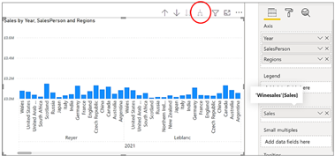
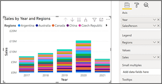
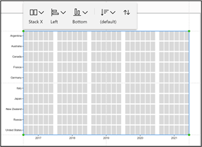
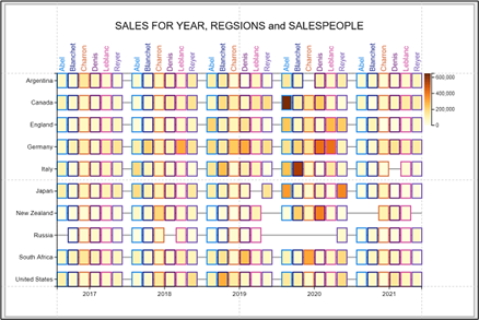
But let’s get more ambitious. Up to now in my posts, we’ve always used just two categories, Year and SalesPerson but let’s now introduce a third category; Regions. Let’s bind Year to the X-Axis and bind Regions to the Y-Axis. Just like before, notice the “grid” layout even though the sub-layout is still “Stack X”.
|
Using 3 categories |
“Grid” layout dictated by the X and Y categories, not the sub-layout |
|
Image
|
Image
|
Each glyph in the chart above represents a Salesperson but we don’t know which Salesperson. What we can do here is bind the SalesPerson field to the “Stroke” attribute of the rectangle to create a coloured border dependant on the SalesPerson. To show the value of the sales, we can again bind the Sales field to the “Fill” attribute of the shape and select a gradient fill, adding the Legend.
However, it’s still not very clear which SalesPeople’s sales we’re looking at. What we want is a second “X-Axis” at the top of the chart that labels each “column” of glyphs accordingly. Like this:-
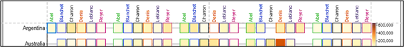
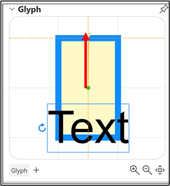
To do this we need to add a Text mark to the glyph and then:-
- Anchor the Text mark to the top of the glyph
- Drag the Text mark above the glyph
- Rotate the Text mark
- Bind the Salesperson field to the Text and Colour attributes
|
Anchor the Text mark |
Move and rotate the Text mark and bind Salesperson |
|
Image
|
Image
|
However, we’ve ended up with a bit of a mess:-
What’s happened of course is that we get a Text mark above every glyph, not just above the shapes at the top of the chart. To achieve our desired result we need to get to grips with the “Visibility” attribute of the rectangle shape. Before doing this, however, let’s digress a little and look at how Charticulator controls the visibility of different elements of the chart.
Hiding Elements and “Conditioned by…”
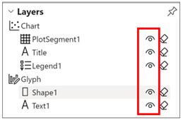
We can easily hide any layer in the Layers pane by using the “Toggle visibility”:-
To hide the X or Y-Axis labels, you can use the “Visibility” attribute of the plot segment:-
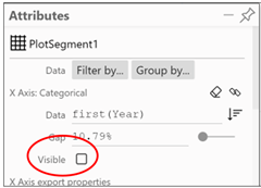
However, both of these approaches is an “all or nothing” scenario. We want to show only the Text marks that lie in the X-Axis space at the top of the chart i.e. the Text marks associated with “Argentina” …
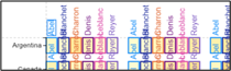
…and hide the other Text marks. But if we hide the “Text1” layer, it will hide all the Text marks. So how do we hide some Text marks but not others?
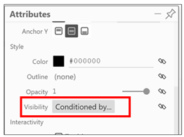
Conditioned By…
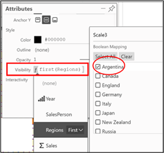
Charticulator has provided a way to do this. The attributes of a Text mark or a shape include a “Visibility” attribute This attribute allows you to bind data on which you can filter out specific Text marks or shapes. This is the “Conditioned by…” bit you can see in the Attributes pane against the “Visibility” attribute. If you bind the Regions field to the “Visibility” attribute, you can then filter on “Argentina” so that only show Text marks for Argentina show at the top of the chart.
|
Use the “Visibility” attribute |
First bind the field and |
Only the text for “Argentina” shows |
|
|
Image
|
Image
|
Image
|
|
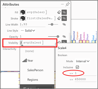
We can do a similar thing to hide a rectangle shape where there are zero sales. Again, using the “Visibility” attribute of the shape and “Conditioned by…” we can bind the Sales field and filter Sales greater than zero:-
|
The “Visibility” attribute of the |
Only showing rectangles for sales greater than zero |
|
|
Image
|
Image
|
|
And finally, I added a gridline (using the “Gridline” attribute of the plot segment) and also added a chart title. So there we have our “matrix” style chart. Now let’s look at another way to express multiple categories and that is in a “small multiples” type chart.
Small Multiple Type Charts
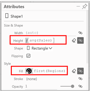
An alternative way to plot multiple categories is to use the “small multiples” approach. Let’s create a simple column chart using the rectangle Mark in the Glyph pane and put Regions into the Fill attribute of the shape and Sales into the Height attribute:-
At first, the chart looks very crowded because there is a rectangle glyph for every Year for every SalesPerson in every Region, synonymous with “expand all down one level in the hierarchy” of a Power BI chart.
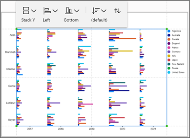
But look what happens when we put Year on the X-Axis, SalesPerson on the Y-Axis. Because we have a “Stack X” sub-layout, we automatically get “mini” column charts for each Year and each SalesPerson to show Sales in each Region. This is equivalent to the “small multiples” option in Power BI. We could use other the sub-layout options to create different “mini” charts.
|
Year bound to the X-Axis and Salesperson bound to |
It doesn’t look so good if we “Stack Y” and |
|
|
Image
|
Image
|
|
|
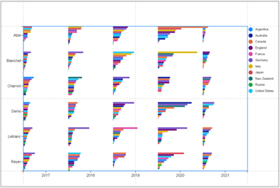
The same charts sorted by Sales |
||
|
Image

|
Image
|
|
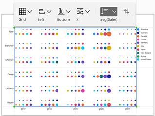
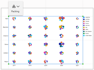
Let’s try working with a Symbol glyph instead of a rectangle Mark. In the examples below we’ve bound the Sales field to the Size attribute of the symbol and the Region field to the Fill. We could see what the Grid sub-layout looks like (with the count attribute of the plot segment set to 5) or even Packing:-
|
Image
|
Image
|
Image
|
Note: Charticulator.com users will know that there is another way to create the “small multiples” approach and that is to use “nested” charts. Charticulator in Power BI does not support nested charts.
I hope you’ve enjoyed our little foray into working with Charticulator’s categorical axes, but of course, this now begs the next question what about numeric axes? We’ve already had a brief look at using numeric axes in my Charticulator #4 blog post. On that occasion, we learned the difference between numeric Legends and numeric Axis. In my next blog, we revisit the numeric axis. We delve deeper into its attributes looking not only at controlling the numeric formatting and range but finding out what Charticulator’s “Tick Data” is and what it can do for you.
This is part 7 of our 14-part in-depth guide to Charticulator.
Want to keep learning about:
-
Charticulator expressions?
-
Formatting Numeric Expressions in Charticulator?
-
Scaffolds, Guides and Anchoring?
Add new comment