Charticulator in Power BI #8
Numeric Axes, Tick Marks & Tick Data.
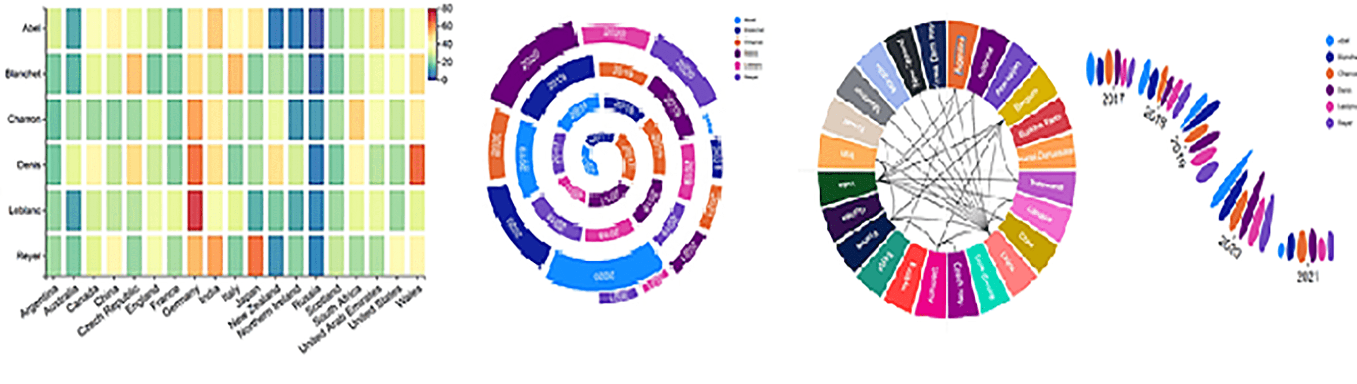
If you’ve read my previous blog post you’ll know that with Charticulator you can use two categorical axes and hopefully this has inspired you to build more adventurous visuals. To entice you to carry on reading my series of posts, I keep holding out a “carrot”, insisting that you can do a whole load of things in Charticulator that you can’t do in Power BI visuals. The “stick” is that to be able to do all these wonderful things, you first have to get to grips with the sometimes weird and wacky world of Charticulator. We’ve already seen that a value axis is sometimes a “legend” and that glyphs will overlap themselves of their own accord. We’ll also find out how elements of the chart will wander around the place unless you anchor them (the subject of a later post) and I’m sure you’ve found your own peculiarities.
I hope this post is definitely a “carrot” urging you forward with your Charticulator knowledge, looking this time at clever ways to use numeric axes.
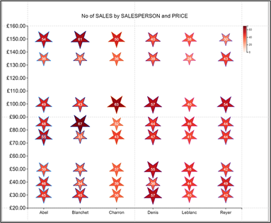
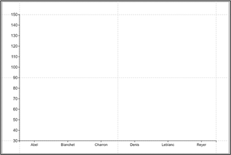
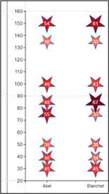
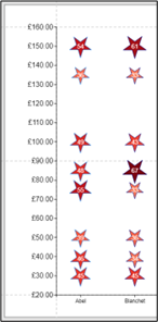
Let’s start our venture by considering the two charts below. In these, we want to show the number of sales that each Salesperson has achieved for expensive wines or for cheap wines, prices per case ranging from £30 to £150.
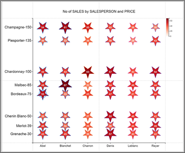
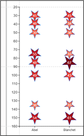
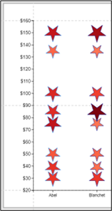
In the chart on the left, the PricePerCase field has been bound to the Y-Axis giving us a convention numeric axis. However, we don’t know which wine the star symbols represent. In the chart on the right, you can see that the Y-Axis shows a label for each wine and the price per case. The Y-Axis is still a numeric axis despite its appearance. In Charticulator, using a numeric axis you can generate text labels associated with specific values along the axis. Does this sound intriguing? Then read on.
|
Binding PricePerCase to the Y-Axis generates a |
Using the same numeric Y-Axis, Charticulator can |
||
|
Image
|
Image
|
||
|
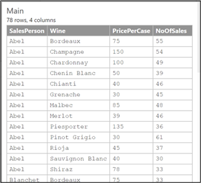
Data we’ve plotted above. |
|||
|
Image
|
Image
|
||
Unfortunately, here comes the “stick” because before we can attempt these charts there’s quite a bit more we need to know about Charticulator’s numeric axes.
Let’s start by creating the chart above on the left and then we can focus on its numeric axis.
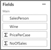
Using the data shown above, firstly we’ve bound SalesPerson to the X-Axis and bound PricePerCase to the Y-Axis, creating a numeric Y-Axis.
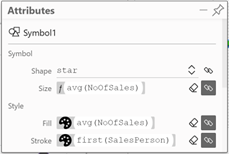
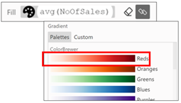
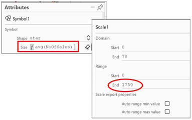
Now we can design our glyph using a Symbol shape, converted to a star. We’ve then bound the NoOfSales field to “Size” and “Fill” attributes of the Symbol and SalesPerson is bound to the “Stroke” attribute. To generate the colour scale representing the NoOfSales value, we clicked onto the “Fill” attribute to edit the colour scale to “Reds”:-
|
Image
|
Image
|
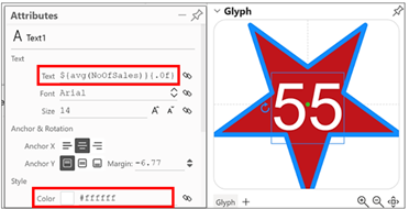
Next, we added a Text mark to the glyph, dragging it to the centre of the symbol. We then bound NoOfSales to the Text attribute of the Text mark, edited the format to 0 decimal places i.e.”{. 0 f}” and changed the colour to white:-
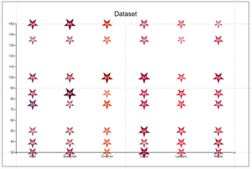
However, our chart is still not right. The star symbols do not show a great difference in size from smallest to largest.
What we can do here is edit the scale to increase the range of sizes. To do this, click into the “Size” attribute and in the “Scale1” dialog that opens, change the End range value. I’ve increased it to 1750 but you can experiment and see what you like. By the way, we take a closer look at scales and ranges in my later blog posts.
|
Image
|
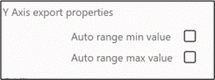
Note: If you change the Range attribute, just also ensure that you turn off “Auto range min value” and “Auto range max value” under the “Scale export properties” attribute otherwise when you return to Power BI, the range will have reverted. |
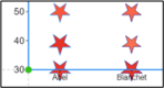
You’ll also notice that the star symbols have spilt outside the plot segment at the top and bottom of the chart and also the numbers on the Y-Axis are not formatted as currency. This is where we now need to focus on Charticulator’s numeric axes.
Numeric Axes Attributes
To remedy these two problems let’s take a closer look at the numeric Y-Axis attributes:-
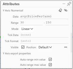
Range
To move the values on the Y-Axis up, you can change the Range attribute of the Axis. You could also reverse the scale if you wanted to.
|
Image
|
Image
|
|
Image
|
Image
|
|
Image
|
Note: Just as above when you rescaled the star symbol, if you change the Range attribute of the Y-Axis, ensure that you turn off Charticulator’s automatic scaling under the “Y-Axis export properties” attribute otherwise when you return to Power BI, the range will have reverted. |
Format the Tick Numbers
To format the numeric axis as currency, we’ll have a brief look at Charticulator’s formatting syntax. I’ll be dedicating my entire next blog post to the formatting of text and numbers in Charticulator so we won’t do too much of it here. To apply a currency format you can use the Tick Format attribute and put the format string inside curly brackets. I’ve shown you two different formats below:-
|
Image
|
Image
|
|
Image
|
Image
|
Formatting the Tick Font and Tick Mark
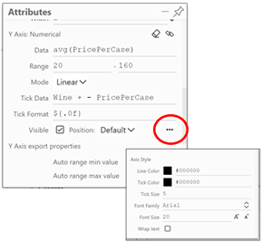
If you want to change the colour or increase the size of the text or tick marks on the Y-Axis, in the attributes pane, click on the ellipse bottom right of the Y-Axis attributes.
So we’ve now completed the first example chart.
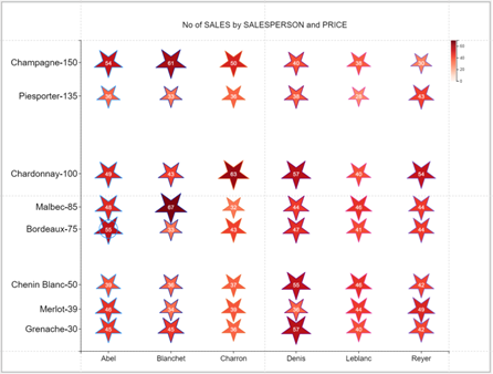
Tick Data
The problem with the chart above is that you don’t know which Wine is being plotted in the star symbol. It’s here that we can get Charticulator to generate text labels associated with specific values along the value axis. To do this, use the “Tick Data” attribute and simply type the name of the field whose text values you want to use. I’ve used the Wine field and the PricePerCase field, separated with a dash character.
Note the use of the “+” to concatenate the Wine and PricePerCase fields. Also be careful of the following:-
- Charticulator’s format strings are case sensitive so you must type the name of the field in the correct case.
- If you have a space in the name of your field you must surround the field name with a grave character. You’ll find the key for this character at the top left corner of your keyboard, beside “1” and under “Esc” e.g.:-
The last thing we need to complete the chart is to give it a Title…
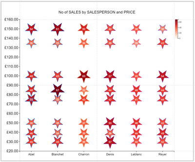
… and by anyone’s standards, that’s a pretty cool chart!
So now we’re pretty sorted with using Charticulator’s categorical and numeric axes. However, you may have noticed there’s one area that we’ve been consistently passing over and really not explaining at all. That is those expressions that Charticulator uses when binding data i.e. all that stuff that begins with a dollar sign. And what’s going on with the numeric formatting syntax i.e. the stuff inside the curly brackets. Apparently, it’s known as “d3-format”. So without further ado, let’s move on to my next post where we’ll explore Charticulator expressions and the obscure world of “d3-formats”.
Add new comment