Charticulator In Power BI #13 – Polar Scaffolds. Pies, Peacocks & Nightingales
Polar Scaffolds. Pies, Peacocks & Nightingales.
In my last post, I took you through using Horizontal and Vertical Line Scaffolds. It was there that I think we concluded we’d probably rather use sub-layouts, not Scaffolds to lay out our charts horizontally or vertically, mainly because sub-layouts give us a lot more design choices. However, there is another type of Scaffold for which hopefully you will find a plethora of uses. If you want to design circular chart types such as pie charts or nightingale charts, you will need to apply the Polar Scaffold and, unlike Horizontal Line and Vertical Line Scaffolds, you get a good choice of sub-layouts to work with.
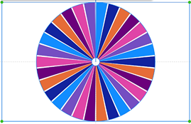
So in this post, let’s get to grips with the Polar Scaffold. We will also take a look at the “Custom Curve” Scaffold which includes a tool for creating spiral charts. Just to whet your appetite with what you’re going to achieve if you read this post, take a look at these charts:-
|
Pie Chart with multiple categories |
Nightingale Chart |
Spiral Chart |
|
Image
|
Image

|
Image

|
|
Circular Chart |
Peacock Chart |
Custom Curve |
|
Image

|
Image

|
Image
|
They’ve all been generated using either the Polar or Custom Curve Scaffold. Liking the look of these? If the answer is yes, then read on and I’ll show you how they were built.
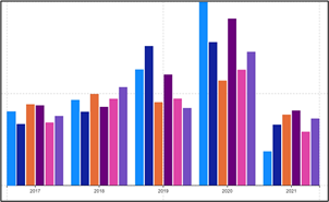
To start, you’ll need a chart similar the one below that uses two categorical fields and one numeric field. Then, in the example below, using a rectangle mark in the glyph pane, I’ve bound the SalesPerson field to the “Fill” attribute.
|
Using these fields… |
… and using a rectangle mark, I’ve created this chart |
|
Image

|
Image
|
Applying a Polar Scaffold
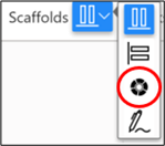
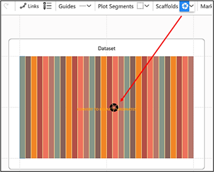
To apply the Polar scaffold, select it from the Scaffolds button on the menu bar
and then drag the Polar scaffold on to the plot segment.
|
Select the Polar Scaffold… |
…drag and drop it onto the plot segment… |
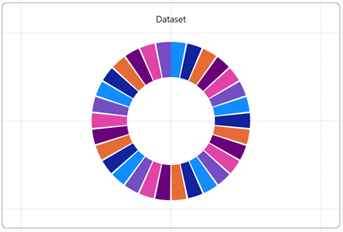
…and you will get a donut chart! |
|
Image
|
Image
|
Image
|
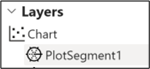
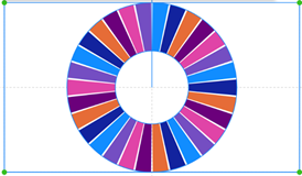
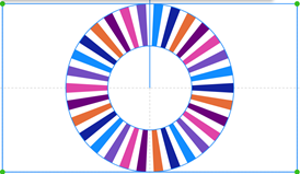
The chart has now changed from a rectangular style of chart that uses an X and Y Axis (known as a “cartesian” chart) to a circular “donut” style of chart. Notice you get a segment for every Year for every SalesPerson, 30 segments in all. Also notice that applying a Polar Scaffold creates a “Polar” plot segment. This can be identified in the Layers Pane because of its different icon.
To change the “donut” into a “pie”, drag inwards on the inside edge of the chart. You can increase the circumference by dragging on the outer edge. You can also drag on the edge of a segment to increase the gap between the segments.
|
Drag inwards on the inner edge… |
…to decrease the hole |
|
Image
|
Image
|
|
Drag outwards on the outer edge… |
…to increase the circumferance |
|
Image
|
Image
|
|
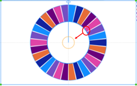
Drag between two segments… |
…to widen the gap |
|
Image
|
Image
|
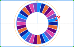
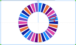
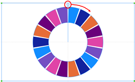
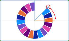
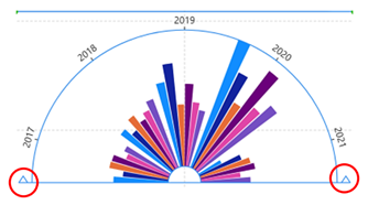
If you want to start and end the chart at a specific angle, for example to create an arc layout, you can drag in a circular direction on the handles at the top of the chart.
|
Drag on these handles… |
…at the top of the chart… |
…to change the angle where the chart starts |
|
Image

|
Image
|
Image
|
…and create an arc layout.
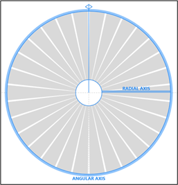
Binding Fields to Polar Axes
A Polar plot segment has two axes; Angular and Radial. You can drag categorical fields into either the Angular or Radial axis by dragging directly onto the plot segment or by using the attributes pane:
|
Image
|
Image

|
Just like a cartesian type chart, you can put either a categorical field or a numeric field into either of these axes but in this post, we will only be using categorical axes.
Note: There are some scenarios where you might need a numeric axes with the Polar plot segment but it this was the case, you would use a “Data Axis”, the subject of a later post.
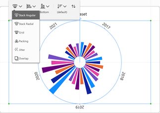
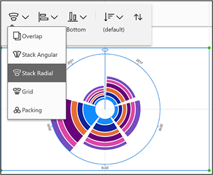
Once you have plotted the axis you want, you can then further change the layout of the circular chart by using one of the sub-layouts:-
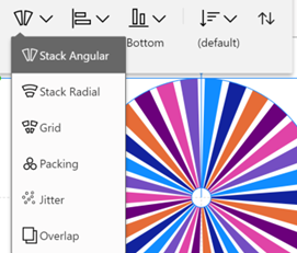
We’re now going to look at the outcome of applying these sub-layouts, combining them with either an Angular or Radial Axis.
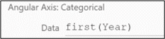
Angular Axis and Stack Angular
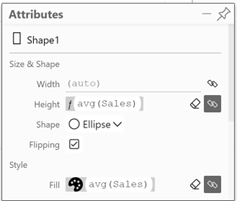
For instance, I’ve used the Year field on the Angular axis and I’m using the default sub-layout “Stack Angular”. I’ve dragged the SalesPerson field into the “Fill” attribute of the rectangle Shape1.
|
Image
|
Image

|
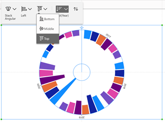
To see the Sales values, I’ve then dragged the numeric Sales field into the “Height” attribute of the rectangle shape. With Sales still in the Height attribute, I’ve then clicked into the plot segment and change the alignment e.g. to “Top”:-
|
Using the Angular Axis and Stack Angular Sub-Layout |
You can also change the alignment |
|
Image
|
Image
|
Creating the Peacock Chart
You can use the combination of an Angular Axis and Stack Radial sub-layout to create a peacock chart. You can see that using the chart above left, I have dragged on the handles (circled in red below) to create an arc shape.
I then changed the Shape of the mark to an “Ellipse” and swapped the Year Field in the “Fill” attribute for the Sales field, giving it a “Spectral” gradient fill.
|
Use the “Ellipse” shape and a “Spectral” fill.… |
…and you get a Peacock chart |
|
Image
|
Image
|
With a few tweaks such removing Year from the Angular axis and replacing it with a Text mark that concatenates Year and Salesperson (see my blog post, Charticulator in Power BI #9) and giving the chart a black background, I ended up with this:-
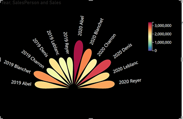
You may also notice that I’ve filtered the SalesPerson field to show only three SalesPeople.
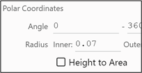
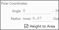
Height to Area
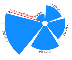
When you bind a numeric field to the “Height” of a glyph, when plotted in a Polar plot segment, the heights of the glyphs will be proportional, but the areas will be skewed for smaller values as the radius decreases. The outcome of this is that smaller values look disproportionally smaller relative to area. The reason for this is that the “Height to Area” attribute of the Polar segment is checked off.
|
“Height to Area” checked off |
The heights of the glyphs are proportional but not the area. |
|
Image
|
Image
|
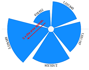
If you want the area of the glyph to reflect the value bound to the “Height” attribute, check on the “Height to Area” attribute.
|
“Height to Area” checked on |
The areas is proportional, not the height. |
|
Image
|
Image
|
Use this check box to bind the value bound to “Height” to the area of each segment, as opposed to the height.
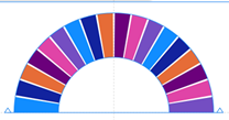
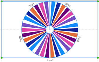
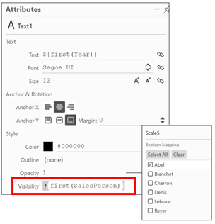
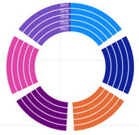
Angular Axis and Stack Radial
With Sales still in the “Height” attribute and the alignment set to “Bottom”, you can click into the plot segment, and change the sub-layout to Stack Radial:-
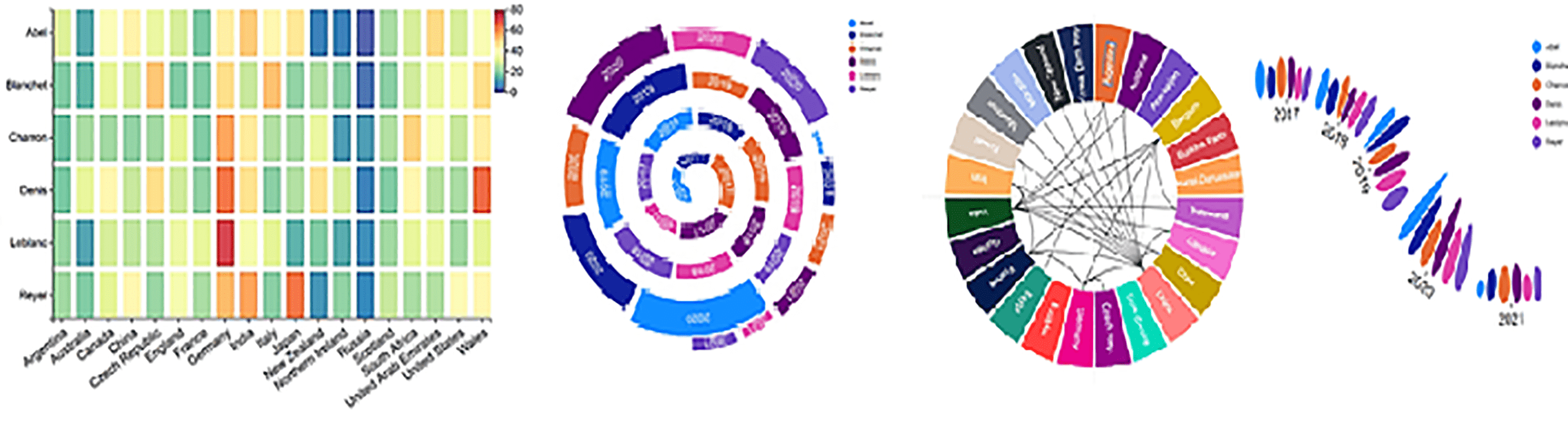
You can see that the chart above is the basis of this Nightingale Chart:-
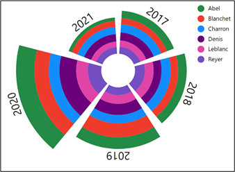
Notice how I’ve edited the colours used for each SalesPerson and I’ve hidden the Year field on the Angular Axis. I then used a Text mark bound to the glyph and bound the Year field to it. So that the Text mark only appears at the top of each segment, I used the “Visibility” attribute of the Text mark and bound the SalesPerson field to it, selecting only SalesPerson “Abel”.
Radial Axis and Stack Angular
Starting with this chart :-
|
Using these fields… |
… and using a rectangle mark. |
|
Image
|
Image

|
|
Apply the Polar Scaffold… |
…and put the Year field onto the Radial Axis… |
…you could then put the Sales field into the “Width” attribute |
|
Image
|
Image
|
Image
|
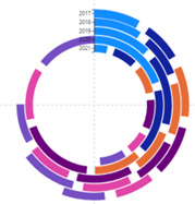
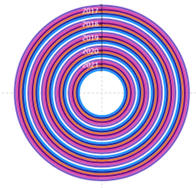
Radial Axis and Stack Radial
| Apply the Polar Scaffold… | …and put the Year field onto the Radial Axis and Stack Radial… | …you could then put the Sales field into the “Width” attribute |
|
Image

|
Image
|
Image
|
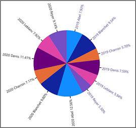
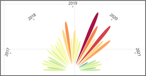
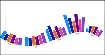
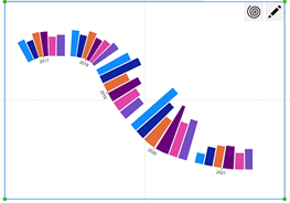
You can see that the last chart on the right is the basis of this chart:-
In this chart, I’ve simply changed the “Fill” attribute of the shape and bound Year to it, rather than SalesPerson. To get the “wispy” effect, I then changed the shape of the glyph to an ellipse rather than a rectangle.
Working with the Custom Curve and Spiral Scaffold
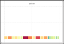
For this I used these fields:-
|
Image
|
Image
|
To create the chart, I used a rectangle shape in the glyph pane and put Sales into the “Height” attribute and SalesPerson into the “Fill” attribute and Year went on the X-Axis.
I then dragged the Custom Curve Scaffold into the Plot Segment
You can then use the pencil button top right to draw your own curve.
|
Image
|
Image
|
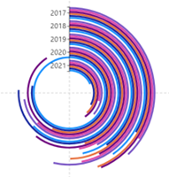
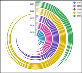
To create a spiral, click on the spiral button
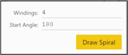
Now you can specify the “Wingdings” which determines the tightness of the spiral. The bigger the number, the tighter the spiral. By default the spiral will start at the 180 degree point (i.e. at the bottom of the spiral) but you can change this in the “Start Angle” attribute.
In the chart below, I used the same rectangle shape in the glyph but this time put Sales into the “Width” and “Fill” attributes, selecting a “Spectral” gradient fill. I changed the “Height” attribute to 40. At this stage the chart looks a bit odd but don’t worry.
I then applied the “Custom Curve” Scaffold and clicked on the Spiral button, changing the “Wingdings” attribute to 2. I also closed the gap in the plot segment attributes to pull the shapes together.
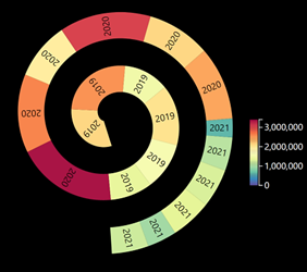
That’s a pretty cool chart, eh? Don’t you agree that at last we’re beginning to tame the beast that is Charticulator! But we’ve only just started. Next stop, the “Line” plot segment. You may not think that a “line” could ever be very exciting but believe me, this will be mind-bending stuff! Or do I just need to get out a bit more? Anyway, onward and upward to my next blog post on the Line Plot Segment.
Add new comment