Charticulator In Power BI #10
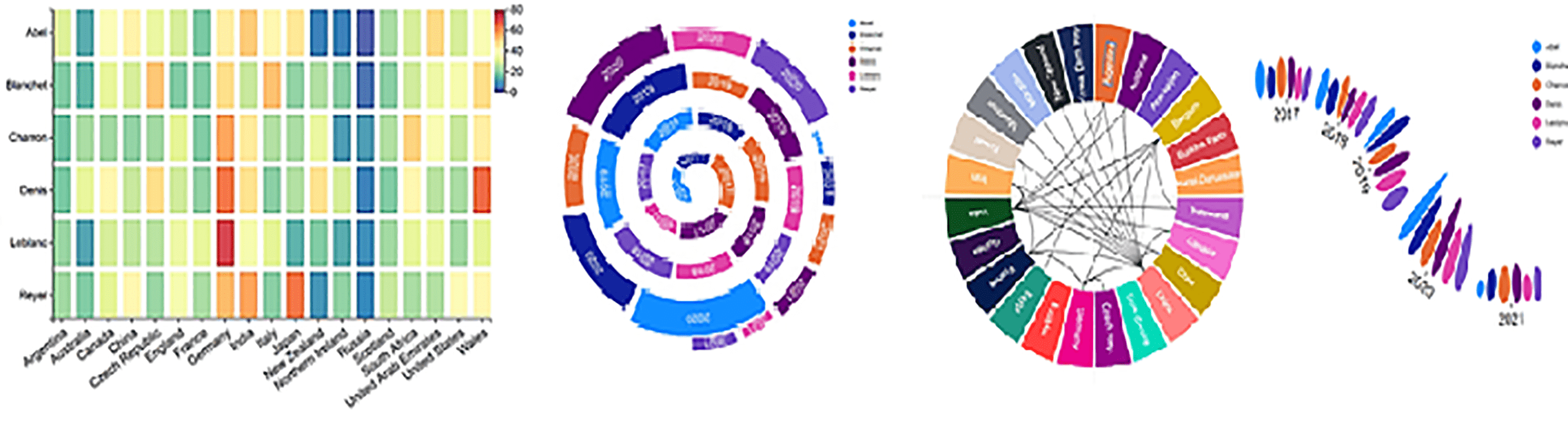
Scales & Legends.
The problem with attempting to explain how Charticulator works is that there’s a frustrating “chicken and egg” scenario. To understand topic “A”, you need to know about topic “B” but to understand topic “B”, you need to know about topic “A”. So in other words, you need to already have some knowledge of each topic before we can attempt to explain more. This is why in this post, we’re going to re-visit ground some of which we’ve covered before, only this time in the light of what we already know. We’re going to take a second look at Charticulator’s scales and legends because there’s always more to say on a topic and further insights to be had.
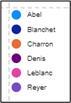
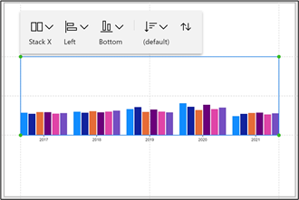
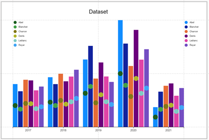
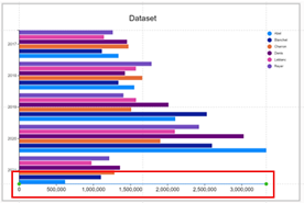
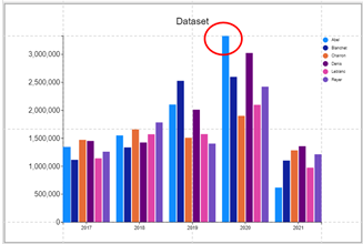
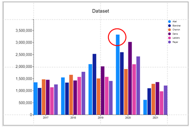
This is the Charticulator chart and data we’ll be using in most of our examples below.
|
Image

|
Image
|
Image
|
Charticulator Scales
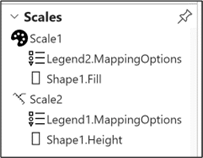
Charticulator creates a scale for you whenever you bind data to an attribute. The scale determines how the data is mapped to the visual elements of the chart like height, colour, size etc of marks and symbols. You can see these scales in the Scales Pane that lists all the scales used by your chart along with legends associated with the scale. It would be unusual to have a scale without a legend and so you can think of a “scale” in Charticulator as any attribute of a shape or symbol that requires an explanation in a legend.
There are three types of scale in Charticulator; numeric scales
, colour scales
and scales that map icons to categories but we’ll be looking just at the first two types. You can see examples of these two types of scale in the charts below.
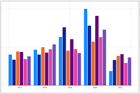
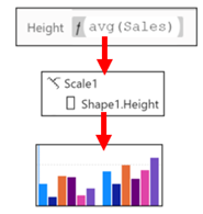
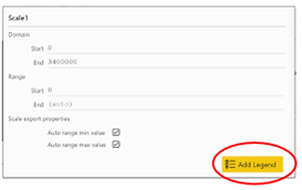
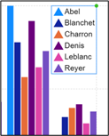
- “Scale1” is a numeric scale associated with the “Height” attribute of the rectangle shape and also contains a numeric legend on the Y Axis explaining the Sales value mapped to the height.
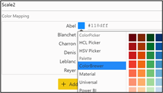
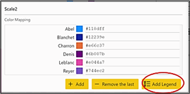
- “Scale2” is a colour scale associated with the “Fill” attribute of the rectangle and again a legend has been added to explain the colours.
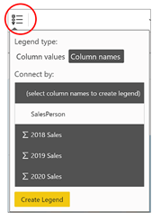
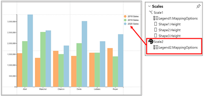
Mostly scales are created for you by Charticulator and then you need to create a legend explaining the scale yourself. There is an exception to this. If you’ve plotted multiple numeric values e.g. in a clustered column type chart, the glyph will comprise multiple shapes, each with data bound to their own numeric attributes creating multiple scales. In this scenario, you can insert a legend using the “Column names” option (using the Legend button on the menu bar) and in doing so you’ll create an associated scale defining the colours used in the legend (shown in “Scale2” below).
|
Image
|
Image
|
We look more closely at working with multiple values in upcoming blogs.
Let’s now take a closer look at Colour Scales.
Colour Scales
A colour scale is created when you bind a category field or a numeric field to an attribute that has a colour associated with it such Fill, Stroke (border) or Text colour. If you bind a category field to one of these attributes, this creates different colours for each category. If you bind a numeric field to the attribute, this will create a colour scale.
|
Categorical Colour Scale |
Numeric Colour Scale |
|
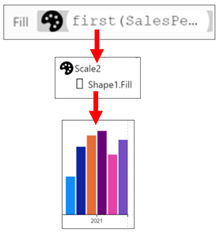
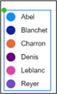
Salesperson categorical field bound to the “Fill” attribute of the rectangle shape creates colours for each category. |
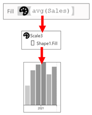
Sales numeric field bound to the “Fill” attribute of the rectangle shape creates grey gradient colour showing values. |
|
Image
|
Image
|
Editing Colour Scales
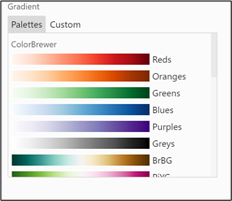
You can edit the colours of the scale either by clicking on the attribute or by clicking on the scale name in the Scales pane. For instance, I’ve clicked on the “Fill” attribute of the rectangle shape and I can edit the colours used for each Salesperson or edit the colour scale for the Sales field.
|
Click on the attribute |
Click on the colour you want to edit. |
Edit a gradient colour scale used by numeric data. |
|
|
Image
Image
|
Image
|
Image
|
|
Numeric Scales
A numeric scale is created when you bind a numeric field to a numeric attribute such as “Height”, “Width”, “Size” or “X Span/Y Span”.
|
Numeric Scales |
|
|
The numeric scale associated with the “Height” attribute of the rectangle shape defines the height of the shape. |
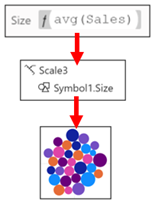
The numeric scale associated with the “Size” attribute of the symbol defines the size of the symbol. |
|
Image
|
Image
|
Editing Numeric Scales
Just as with colour scales, you can edit a numeric scale either by clicking on the attribute or by clicking on the scale name in the Scales pane. When you edit a numeric scale, you have a choice of editing the “Domain” and or the “Range”.
We look at editing the “Domain” below in the section on legends (see Edit the Scale of a Numeric Legend) but for now, let’s focus on what the “Range” option can do for us.
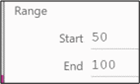
Well in fact, if you’re working with a mark or line as opposed to a symbol, the range option won’t do that much for you. The range attribute of the scale determines the difference between the smallest glyph and the biggest. In our chart this is the difference in height between the shortest rectangle and the tallest. If you’re using a mark or a line, when you first bind numeric data, Charticulator will automatically scale the height, width or span of the mark or line to fit the plot segment. This means that if you change the size of the plot segment, the glyph automatically re-scales. Therefore, if we put measurements into the Start and End attributes, this will constrain the size of the glyphs.
|
The range is automatically scaled… |
…which means you can re-size the plot segment and the relative size of the shapes are retained. |
|
Image
|
Image
|
|
If you enter a Start and End value… |
… this will constrain the relative sizes of the shapes irrespective of the size of the plot segment. |
|
Image
|
Image
|
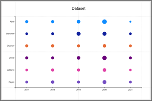
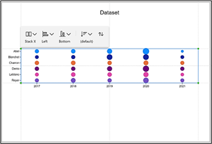
You may find more reason to change the range values if you’re using symbols as we are in the chart below. The Sales field has been bound to the Size attribute of the symbol.
|
Image
Image

|
Image
|
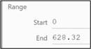
When you look at the scale for the Size of the symbol by clicking on the scale in the Scales pane…
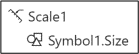
…you’ll see that unlike the rectangle mark, the symbol has a specific “End” value in the Range attribute (628.32), constraining the size of the symbol irrespective of re-sizing the plot segment. You can edit the “End” value to increase the relative size of the symbols.
|
The symbol has a Range End value… |
…which will constrain the sizes to the symbols irrespective of the size of the plot segment. |
|
Image
|
Image
|
|
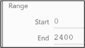
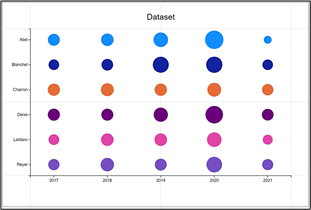
Edit the End value… |
…to change the relative sizes of the symbols. |
|
Image
|
Image
|
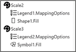
Creating Additional Scales for the Same Field
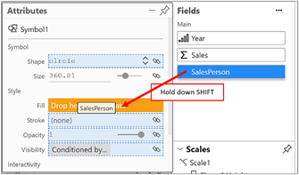
When you bind the same categorical field to different colour attributes, Charticulator by default uses the same colours for each category. For example in our data, SalesPerson Abel’s colour will always be blue whether it’s in a fill, border or text colour. But what if for some reason you want different colours for the same SalesPerson depending on where the SalesPerson field is used? For instance, you can see below that SalesPerson Abel has a blue fill for the rectangle but a green fill for the symbol. You will also see that there is one scale for the Fill of the rectangle and another scale for the Fill of the symbol. We’ve also created legends for both scales.
|
Image
|
Image
|
If you want to do this, and I’m sure you may find your own reasons for doing so, you need to hold down the SHIFT key as you drag the field into the attribute, for example the SalesPerson field, into the Fill attribute of the symbol.
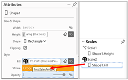
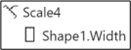
Re-Using Scales
It might be worth saying here that you can also re-use scales by dragging and dropping them into an attribute. For instance, to use the same colours for the borders of a rectangle as you have for the fill colour, you can drag and drop the “Shape1.Fill” scale into the “Stroke” attribute:-
So we’ve been focussing on Charticulator scales, learning what they are and how to manage them. However, once a scale has been created, you’ll want a way to visualise the values represented by the Scale. Specifically, you’ll need an explanation of the height or width of a mark and/or the colours that represent the categories or gradients. This is where you’ll need to create Charticulator legends, so let’s move on and take a closer look at how legends are created and edited.
Charticulator Legends
When you create a legend in Charticulator, it’s listed in the Scales pane along with the scale whose data it maps.
Charticulator will create one of three different kinds of legend depending on the scale that it represents.
- For category colour scales, the legend will map the colours of the categories.
- For numeric colour gradient scales, the legend will show the values represented by the gradient.
- For numeric scales, a numeric legend that sits on the Y or X Axis.
|
Category legend |
Gradient legend |
Numeric legend |
|
Image
|
Image

|
Image
|
Creating Legends
There are several ways to create legends. For instance, you can create a legend by using the Legend button on the Menu bar.
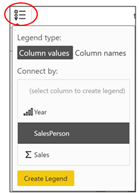
This button lists all your fields and you can select the field for which you want a legend. However, there are several drawbacks to using this method. Firstly, it doesn’t depend on binding data to an attribute so it provides only “default” legends. Because if this, it’s ambiguous as to which scale the legend should be mapped. For instance, you may need two legends for the Sales field, one for a gradient scale and one for a numeric scale but you can only insert a numeric scale from here. Because of these problems, we’ll be creating legends by using the Scales pane. The other advantage of using the Scales pane is that it’s here that you can also edit the colours that are mapped to the attribute or edit the behaviour of a numeric scale.
If you click on a scale in the Scales pane, this will open up a Scales dialog from where you can add the Legend.
|
Use the Scales Pane.. |
…and select “Add Legend” |
||
|
Image
|
Image
|
||
|
Image
|
Image
|
||
If you prefer, you can also click onto the attribute where the data has been bound and that has generated the scale, e.g. the “Height” attribute.
To place a numeric legend on the X Axis for the “Width” attribute, you must either click on the scale in the Scales pane or click on the “Width” attribute. You can’t use the Menu bar button.
|
Image
|
Image
|
Formatting & Moving Legends
All your legends are listed in the Layers pane:-
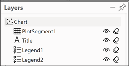
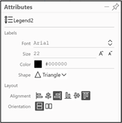
You can then click on a legend name to open the attributes pane. From here you can re-format the legend and change its position.
|
Image
|
Image
|
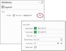
To format the numeric legend, use the ellipse bottom right of the Legend Attributes pane.
|
Image
|
Image
|
Note: II you want to move a categorical legend elsewhere on the canvas, you’ll need to anchor the legend to a Guide or Guide Coordinator, the subject of my next blog post.
Editing the Scale of a Numeric Legend
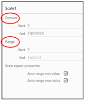
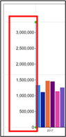
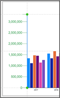
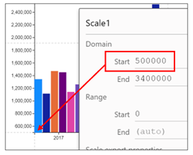
If you want to change the start and end values of a numeric legend, this is where we can use the “Domain” part of the Scales dialog. The “Domain” shows the range of values in the numeric field to which the numeric legend is scaled. e.g. in our data the maximum value in the Sales field is 3,400,000. If you want to change the start value of the legend, edit the “Start” attribute.
Editing the ending value of the legend is a little more problematic. By default, your chart will take up the entire space of the plot segment, the largest or widest shape extending to its edge.
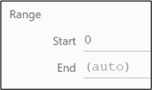
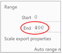
If you want more space between the edge of the plot segment and the tallest or widest shape, use the “Range” attribute in the Scales dialog.
|
Image
|
Image
|
But as mentioned above when we were learning about scales, entering a value into the Range attribute will restrain the tallest shape when you resize the plot segment.
So there we have it. Now you know everything there is to know about Scales and Legends. There is just one more skill we need to acquire before we can move on to why we really are here and that is to create awe-inspiring charts. What am I alluding to? The rather dull world of Charticulator Guides and Guide Coordinators. Let’s stop things on our chart from moving around without our permission! You need to read my next post.
Add new comment