“Strictly Come Dancing” Telling the Story Behind the Numbers with Power BI
Back in March this year, I did think I’d be relieved of my duty of updating the Strictly Come Dancing Power BI Report to reflect another series. To be quite honest, I was hoping this would be the case. I first created the Report for Series 16, updated it for Series 17 but felt that perhaps the Report had now served its time. But who would’ve thought that “Strictly” would survive the Pandemic! So of course, I had no option but to fire up Power BI, dust the Report off and update the data.
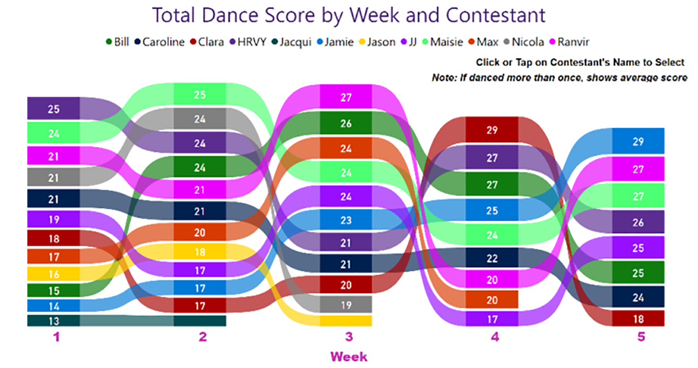
But then I faced a challenging data analysis problem; Bruno wasn’t able to make it as a judge this series. This has really messed with my data! One of the things I’m keen to show in this report is the human endeavour of the Strictly dance competition reflected in the numbers. Therefore, I often show comparisons of scores across the different Series, Contestants, Judges and Professionals.
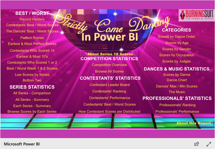
Click to view the full “Strictly Come Dancing Statistics in Power BI”
It would be a shame to penalise the Series 18 Contestants because they only have three judges scoring them. With this in mind, instead of looking at a Total Dance Score out of 30, I have given the Series 18 Contestants an equivalent Total Dance Score out of 40. So for example, in Week 1, Bill Bailey got a Total Dance Score of 15. I’ve “corrected” this score to a Total Dance Score of 20. When making comparisons of scores between Series, I’ve used this “corrected” value and have marked the calculation with an asterisk. Unfortunately, I don’t see any way of levelling up the potential quantity of 10’s that the Contestants can get, clearly it’s never going to be as many for our Series 18 Contestants. Data is never perfect!
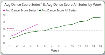
From these numbers, what can we conclude so far? Well, it looks like Series 18 is on the way to a record-breaking high! The pink line in the chart below shows Series 18 average dance scores compared to the average across all Series, shown in the green line. I’ll be updating the report each week as the results come in, so we’ll see if this trend continues.
Long may “Strictly” survive and long may the data tell the story. If you like my Strictly Come Dancing report, or want to see any particular statistics I don’t already show leave a reply in the comments down below!
Burningsuit are Trainers and Consultants in Power BI, specialising in teaching business people how to use Power BI for Data Analytics. We believe that this tool can be used by all types of business large or small, and love teaching SME’s how they can punch above their weight and use the same tools large corporates use, without the expense or complexity. If you’d like more information on us or our courses get in touch with us on 0800 0199 746 or email us.
Add new comment