The Key Influencers Visual Versus Strictly Come Dancing
The Key Influencers visual, introduced in February 2019, is Microsoft’s first visual that uses “Machine Learning” to identify factors that influence the outcome of a particular metric. “Wow”, I thought! The idea of leaving Power BI to do all the hard work in analysing my data seemed too irresistible to ignore, so I gave way to temptation and decided to give it a go.
On the one hand, it’s a very simple visual to construct (it only has 3 buckets; “Analyze”, “Explain by” and “Expand by”), but on the other hand you might struggle to understand the plethora of percentages and increase or decrease factors that it returns. What makes this visual particular complex, is that you will get different outcomes in the visual depending on whether you’re using:-
- Continuous analysis
- Categorical analysis
- Analysing Measures as opposed to Columns
So let’s get to grips with all these figures and factors and start to understand the powerful insights that this Key Influencers visual can give us. The starting point is to use simple real live data and examples that everyone can understand. After all, what’s the point in finding “insights” and “answers” when the data is fictitious?
So up steps my “Strictly Come Dancing” Power BI Report and all the data that sits behind it.
Note: Just in case you’ve never heard of the BBC Strictly Come Dancing TV programme, it’s a dance competition in its 17th series, with a total of 237 contestants who have danced their way through 1,995 dances and been given 7,980 scores from the four judges.
So what insights into this data can the Key Influencers visual find? We all know that some lucky people are just born more talented than others but above and beyond this, are there any other factors, other than talent alone that contribute to contestants getting better scores? For instance, does a particular dance, a particular judge, or their age or gender or even the order in which they dance make a difference to the outcome of their scores?

Let’s get the Key Influencers Visual to answer these questions. However, rather than trying to find all the answers at once (which is where this visual gets really interesting), let’s start by asking a specific question; will contestants get a better score if they are Female or if they’re Male?
So now to construct the visual to answer this question.
In my Data Model, the Scores Fact table records, in the column called “Scores”, each score for a dance from each of the four judges (out of 10).
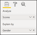
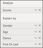
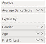
Therefore into the “Analyze” bucket I put the “Scores” column from this table. Then into the “Explain by” bucket I put the Gender column from the Contestants dimension (the Contestants table is related to the Scores Fact table in a many-to-one relationship).
Let’s start by noting three things:-
Firstly, that “Scores” is a column and not a measure.
Next, notice we’re using “Continuous” analysis which is the default if you’re using a numeric column in the “Analyze” bucket.
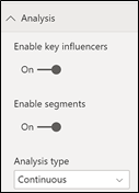
Thirdly note that in “Analyze” I’m using a value in the Fact table.
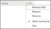
Lastly and perhaps most importantly there is no summarisation going on. The Scores field in the “Analyze” bucket does not default to “Sum” but to “Don’t summarize”.
Why is the fourth point most important? It’s because the visual by default looks at every row
of the Scores table and therefore evaluates all the scores recorded. If you use a column in the “Analyze” bucket and not a measure, the Key Influencers visual will use this row level granularity for the analysis.
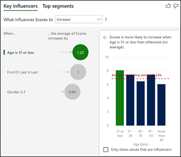
So having placed these fields in the “Analyze” and “Explain by” buckets, what answer does the visual come up with? Will you get a better score if you’re male or if you’re female? This is the conclusion we get showing “Key influencers”(on the left) and “Top segments” (on the right):-
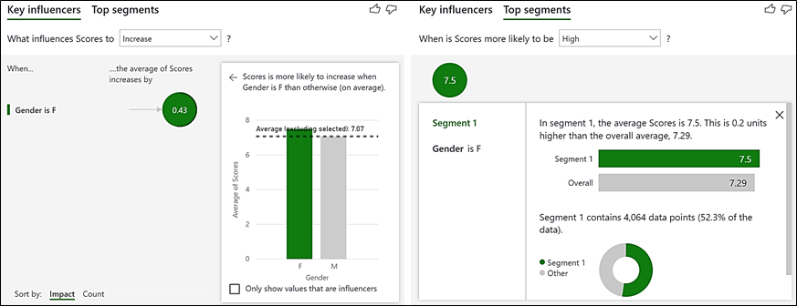
(Note that the Key Influencers visual is divided into two sections; “Key Influencers” and “Top segments”)
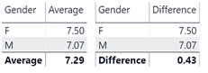
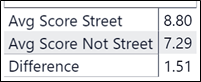
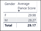
The “Key Influencers” section tells us that “When Gender is F, ….the average of Scores increases by 0.43“. So Female contestants get a score that is on average 0.43 higher than Male. All the figures shown in the visual agree with my calculations: –
The “Top segments” section (there is only one segment containing all the Female contestants – more on this later) tells us that contestants in this segment i.e. Gender is F, have an average score of 7.5 which is higher than the average score for all contestants which is 7.29. Also notice the number of data points for Female contestants; 4,064. This is the number of rows in the Scores table that relate to Female contestants and proves that this visual is evaluating the scores at row granularity of the Fact table. There will be an important difference when we use a measure in the “Analyze” bucket (see below on Using Measures).
But what about the other factors that might impact on a contestant’s score? What about their age, the dance they perform, or the order they performed it (first, last or in the middle)? Well let’s now add these fields into “Explain by”.
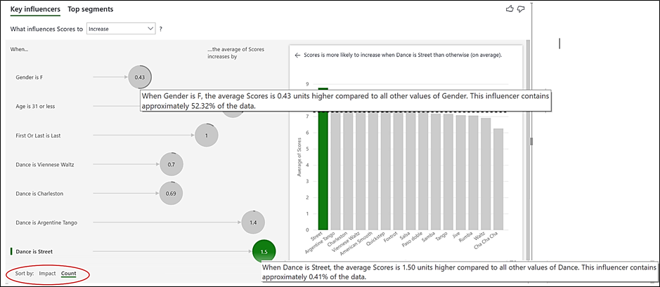
This is now what our visual looks like (looking at Key influencers):-
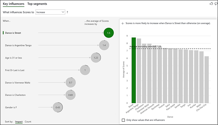
(Please note that in order to see the column chart on the right more clearly, I’ve re-coloured the columns by using the “Drill Visual Colors” formatting card)
Analysing the Key Influencers
So now our Key Influencers visual tells us that if you dance “Street”, you’re likely to get a score that is 1.5 greater than the average for all the other dances which is 7.29 (the dotted line on the column chart). So dancing “Street” is reckoned by the visual to be the factor that most influences a score to be higher.
This also agrees with my calculations:-
(The visual often rounds up its calculations)
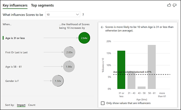
We can also now identify the other Key Influencers on scores being higher:-
- That “Argentine Tango“, “Viennese Waltz” and “Charleston” are also dances where contestants score higher averages (1.4, 0.7 and 0.69 respectively).
- That Gender is not considered now to be such a big influence on the score, sitting bottom of the list at only a 0.43 increase in average score.
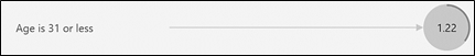
- That people aged 31 or less get a score 1.22 greater than the average score for people who are older.
- That if you dance Last you more likely to get a score that is greater by 1 whole mark than dancing first or in the middle.
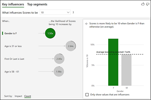
Enable Counts
So if our contestants dance “Street” they should get a better score. However, this raises another question; how likely is it that they will get to dance “Street”? They get a better score by one whole mark if they dance last but how likely is it that they will get to dance last? Probably not as likely as being either Female or Male or being relatively young. We need to have a way of finding the percentages that these “influencers” make up our total data (the scores for all the dances for all 17 series). What we can do here is ask to “Enable counts” on the Analysis formatting card:

And this is what the visual will now look like:-
I’ve also now sorted by “Count” (bottom left of the visual). You can see how the visual has changed. Around each bubble is a grey line that indicates the percentage of the entire number of scores that this influencer comprises. “Gender is F” is back at the top of the list while “Dance is Street” is now at the bottom. If you hover over the bubbles, you can see why; “Gender is F” contains 52.32% of the data whereas “Dance is Street” only contains 0.41%. The grey line also shows us that roughly a third of contestants are “Age is 31 or less”:-
Top Segments
So far we have only been looking at each individual influencer. However, would it now be true to also say that if you are young and female and dance last and danced a Viennese Waltz you will get a higher average score? This is where “Top segments” comes in. Top segments looks at ALL the key influencers that have been identified and finds out if a particular combination of these leads to higher scores. Let’s look at these now:-
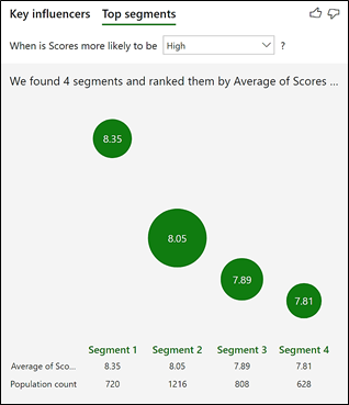
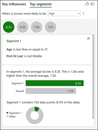
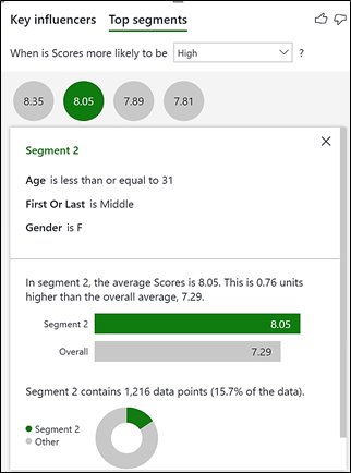
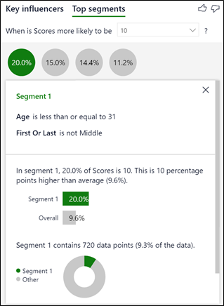
This shows 4 “segments”, represented by the bubbles. Each segment contains a group of contestants that have got a higher average score. The bigger the bubble, the more judges’ scores are in that segment. Remember that the analysis is being done on the Scores table and therefore “Population count” references the rows of this table i.e. the number of individual judge’s scores. To see the make-up of each segment, click on the bubble. Let’s look at just the top 2 Segments:-
|
Image
|
Image
|
Each segment compares the average score of contestants in the segment to the average score overall (7.29).
Segment 1 – Contestants in this segment get the highest average score of 8.35. It contains contestants aged 31 or less and who either danced first or last. However, this segment only contains 9.3% of the total number of scores.
Segment 2 – Contestants in this segment are Female, aged 31 or less and danced in the middle. This is a largest segment containing 1,216 scores; just over 15.7% of the total number of scores.
Also notice that nowhere is a particular dance e.g. “Street” identified as being an influencer in the scores. Why is this, when “Street” was considered the top Influencer? The “Counts” view shows us why by sorting “Street” at the bottom of the list. Contestants only perform each dance once or twice during the competition so a particular dance, when combined with other factors (i.e. gender, age and order) becomes too small a percentage of the overall data to be considered in the segment analysis.
So we can conclude there are three major factors for in scoring better than average scores:-
- If you’re young you can expect to do very well in the competition irrespective of gender or what dance you perform.
- If you’re young, your chances increase even further if you dance either first or last.
- The type of dance e.g. Viennese Waltz is not considered an influencer when combined with other influencers.
Categorical Analysis
So far we have just been using the “Continuous” type of analysis which means we’ve only been looking at what factors cause the scores to increase and be high, the increase being measured in calculating averages for higher scoring groups.
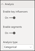
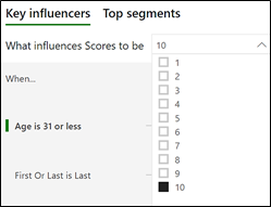
But there is another way to look at our contestants’ performances. What if we want to find out what factors cause our contestants to get a maximum score of 10? This is where “Categorical” analysis can come in. If I change to this “Analysis type” by using the option on the Analysis card, I can then select the “10” category from the dropdown:-
|
Image
|
Image
|
Please note that this is only going to work for me because I only have 10 distinct scores. If I had many scores, e.g. 1 to 100, then for the analysis to work, I would need to categorise them accordingly, for instance into “Very High”, “High”, “Middle” etc. This is suggested by the Microsoft documentation.
For clarity, I’ve also decided to remove the Dance field from the “Explain by” bucket.
This is what my visual now looks like, showing the two different ways of sorting the analysis; by impact or by counts:-
|
Image
|
Image
|
Notice that the analysis now uses factors to determine the extent of influence of a particular group. It tells me that if contestants are Aged 31 or less, it’s more than twice as likely (2.64 times) that these contestants will score 10. Or if you’re Female, your chances of getting a 10 are 1.5 times more likely and notice you’re twice as likely to get a 10 if you dance either first or last.
Let’s now look at the Top Segments and focus in on Segment 1 to compare the Categorical analysis to the Continuous analysis. You’ll see the Key Influences visual comes to much the same conclusions i.e. that being Aged 31 or less and dancing First or Last is a Key Influencer in getting better scores. However, we now have some additional insights. For example, of contestants aged 31 or less and who danced either first or last, 20% of these contestants scored a 10 whereas only 9.6% of ALL contestants have scored 10. Looking at the Continuous Analysis we know that these same contestants get an average score of 8.35 as opposed to 7.29 which is the average score for ALL contestants.
|
CATEGORICAL ANALYSIS |
CONTINUOUS ANALYSIS |
|
Image
|
Image

|
So using a Categorical analysis is great if your metrics contain only a few distinct values or if you have fields in your data that define obvious categories (e.g. “High”, “Medium”, “Low”). Use the “Continuous” analysis for metrics that have a high cardinality. Either way you get to much the same conclusions.
Using Measures
There is yet a third way to analyse the “Strictly” data to see what influencers scores to be higher. Rather than using individual judges’ scores (out of 10), why don’t we use the total score for each contestant’s dance. There are four judges so there is a maximum Dance Score of 40.
In my data I have another table called “Dances” that lists each contestant’s dance and its total score out of 40 in a field called [Dance Score]. This Dances Fact table, just like the Scores Fact table, is related to the Contestants table in a many-to-one relationship.
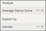
Because in different series and in different weeks, contestants dance a different number of dances, in order to compare these dance scores, I use an average dance score defined in this measure:-
Average Dance Score = AVERAGE ( Dances [Dance Score])
The Average Dance score here is calculated from the individual Judge’s scores, so surely the Key Influencers should return much the same results whether we’re using the Average Dance Score measure or the individual judges’ Scores column in the “Analyze” Bucket
So let’s look to see what happens if I use this measure to analyse Average Dance Scores by Gender.
|
Image
|
Image
|
Why are there no Influencers found? Why when I used the Scores column from the Scores table, it found “F” (Female) as the Key Influencer?
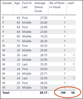
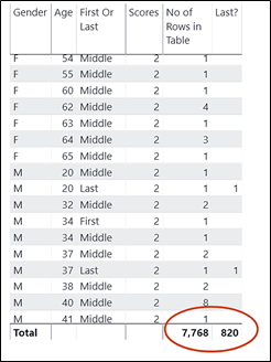
The answer lies in looking at what’s going on behind the visual to see what data is being used. If we convert the Key Influencers visual to a Table visual, we get the answer:
Because we’re using a Measure and measures by definition group and aggregate, clearly there is not sufficient data for the visual to find any influencers. There are only two data points for it to use whereas when using the Scores column, the Key Influencers visual used 4,064 data points (i.e. all the rows of the Scores table)
So what can we do to get the visual to come to life? Well, as the visual is telling us, the remedy is to “Try adding some more fields into Explain by”. So let’s give it a go and add the Age field and the First Or Last field (i.e. the same fields we used in Explain by when we were using the Scores column):
And now the Key Influencers Visual has something to say…..
|
TOP INFLUENCERS VISUAL USING THE AVERAGE SCORE MEASURE |
||
|
Image
|
Image
|
|
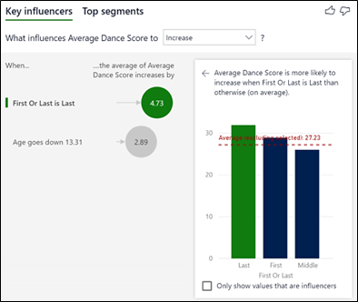
…however, now I’m worried. If we remind ourselves what the visual looked like when we used the Column rather than the measure, we can see different conclusions have been drawn; “First Or Last” is now considered a bigger influencer than “Age”. (Although I haven’t shown it, there are also many other discrepancies). This is what the visual looked like when we used the Scores column:-
|
TOP INFLUENCERS VISUAL USING THE SCORES COLUMN |
|
Image
|
Even more worrying when I hover over the “First Or Last is Last” bubble in the two visuals I get different percentages. When using the Measure, it tells me that “Last” contains 28.14% of the data:-
But when I look at using the Scores column, “Last” apparently contains only 10.56% of the data.
Well, which is it?
The answer again lies in looking at what is going on behind the visuals when we’re using the measure as opposed to the column by converting the Key Influencers visuals to Table visuals:-
|
DATA BEHIND KEY INFLUENCERS USING A MEASURE |
DATA BEHIND KEY INFLUENCERS USING A COLUMN |
|
Image
|
Image
|
In the table on the left using the measure, we can see that the Key Influencers visual is using the data generated by the Visual which groups the data by Gender, Age and First Or Last. The total number of these combinations is 199 (Number of Rows in Visual) and the number of these that are “First” is 56, giving us a percentage of 28.14%. So in other words, there is no account made for who they are and which dance it is. Whichever way I look at it, I can’t think this is a meaningful percentage.
In the table on the right using the Scores column (reminding ourselves that this column was set by default to “Do not summarize”) this time the Key Influencers visual uses ALL the rows of the Scores table i.e. 7,768 rows and therefore considers all the scores. Of these, 820 were scores where the contestant danced last, giving us a percentage of 10.56% Clearly, this is the percentage that I would prefer to use.
Using “Expand By”
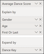
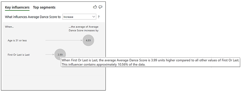
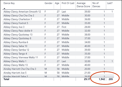
So it’s not that the above analysis using the Measure is wrong, it’s just that it’s less accurate. So can I make this analysis more accurate i.e. as previously mention, I would expect to the Key Influences visual to come up with the same results whether I’m using the Measure or the Column. So how can I get the measure to behave like a column i.e. not to aggregate but to look at individual rows? This is where the “Expand by” bucket comes in. If in “Expand by” I use a primary key or some index value that is unique to each row in the Dances fact table, the visual will now look at each row in the Dances table and I’ll get the same results as using the column. I’ve used the column called Dance Key:-
|
Image
|
Image
|
And if I look at the data behind this visual, I can confirm that it’s using each row in the Dances table for the analysis and therefore now comes to the same conclusion for percentage of contestants who danced last i.e. 10.56%:-
So I’ve come to the conclusion that if you want to use the Key Influencers visual, be vigilant of using measures. Indeed, when this visual was first introduced, it wasn’t possible to analyse with measures. The community complained but I can now see why this was a good ploy by Microsoft and that perhaps they shouldn’t have given way to the clamour. However, having now let the genie out of bottle, perhaps it should be clearer that if you have to use a measure, to get to the best analysis, you need to remove the key attribute of the that measure which is to group and summarise your data and that you must do this by using “Expand by”. Why? Because the visual works best when it analyses row level data, not summarised data.
Add new comment