The “Strictly” Report: Insights into the Data
Alison Box, one of our Directors and Trainers, details how she used Power BI to bring her Strictly statistics to life.
In my previous blog, “The Strictly Report: Behind the Scenes”, I explained how I imported the data, cleaned and re-structured it. The next question was how was I going to explore all this data to get meaningful insights. Would I ever get to answer the “contestant journey” question that had prompted me to create the report in the first place?
In short, how could get Power BI to breathe life into all the Strictly statistics?
In the end what I found to be true was that once I started putting data into graph and chart type visuals, the statistics started to speak for themselves. Insights came to light of their own accord and one insight led to another. In fact, so much so that I became obsessed with exploring more and more aspects of the data.
Here are just five examples of how Power BI provided insights and answers to my questions:
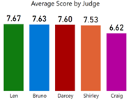
Question 1: Is Craig really the worst judge?
We all know Craig’s measly when it comes to dishing out scores but by how much is he really worse than the other judges?
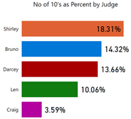
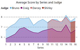
If you look at this by comparing average scores, Craig is not that much worse than the others, 6.62 compared to Bruno’s 7.63. But when you then compare the number of 10’s given out, the difference between judges becomes more apparent (in the second visual). The third visual shows that Craig has consistently been the lowest scoring judge through all 16 series.
|
Image
|
Image
|
Image
|
|
Looking at average scores, Craig doesn’t look that worse than the others |
But now things look different! Craig (shown in pink) is definitely the worst scoring judge in the competition |
Craig is consistently the lowest scoring judge across the 16 series |
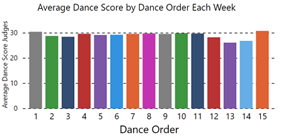
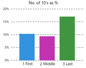
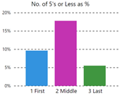
Question 2: Does the order in which the contestants dance affect their score?
Again, if you look at the first visual, it would appear that there is a slight advantage to dancing either first or last (this pattern is much the same for each individual weeks where there were fewer contestants) but when you look at high and low scores given, there is a marked benefit to dancing last
|
Image
|
Image
|
Image
|
|
It might be better to dance first or last |
More chance of getting 10 if you dance last |
More chance of getting 5 if you dance not first or last |
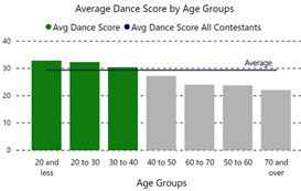
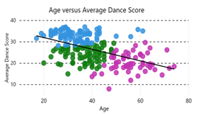
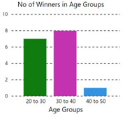
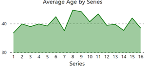
Question 3: Does age matter?
Not surprisingly, yes. If you’re aged over 40, your chances of winning are not so good.
|
Image
|
Image
|
Image
|
|
Contestants over 40 have an average score that is below the average for all contestants |
Each dot represents a contestant and the trend is definitely downward! |
There’s only been one winner aged over 40 (Joe McFadden, aged 42) |
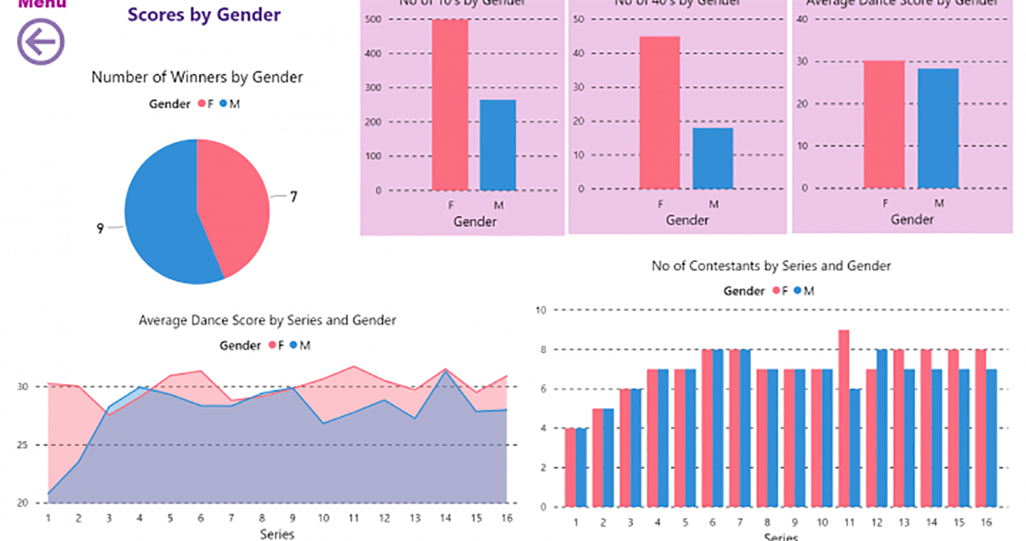
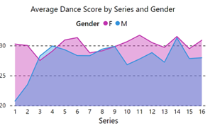
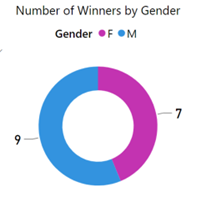
Question 4: Does gender matter?
This is a surprising one. It would appear that women’s average score is consistently higher than men’s across all series. However, when you look just at winners, you see a different story.
|
Image
|
Image
|
Image
|
|
It looks like women are consistently better dances than men |
It would also appear that women have fewer bad scores |
But they don’t seem to win as often |
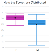
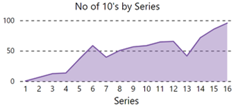
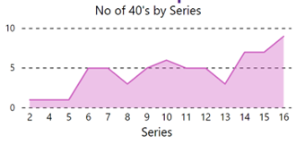
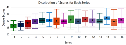
Question 5: Was Series 16 really the best ever (according to Shirley Ballas)?
The answer to that question is; it depends how you measure the term “best”. If you measure it by how many 10’s and 40’s were scored then yes, Series 16 does come out best, but if you look at average scores across all series, then Series 16 was pretty ordinary and it would appear that Series 14 was far better.
|
Image
|
Image
|
|
Image
|
Image
|
Note: The poor average for Series 16 is because whilst Ashley Roberts was the all-time best performing contestant, Suzannah Constantine and Katie Piper were among the worst scoring contestants of all time. The box plot above shows this dispersion of scores and shows why Series 14 was actually the “best” series.
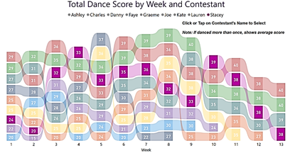
So, what about a contestant’s “journey”? What does Power BI have to say on that?
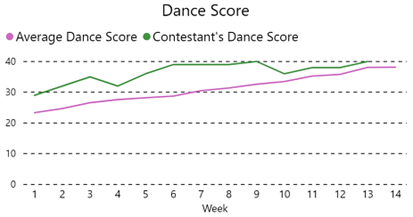
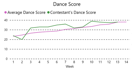
Which brings me to the reason I did all of this in the first place. How can I best show a contestant’s “journey” through the weeks of the competition to the final?
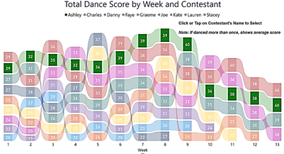
I’ve taken the winner, Stacy Dooley and the contestant that got by far the best scores, Ashley Roberts and compared their “journeys”. A simple line chart shows the ups and downs of their weekly scores but when I placed the data in a Ribbon chart and filtered to show just one contestant the story was clear to see. Comparing Stacey’s journey to Ashley’s we can see how Stacey had a rougher ride through the competition. She was the plucky improver that we all love and for this reason she deserved to win!
|
Ashley’s scores |
Stacey’s scores |
|
Image
|
Image
|
|
Image
|
Image
|
These are just some of the visualisations I have created in the Strictly Come Dancing Power BI Report. If you would like to find more insights into the data, why not look at the entire report at the entire report here.
Add new comment