Understanding the “Analytics” Lines in Power BI

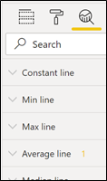
In our Power BI training courses, I show people how to add a Constant Line to a clustered column chart by using the Analytics section of the Visualizations pane. I then explain that the other Analytical lines (Max, Min, Average etc) are “calculations across the totals”. But what do I actually mean by this; what are these calculations? I do feel that these Analytics Lines deserve a much better explanation so now is the time to turn the spotlight on them.
Firstly I’m going to take a closer look at the Constant Line to show you how to display the data label and value (what should be a simple thing actually takes a number of steps). Then, I’m going to unravel the calculations behind the “Average”, “Max” and “Min” lines.
The Constant Line
Let’s take the Constant Line first.
The “Constant Line”, as its name suggests is pretty much that; a reference line that doesn’t change with your data. Let’s use the Constant Line to put a Target line of £400,000 for our Salespeople on a column chart visual as shown here:-
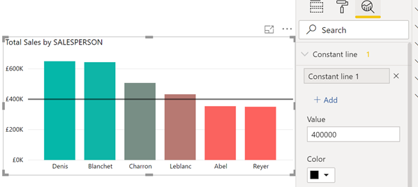
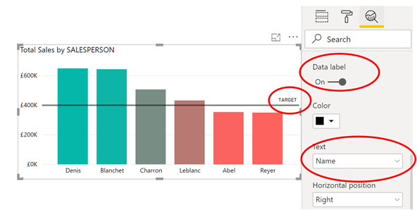
But clearly this line is of no use unless you know that it’s the Target! So how do we label it? Well the starting point is to give the line a meaningful name other than “Constant Line 1”. To do this, you can simply double click on the name and retype e.g. “Target”. You can then turn the data label on and change the “Text” option to name.
Useful though this line can be it’s a little limited in what it can do for you; most people want a dynamic line that changes as the data changes.
Min, Max and Average Analytical Lines
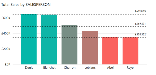
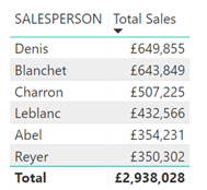
So let’s turn our attention to other Analytics lines that do just that. I’ve added a “Max”, “Min” and “Average” line and turned on the data labels to show the value of the lines. As mentioned above, these data labels show calculations for the totals for each Salesperson (as opposed to row level calculations):
These data labels are easy to display but what if you want to calculate these values yourself? Admittedly, if you want to show the Max and Min of totals in a visual, you could just to sort on a the visual like this:-
But what about the Average? How would you create a measure to calculate this value? And indeed, why would you want to? I can think of at least three reasons.
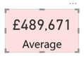
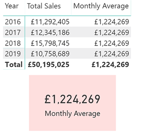
Firstly, you may want to display this value in a Card:-
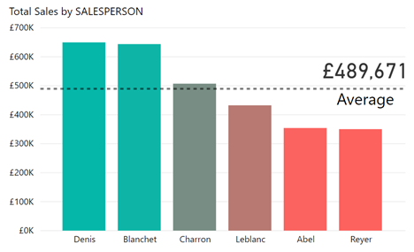
Secondly, the default data label is too small to see and unfortunately, you can’t increase the font size of Analytical Line data labels. An improvement might be again to display this average in a Card and then place on the Column chart:-
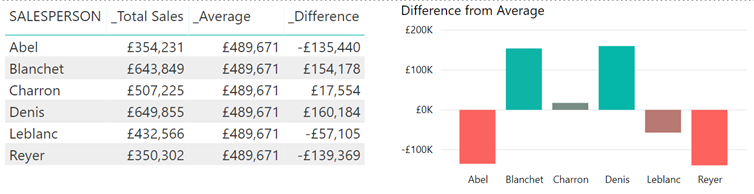
Thirdly, you might want to calculate how much each Salesperson’s totals differed from this average so you can then plot this in a Column chart:-
So how do you create the measure for this Average (and indeed how would you calculate the Max or Min of the Totals, rather than just sorting)?
Just like most DAX expressions, this measure for the average is pretty simple to type in
…….
_Average = AVERAGEX (ALL (SalesPeople) , [_Total Sales])
………….but more challenging to understand.
Explanation
The expression removes any filters from the Salespeople table using ALL so we now have a table containing all the salespeople. The Total Sales are then calculated for each Salesperson. Please note that “[_Total Sales]” must be a measure because the expression uses context transition (For more information visit https://www.sqlbi.com/articles/understanding-context-transition/). Because we’ve used ALL, the AVERAGEX function can then find the average of all the Salespeople’s totals.
Please note that if you want to find the Max or Min across the totals, just use MAXX or MINX instead of AVERAGEX.
However, let’s now have a go at finding the average for years.
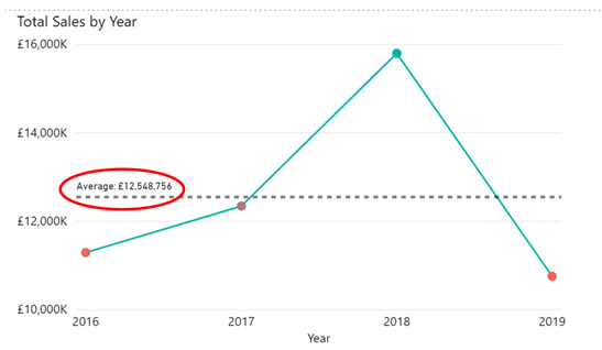
And now you’re going to find that when you try to calculate the Average for Totals across Years, this calculation doesn’t work:-
Average for Years = AVERAGEX (ALL (DateTable) , [Total Sales])
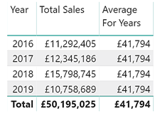
We can see that we get the wrong average of £41,794, when the correct calculation should be £12,548,756. To see why this measure doesn’t calculate correctly, we can apply the same explanation to this measure as to the one above, The measure removes any filters coming through from the Date Table, in this case it removes the filter from the Year, so now we have a table that contains all the dates from the DateTable. The Total Sales are then calculated for every
date in the date table for which there are corresponding sales in the Sales table and finds the average of these (1,201 dates have corresponding sales so it’s 50,195,025 / 1,201 = 41,794 ).
So this will always be a problem when you’re working with different granularites in the same table. What we need is a different measure that will calculated the averages at yearly granularity (rather than date granularity) as in this example:-
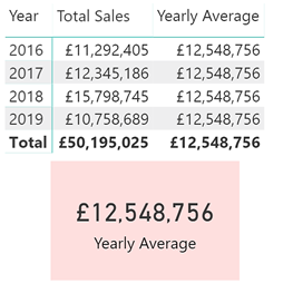
So this is the correct expression for the Yearly Average measure:-
Average for Years = AVERAGEX (ALL (DateTable[Year]) , [Total Sales])
In this expression, the ALL function creates a table that has removed all the filters from the Year column in the DateTable and so we can now look at finding the average across all years. The “Total Sales” measure can then be calculated for every year and the AVERAGEX function then finds the average of these Sales.
So now let’s take this a step further and look at calculating the Monthly average:-
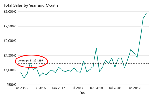
This is the measure that I’ve used here:-
Monthly Average = AVERAGEX ( ALL( DateTable[Year], DateTable[Month] ) , [Total Sales] )
The Monthly Average measure works in much the same way as the “Yearly Average” above except that now we’ve also removed the filters off months to including all months for all years. So this expression finds the Total Sales for every month of every year so that AVERAGEX can then find the average of all these months’ sales.
But what about the Monthly Average for each year. So in other words to take each year’s total sales and divide by the number of months in that year. In the following example we can see that the Average Monthly sales for 2018 is £1,316,562
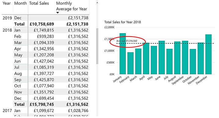
This is the measure I have used in the above example:-
_Monthly Average for Year = AVERAGEX (ALL (DateTable[MonthNo, DateTable[Month]) , [Total Sales])
Notice here we haven’t removed the filter off the Year column so each year is still being filtered, but we have removed the filter off the Months. Notice that because of a querk on sorting Month names alphabetically, to remove the filters from the Month (i.e. month names) column you must also remove filters the MonthNo (i.e month numbers) column. The ALL function groups the Years and all the Months to find the average across ALL months for each year.
So if you like displaying these Analytical lines, you may now want to do more with these calculations.
Benefit from expert training
At Burningsuit we have years of experience in providing expert, well-rated training courses in Power BI, DAX and Excel. We’re adept at providing the information and skills you need to make the most of Power BI together with your data and offer on-site and public courses across London and the UK.
Browse our latest public courses in London here and book your place. Want to discuss your requirements? Give us a call on 0800 0199 746 – we’d be happy to help!
Add new comment