7 Secrets of the Pie Chart

I suppose I shouldn’t really be writing this blog because the question has to be asked, why are you using a pie chart? But if you really must, at the very least make your pie charts unambiguous and preferably, interesting. Let’s not have anything anymore that looks like this:-
|
An example of a really bad pie chart! |
|
Image
|
So I’m hoping that by revealing my seven secrets below, you’ll either never use a pie chart again or at least you’ll produce something a little more meaningful.
#1 What's Wrong with Pie Charts?
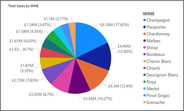
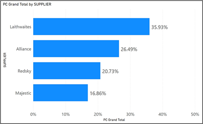
Just because you can use a pie chart, doesn’t mean you should. There’re many articles written by experts that tell you why you shouldn’t use pie or donut charts. One of the best articles on this subject was written by Stephen Few in 2007. Let me just sum up one of the major points that Stephen Few makes. Below we have a pie chart and a bar chart showing the same data. Question; which chart better shows largest to smallest?
|
Image
|
Image
|
I think we’re all agreed it’s the bar chart.
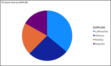
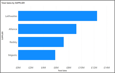
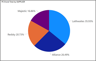
The problem with pie charts is that they’re difficult to decode. Because of this, we overload them with additional information to make up for this shortfall. Compare the pie chart and bar chart below which are showing the same information. The supplier names and their percentages are much clearer in the bar chart on the right.
|
Image
|
Image
|
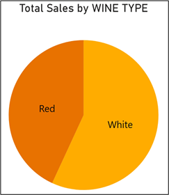
Personally, I think pie charts are only useful if you’re showing the ratio of two categories, because it’s the only situation where the pie chart is easy to decode:-
However, Power BI has given you the pie chart to use so at least use it with restraint.
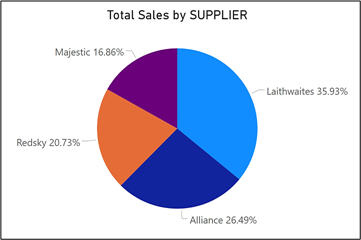
#2 How to Sort the Segments
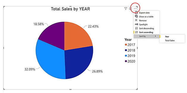
The default sort order of the pie chart is the same as other visuals, that is descending by value……
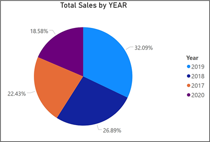
…which can sometimes look rather odd as in the above example where you would want the years in the correct order. You sort the pie chart just like any other visual by using the “More options” button and selecting the correct value by which to sort.
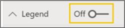
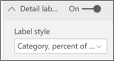
#3 Get Rid of the Legend and Replace it with Category Labels
Is there any point in showing the legend? It just takes up space and to use it, you have to consistently match the colour to the segments. Why don’t you turn off the legend and replace it with “Category, percent of total” as the label style, as shown below:-
#4 Beware of What Percentage You’re Looking At
Consider the two pie charts below. In the first one, we’re using a table visual to highlight 2019 sales. You’ll notice the sales for supplier Laithwaites has a percentage of 10.71%.
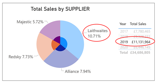
However, in the pie chart blow, we’re using a slicer to filter sales for 2019. You’ll notice now that sales for supplier Laithwaites now has a percentage of 33.37%.
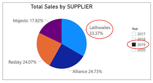
Why the different percentages? In the first pie chart, the percentage of 10.71% is the percentage that Laithwaite’s 2019 sales comprise of total sales for all
years. In the second pie chart, the percentage of 33.37% is the percentage that Laithwaite’s sales comprise of the total sales in 2019 only.
Remember, that slicers filter data whereas chart highlighting does just that; it highlights the selected data but any calculations are still performed on all the data.
#5 Make the Chart “Details” Work by Using Drill Down
Firstly, what do we mean my “chart details”? This is where you get a whole load more percentages to peruse because the “details” give you a further breakdown of the category that you’ve put in the legend.
In the example below, we’ve added the wine TYPE (Red or White) column into the “Details” bucket:-
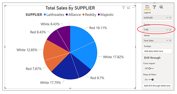
Notice how the detail labels show percentages for the “Details” rather than SUPPLIER. Because of this, I’ve had to display the legend so we can tell which colour is which supplier. Of course, this is how the pie chart has to behave because a pie chart must always show the ratio of the parts to the whole. But what we’re itching to do here is to show what percentage each wine type is of each supplier’s sales, not of the total sales.
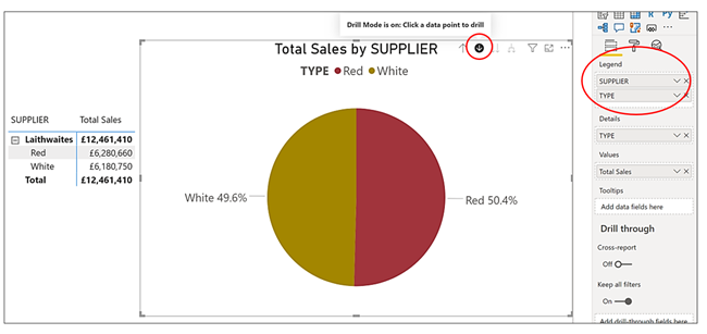
This is where the drill down can help us. If you put the TYPE column also in the Legend bucket under SUPPLIER, you can then drill down to the percentages for each SUPPLIER. To do this, click on the down pointing arrow to turn drill down on and then click on a supplier’s segment in the pie chart. This will drill you down to show the breakdown of TYPE for each supplier and show you the percentage you’re after. Notice how I’ve included a table visual on the left so we can be sure which supplier we’re looking at.
#6 Ditch the Pie Chart for a Something Else
Why are you using a pie chart at all? In Secret #1 above, we gave you reasons not to use a pie chart. But how do you get the percentages showing in the data labels if you decide to use some other visual? Take a look at this example of a bar chart:-
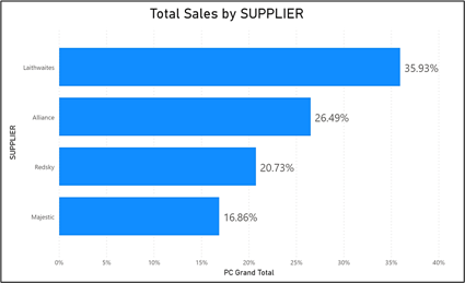
You can see it’s show the percentages that you would get in the pie chart. To do this, all you need is a measure like this:-
Percent of Grand total = DIVIDE ( SUM ( Sales [Total Sales] ) ,
CALCULATE ( [Total Sales], ALL ( Sales ) )
)
Note: In the above measure, we have a column called “Total Sales” that sits in a table called “Sales”.
#7 How to Use Pie Charts to Filter Visuals
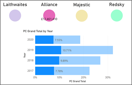
The best use of a pie chart is not to use it as a pie chart at all! Look at the visuals below. If I select “Alliance” in the “pie” chart, you can see in the bar chart below, that it highlights Alliance’s percentage sales for the different years.
|
Using pie charts as slicers. We’ve selected “Alliance”. |
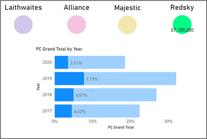
Using pie charts as slicers. We’ve selected “Redsky”. |
|
Image
|
Image
|
What’s the secret? All I did was to create separate pie charts for each supplier. I use visual level filter to make sure that each pie chart only showed one supplier:-
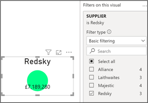
I edited the chart titles so they reflected the supplier that I had filtered and I changed the detail label to only show the value and positioned it inside the pie chart. And that’s about it! These pie charts work great to highlight the data in the bar chart. Notice I’ve included the percentage measure that we did in Secret #6.
Hopefully, we’ve given you some food for thought. Either don’t use a pie chart or at least be a little more adventurous. We cover a range of visualisations on both our Fundamentals and Advanced courses, meaning you can get in depth knowledge on exactly how to use these functions to your advantage. If you would like more information about our courses, get in touch with our team on 0800 0199 746.
Add new comment