Charticulator In Power BI #14 – The Line Plot Segment
The Line Plot Segment.
When most of us think of a chart or graph, we’re usually thinking in terms of a “cartesian” chart where data is plotted on both the X and Y axis. We created cartesian charts when we used the 2D plot segment that we explored in my earlier posts; #5 and #6. However, with Charticulator, you always need to think “outside the box”, to think laterally because there is another approach to plotting data and that is to use just a single axis. Let me introduce you to Charticulator’s “Line” plot segment, the topic of this blog post, that allows you to build charts that use a single line axis. Moreover, what you may not be surprised to discover is that using just one Line plot segment gives you very little to work with. It’s when you start to use multiple Line plot segments that the magic begins.
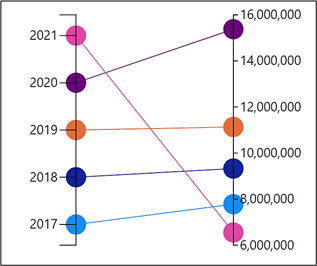
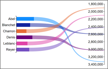
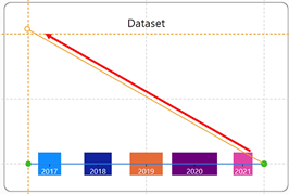
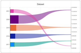
Consider the two charts below that are variations on the same idea, that is using two Line plot segments to create a “slope” chart.
|
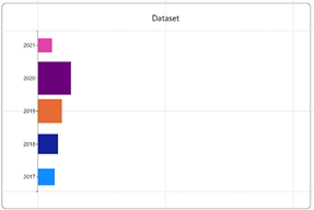
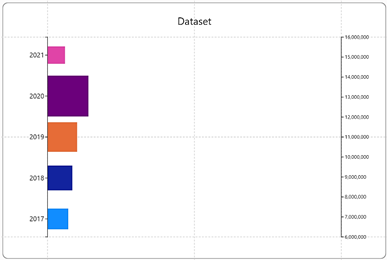
Slope chart showing Sales by Year |
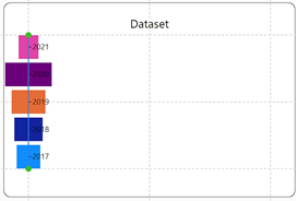
Variation on the Slope chart showing Sales by SalesPerson |
|
Image
|
Image
|
If slope charts are your thing, why not read on and find out how I created these eye-catching charts using Charticulator.
Creating a Line Plot Segment
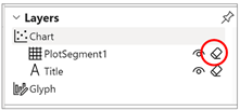
To create a Line plot segment, first remove “PlotSegment1” from the Layers Pane by using the eraser button.
Then select the Line plot segment button on the menu bar
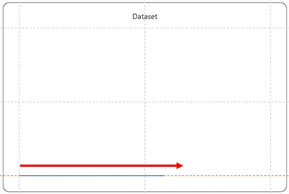
and drag and draw the Line along a guide on the chart canvas. We’re creating a horizontal Line plot segment below:-
|
Delete “PlotSegment1” |
Draw your Line Plot Segment along a guide on the canvas. |
|
Image
|
Image
|
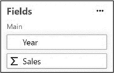
These are the fields we will plot onto the Line plot segment:-
Just like when working with X and Y axes, our Line axis will be either categorical or numeric depending on the data plotted on it. Let’s first consider a categorical Line axis.
Using a Categorical Line Axis
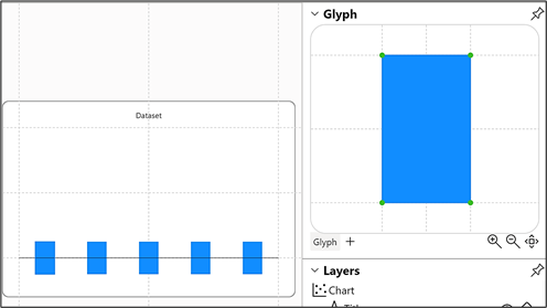
Having drawn a horizontal Line plot segment, if we now create a rectangle shape as our glyph it will be plotted onto this line:-
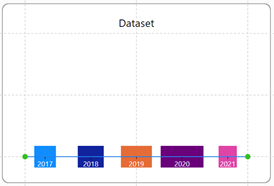
If we then bind the Year field to the Axis attribute of the Line plot segment, this will create a categorical axis. We could also bind the Sales field to the “Width” attribute of the rectangle and bind Year to the “Fill” attribute. Our Line plot segment does not have to sit horizontally. We could drag on the right end handle of the line and anchor it to the vertical guide on the canvas.
|
Horizontal categorical Line plot segment using a rectangle mark |
Drag on the Line plot segment handle to reposition the line |
|
Image
|
Image
|
|
Vertical categorical Line plot segment |
|
|
Image
|
Using a Numeric Line Axis
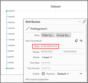
Now let’s consider a numeric line axis. Using the same data as above, let’s drag and draw a vertical Line plot segment and bind the numeric Sales field to it. To make the numeric scale descending, you’ll need to drag in an upward direction.
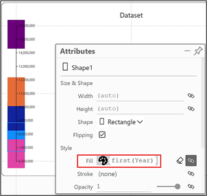
Then we can create a rectangle glyph and bind the Year field to the “Fill” attribute.
You will now observe the same behaviour on the numeric Line axis as a numeric Y or X axis in a cartesian chart, that is the rectangles are plotted on the line with their centre point on the value being plotted and therefore the rectangles must overlap. I think you’ll agree that the rectangle shape used here is not really going to do much for us so let’s try using a symbol instead, just like we did when working with a cartesian chart.
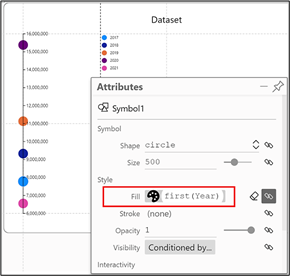
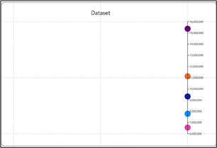
At last we’re getting somewhere! I’ve bound the Year field to the “Fill” attribute and inserted a Legend to show that each symbol represents the sales for a particular year, plotted correctly on the axis. I think you’ll agree though, that this chart is a little underwhelming. So let’s introduce a second Line plot segment.
Using Additional Line Plot Segments
Before adding a second Line plot segment, I’ve moved the first Line plot segment over to the right of the canvas. You can drag on the green handles top and bottom of the line and then anchor them to the guides on the right of the canvas.
I then drew a second Line plot segment up the left hand guide of the canvas. The circle symbol representing each year is automatically plotted on the second axis.
This behaviour may take you by surprise, that the circle symbol appears automatically on the second line axis. However, remember that normally when you create a chart in Charticulator, you don’t
start by creating a plot segment. The 2D plot segment is already on the canvas. Then when you add your glyph to the glyph pane, it’s automatically plotted onto the 2D plot segment, just as our circle symbol has been automatically plotted onto the Line plot segment.
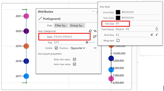
To label the symbols, I bound the Year field to the Axis attribute of the Line plot segment and increased the Tick Size.
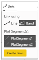
At the start of this post, I referred to magic happening when you use multiple Line plot segments. The magic is this; as soon as you have multiple Line plot segments in your chart, you can link the glyphs between them. Just look at what the Links button on the menu bar looks like when you click on it…
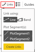
…and this is what you get if you click “Create Links”:-

But we don’t want to settle for this chart. I guess you would call it a “slope” chart but we can take it to a higher level. The problem is that at the moment we are confined to using the same circle glyph on both Line plot segments. For instance, we might want the symbol glyph on the righthand Line plot segment to be a different shape, colour or size but at present we can’t do that. If we could use different glyphs for different plot segments, wouldn’t that be great and indeed we can. So far In all my blog posts, this is the first time we’ve considered using more than one glyph in our chart. In fact, using multiple plot segments with multiple glyphs is a topic we will re-visit in more detail in later posts but for now, let’s see how using a second glyph can make this chart a little less prosaic. We could, for instance, re-design the chart to look like this:-

In this version of the chart, the Line plot segment on the right uses a different glyph from the Line plot segment on the left. We’ve made the glyph on the right so small you can’t see it and it’s only being used to link the glyphs.
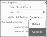
To build this chart, start by using a vertical Line plot segment with the Year field bound to the axis, the Sales field bound to the “Height” attribute of the shape and the Year field bound to the “Fill” attribute. Also, move the Year axis labels to the opposite side of the line using the “Default” attribute of the plot segment, under “Axis Categorical”.
|
Image
|
Image
|
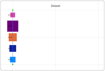
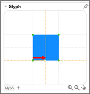
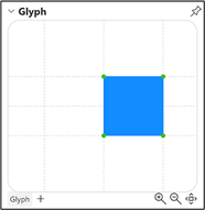
The rectangles look odd straddling the line and need to be moved so their left edge starts on the line. To do this, drag the left edge of the rectangle so it’s anchored to the centre guide in the Glyph pane
|
Drag the left edge of the rectangle…. |
…and anchor it to the centre guide in the Glyph pane… |
…and the rectangles are aligned correctly… |
|
Image
|
Image
|
Image
|
Using a Second Glyph
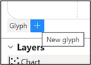
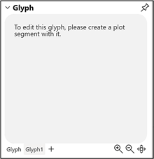
To create the second glyph, click on the plus at the bottom of the Glyph pane. You will then see a message in the Glyph pane telling you to create a plot segment.
|
Click on the plus… |
…you need to create the Line plot segment next |
|
Image
|
Image
|
By creating the new glyph first and then creating the plot segment that uses it, this associates the new glyph with the new plot segment.
Create the second Line plot segment by dragging upwards on the guide sitting on the right of the canvas. Bind the Sales field to the second Line plot segment.
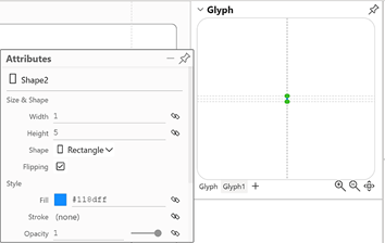
You’re now ready to create the second glyph that will be plotted on the second Line plot segment. For this, we used a rectangle mark, giving it a width of 1 and a height of 5.
The rectangle is so small that you can’t see it plotted on the second Line Plot Segment. But look what happens when you add a “band” linking the plot segments.
|
Link the plot segments using a band |
|
|
Image
|
Image
|
|
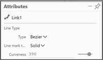
A “Bezier” band can look more pleasing |
|
|
Image
|
Image
|
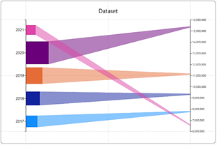
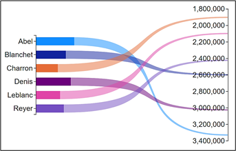
And here’s one I did earlier using a SalesPeople field instead of a Year field.
I hope you’re well-pleased with your slope charts. I know I am! However, at the beginning of this post didn’t I mention using multiple Line plot segments? We’ve just been using the two. The thing is, we can use as many Line plot segments as we want but the requirement to do so will depend on how many measures we need to plot. Designing charts that use multiple measures, known as “wide data” often requires a completely different approach from plotting just a single numeric value.
Add new comment