7 Secrets of the Matrix Visual 2019

Some of you Excel users may have realised that the Power BI Matrix visual is just an Excel Pivot Table by another term. You even get buckets for “Rows”, “Columns” and “Values” just like constructing an Excel Pivot Table.
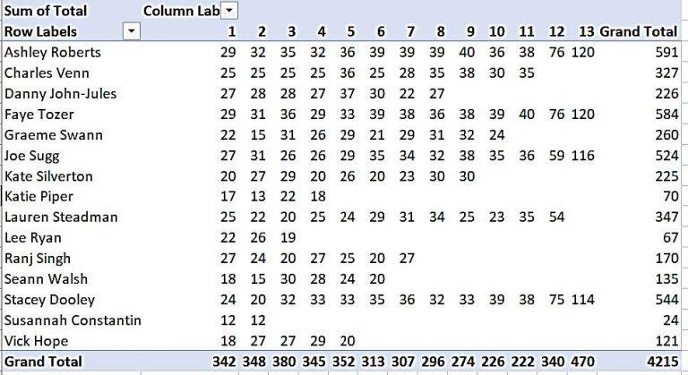
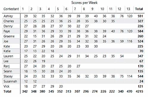
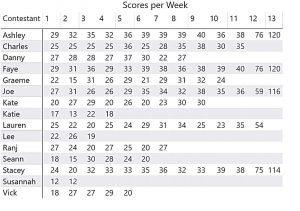
The temptation is to think this is all the Matrix visual can do; act like, well, a typical Pivot Table: –
|
Image
|
Image
|
| However, depending on your knowledge of Excel Pivot tables, you’ll know that if the Matrix is just like an Excel Pivot Table, then you should be able to do a lot more than just show a “matrix” of data. The trouble is that unlike the Excel Pivot Table, where all the options are readily at hand on the Excel Ribbon, most of the Matrix options are so hidden away they could be described as “secrets”. |
Image
|
With this in mind, here are my seven favourite Matrix secrets.
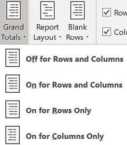
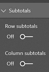
Secret No.1 – Grand Totals are really Subtotals.
In an Excel Pivot Table, Grand Totals are easily removed (just use the button on the Ribbon labelled “Grand Totals”). In a Power BI Matrix, you might think you’d be able to do the same thing on the Grand Totals card, but you won’t see any option to turn them off. This is what I mean by “secretive”. Where is this option hidden? Well, one thing you must understand is that in a Power BI Matrix, Grand Totals are really Subtotals! So to turn Grand Totals off, use the Subtotals card.
However, be warned; if you have multiple fields in the Rows bucket, this will remove all your Subtotals, not just the Grand Total. To remove only the Grand Total while retaining other Subtotals, you’ll need to discover another secret, No.4 below.
Secret No.2 – Expand all down one level in the hierarchy.
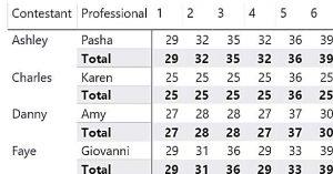
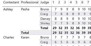
The starting point to understanding this secret is to appreciate that it’s not until you work with multiple fields in the “Rows” bucket that your Matrix can become more informative. You’ll see below that I now have both Contestant and Professional in Rows.
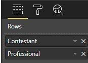
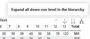
Unfortunately, when you put a second field into Rows, it may appear that nothing much has happened; secretive or what! However, you’ll notice a series of arrows at the top right (or bottom right) of the visual. There is one label “Expand all down one level in the hierarchy”. Apparently, this is what you need to click on to see the second row.
Looking at the Matrix above, not exactly what I want though. The Professional names are indented under each Contestant when they really should be sitting beside each other, and because there is only one Professional for each Contestant, I get irrelevant Subtotals on the Contestant rows (in bold). More secrets need revealing!
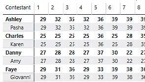
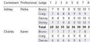
Secret No.3 – Turn off “Stepped layout”.
With most Matrices, the indented or “Stepped” layout gives less clarity to which rows the values refer to. It’s better to put each Row label in a separate column. To do this, just turn off “Stepped layout” on the Row headers card (cf. “Compact layout” of the Excel Pivot Table).
This is definitely an improvement, but I still see those subtotals and they’ve now moved to a row of their own!
Clearly, I can now just turn off the Row subtotals on the Subtotals card (as explained in Secret No. 1 above.)
Secret No.4 – Only show the Subtotals/Grand Totals you want to see.
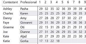
However, if I add a third row label e.g. for the Judges, things become a little more challenging. I now want to show the subtotals, but only for the Judges’ Scores. If I turn subtotals on, I get subtotals for both Professionals and Judges, showing the same values.
So how do I control which Subtotals and/or Grand Totals to show? This secret is really hidden away where no one can find it!
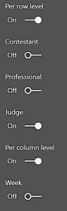
So this is where you will find it. On the Subtotals Card, at the bottom, there is a “Per Row Level” and a “Per Column Level” option. Turn these on.
Then select the field(s) that you want to show Subtotals or Grand Totals for (note the Grand Total field is listed first). I found “trial and error” worked well here!
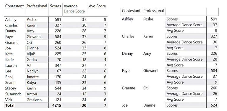
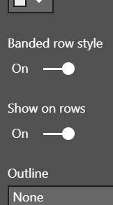
Secret No.5 – Show Values on Rows
Ever wanted to do this? Compare the two Matrix visuals below. On the left, the Values are in columns, which is the default. On the right, the values have been placed in the Rows. This is a well-known secret, but all you need to do is expand the Values card and select “Show on rows”
Secret No.6 – Show text in the Values area.
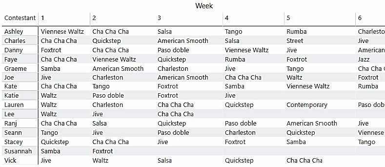
Ever wanted to put the names or descriptions into the values area of the Matrix, as in the example above. You can see that in Rows is Contestant names, in Columns is the Week and the values area is populated with the names of the dances performed.
For this you need a simple measure as follows: –
Dance Name = SELECTEDVALUE(Dances[Dance])
In the brackets of the SELECTEDVALUE function, put the column name of the column you want to put in the middle of your Matrix and use this measure in the Values bucket.
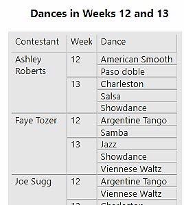
However, just to say that if there is more than one dance in a particular week, then the dance won’t show so this is why I needed another Matrix to show multiple dances per week.
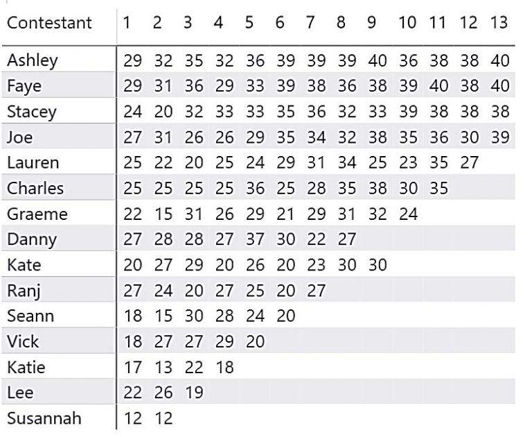
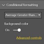
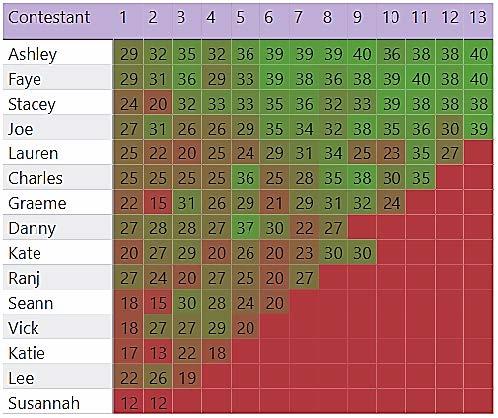
Secret No.7 – Use Conditional Formatting.
Compare the 2 visuals below. See how much more appealing and informative the coloured chart is. Just using a simple background color brings the visual to life.
|
Image
|
Image
|
Matrix Visuals in Power BI are extremely useful when it comes to displaying information clearly and wanting to drilldown into the numbers. We cover a range of visualisations on both our Fundamentals and Intermediate courses, meaning you can get in depth knowledge on exactly how to use these functions to your advantage. If you would like more information about our courses, get in touch with our team on 0800 0199 746.
Add new comment