Charticulator in Power BI #12 – Horizontal Line & Vertical Line Scaffolds
Horizontal Line & Vertical Line Scaffolds
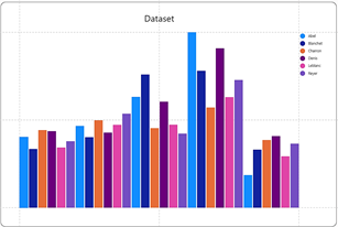
Before we delve into the rather obscure world of Scaffolds, let’s remind ourselves of what we know so far about how Charticulator lays out a chart. If you’ve read my blog post “Charticulator Explained #5” on Plot Segment Layouts you will know that there are two key drivers in the layout of the chart; fields bound to the axes and sub-layouts. So for instance, we will get different layouts if we bind the Year field to the X-Axis and change the sub-layout to “Stack Y” or if we bind Year to the Y Axis and change the sub-layout “Stack X”:-
|
Year on X-Axis and “Stack Y” |
Year on Y-Axis and “Stack X” |
|
Image
|
Image
|
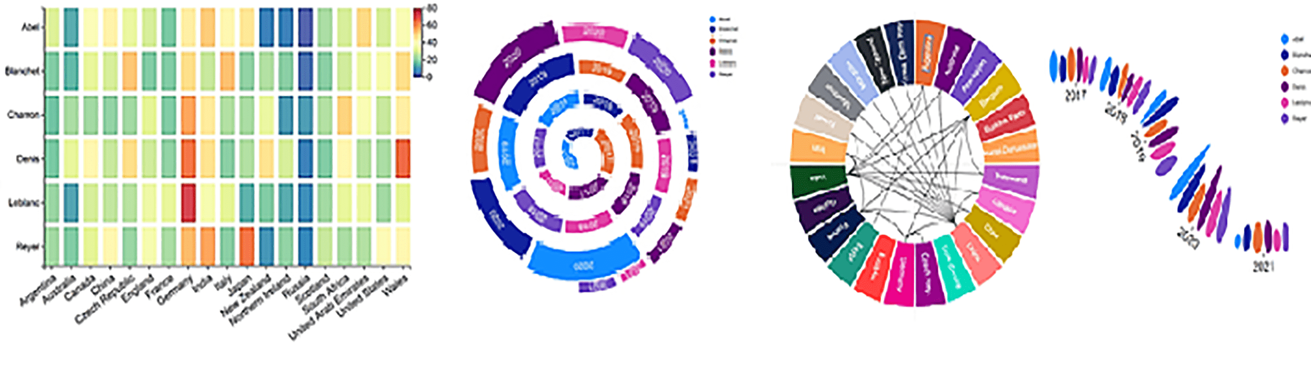
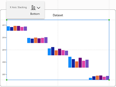
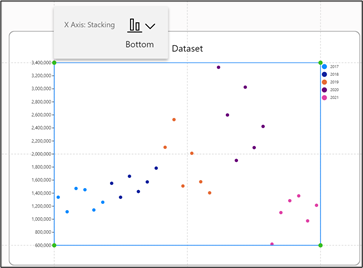
However, there is a third factor that contributes to the layout of a chart and that is the Scaffold. Horizontal Line and Vertical Line Scaffolds are another approach to laying out the glyphs in your chart and drive the layout where there is no category or value on the X or Y axis. Scaffolds will remove any sub-layouts that have been applied to the chart. Consider the chart below. There is clearly no field bound to the X-Axis and the numeric scale on the left is a “Legend”, not a numeric axis. What is determining the layout? The answer is that both a Horizontal Line and a Vertical Line Scaffold has been applied to the chart.
If this idea intrigues you, read on.
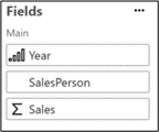
We’ve created this chart using the fields shown on the left but we’ve not bound any field to the X or Y Axis.
|
The data we’re using |
The chart we’ve created |
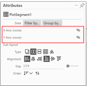
Note there are no fields bound to the |
|
Image
|
Image

|
Image
|
This is because we’re going to use a Scaffold to determine the layout of the glyphs, not fields bound to the axes or any sub-layouts.
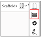
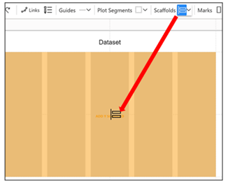
You apply a Horizontal Line or Vertical Line Scaffold to a plot segment by selecting the Scaffold from the Scaffolds button and then dragging the Scaffold into the plot segment on the chart canvas. We’ve used the Vertical Line Scaffold to start.
|
Dragging the Vertical Line Scaffold onto the plot segment will create horizontal stacking of the glyph. |
|
|
Image
|
Image
|
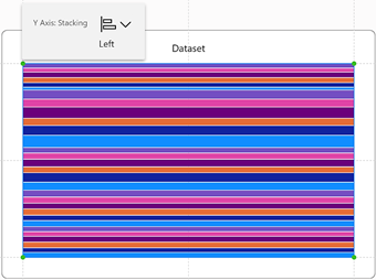
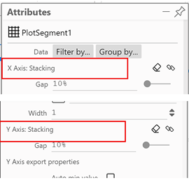
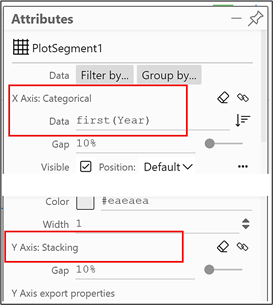
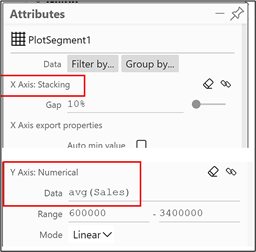
If you look at the plot segment attributes pane, you will see that the “Y-Axis” attribute is set to “Stacking” instead of having a field bound to it.
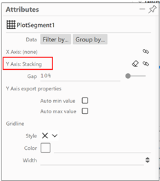
Notice that it’s here also that you can remove the scaffold by clicking on the eraser.
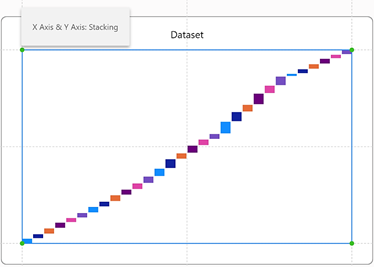
If you now apply a Horizontal Line Scaffold, it’s bound to the “X Axis” attribute along with the Y Axis stacking.
|
Image
|
Image
|
So now we have Scaffolds controlling the layout of both the X and Y-Axis but you can start to “mix and match” Scaffolds with fields bound to the X or Y-Axis. Let’s look at the combination of Scaffolds and categorical axes first.
Scaffolds Combined the Categorical Axes
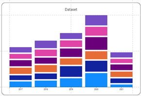
Using this chart….
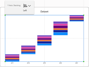
…where we’ve bound the Sales field to the “Height” attribute of the rectangle mark, we can combine a categorical X Axis with a Vertical Line Scaffold. Note how the Scaffold controls the layout of the Y-Axis.
|
Categorical X-Axis and Y-Axis Stacking…. |
Results in a upwards diagonal layout… |
|
Image
|
Image
|
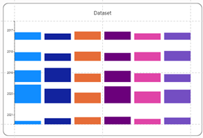
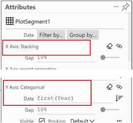
Or we can combine a categorical Y Axis with a Horizontal Line Scaffold. Again, note how the scaffold controls the layout of the X-Axis.
|
Categorical Y-Axis and X-Axis Stacking…. |
Results in a downwards diagonal layout… |
|
Image
|
Image
|
Scaffolds Combined with Numeric Axes
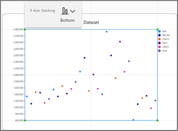
We get more interesting (and possibly more useful) layouts if we combine a Scaffold with a numeric axis. Using this method, we can create “Scatter” charts without having to use both a numeric X-Axis and a numeric Y-Axis as is the case with a Power BI Scatter chart.
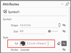
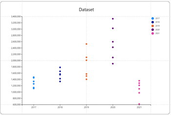
Consider the charts below. This time, we’re using a symbol in the glyph and the SalesPerson field bound to the “Fill” attribute. You can see that in the chart on the right, we have combined a Horizontal Line Scaffold with a numeric Y-Axis. To make the data clearer, in the chart bottom right, we have replaced the “Fill” of the symbol with the Year field. You can see that the symbols (i.e. the data points) create a “Scatter” chart showing the Sales for each SalesPerson in each Year.
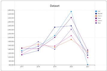
If we were to place the Year field into a categorical X axis instead of the Scaffold , the data points would now “Overlap” by default and line up for each year accordingly. Introducing a “Link” line will turn this into a “Line” chart.
|
Using the Horizontal Line Scaffold and a numeric Y-Axis…. |
….creates a scatter chart without the use of a numeric X-Axis |
|
Image
|
Image
|
|
If we put Year into the “Fill” attribute… |
…we can see how the symbols are plotted correctly |
|
Image
|
Image
|
|
We can compare how the symbols are laid out if we use no scaffold and a categorical X-Axis |
This would be the basis for a line chart if we introduce a “Link” line. |
|
Image
|
Image
|
So using a scaffold in conjunction with a numeric axis can create interesting scatter charts without resorting to two numeric axes But what else can we use them for? Below is another example of using Scaffolds to good effect because here we’re constructing a chart with no fields bound to X or Y Axis but just using X and Y Scaffolds.
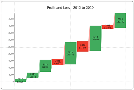
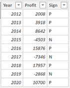
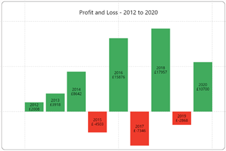
Here is the data we’re going to use in our chart. It records profit and loss over 9 years:-
Using just a rectangle glyph, and putting Profit into the “Height” attribute, Sign into the “Fill” attribute and using Text marks for Year and Profit, this is the column chart we get:-
If we now apply both a Vertical Line and a Horizontal Line Scaffold, this is how the chart will be laid out:-
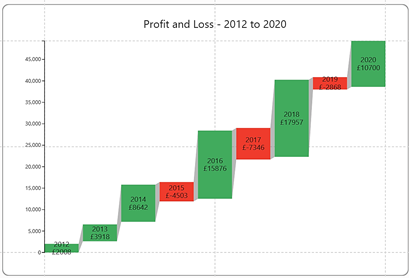
To finish this chart, I’ve added a Legend for the Profit field and linked the rectangles using a band.
Notice that I’ve used no fields on either the X or Y Axis.
I bet you’re thinking using Vertical Line and Horizontal Line Scaffolds is little rarefied. How often do you need to create scatter charts with no numeric X-Axis? Probably not that often. I think we can conclude that probably we’d rather use sub-layouts, not Scaffolds to lay out our charts either horizontally or vertically, mainly because sub-layouts give us more in design choices
Why then don’t we quickly move on to look at a type of Scaffold that I think will bowl you over. I’m talking about the Polar Scaffold. If you love fancy circular and radial charts, as opposed to boring square and rectangular charts, the Polar Scaffold is for you, but you’ll have to read my next blog to learn all about them.
Add new comment