Creating a Waterfall Visual with “From” and “To” Values

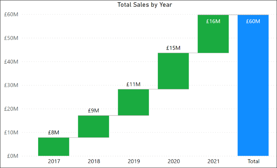
If you have ever created the default Waterfall visual in Power BI, you will know that it will only show you the “To” value. This value is the total of the individual values from each category. For example, in the visual below the “Total” column is simply the sum of all the yearly sales totals:-
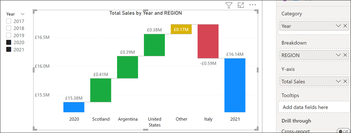
In fact, the only way you can get “From” and “To” totals is to introduce a “Breakdown” field. For example, below, the “REGION” field has been placed in the “Breakdown” bucket and we're also only considering the years specifically from 2020 to 2021:-
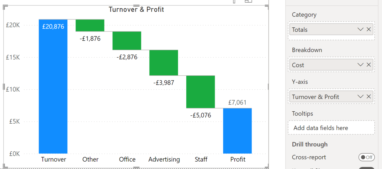
But what if you want to plot “From” and “To” values that are calculated by measures and then show the breakdown variances that are also calculated by measures. Here is an example of what I’m alluding to:-
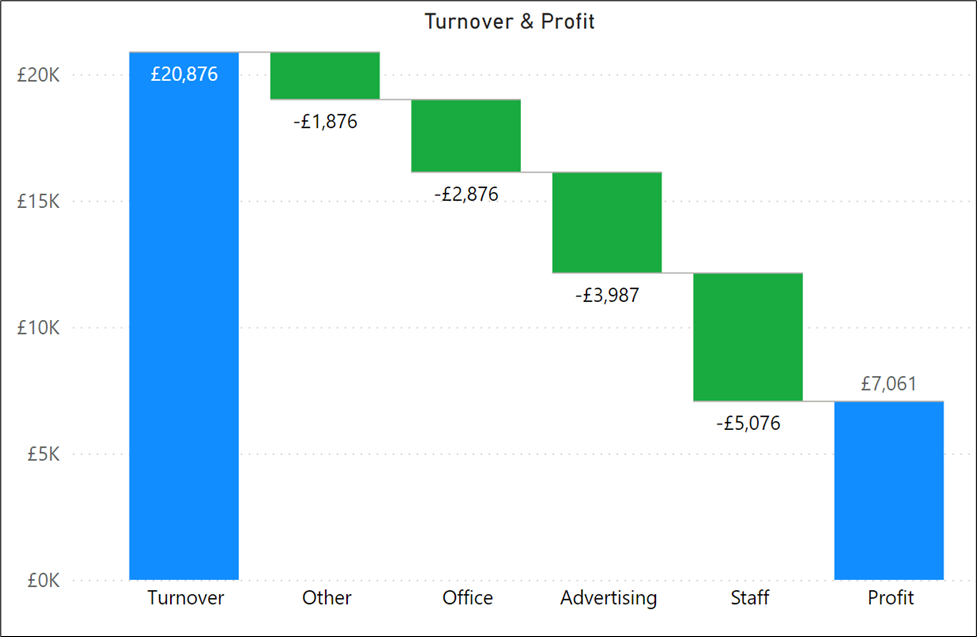
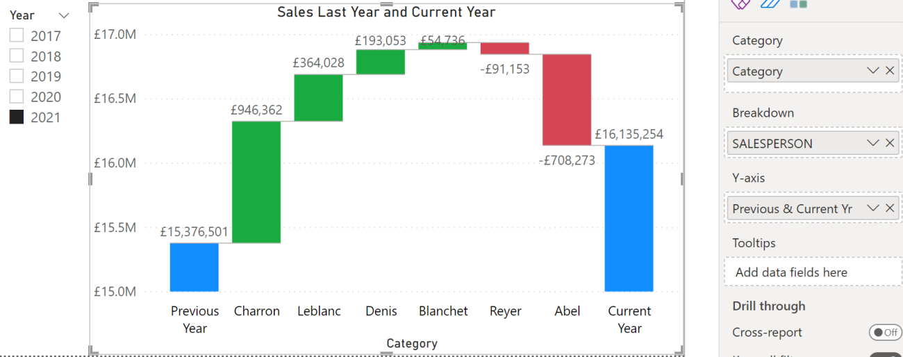
In the Waterfall visual above, you can see that we are plotting the cost variances between turnover and profit. And below is another example where rather than have static years plotted, we are plotting the previous year’s sales (determined by the slicer selection) and showing the breakdown of our salespeople’s sales variances:-
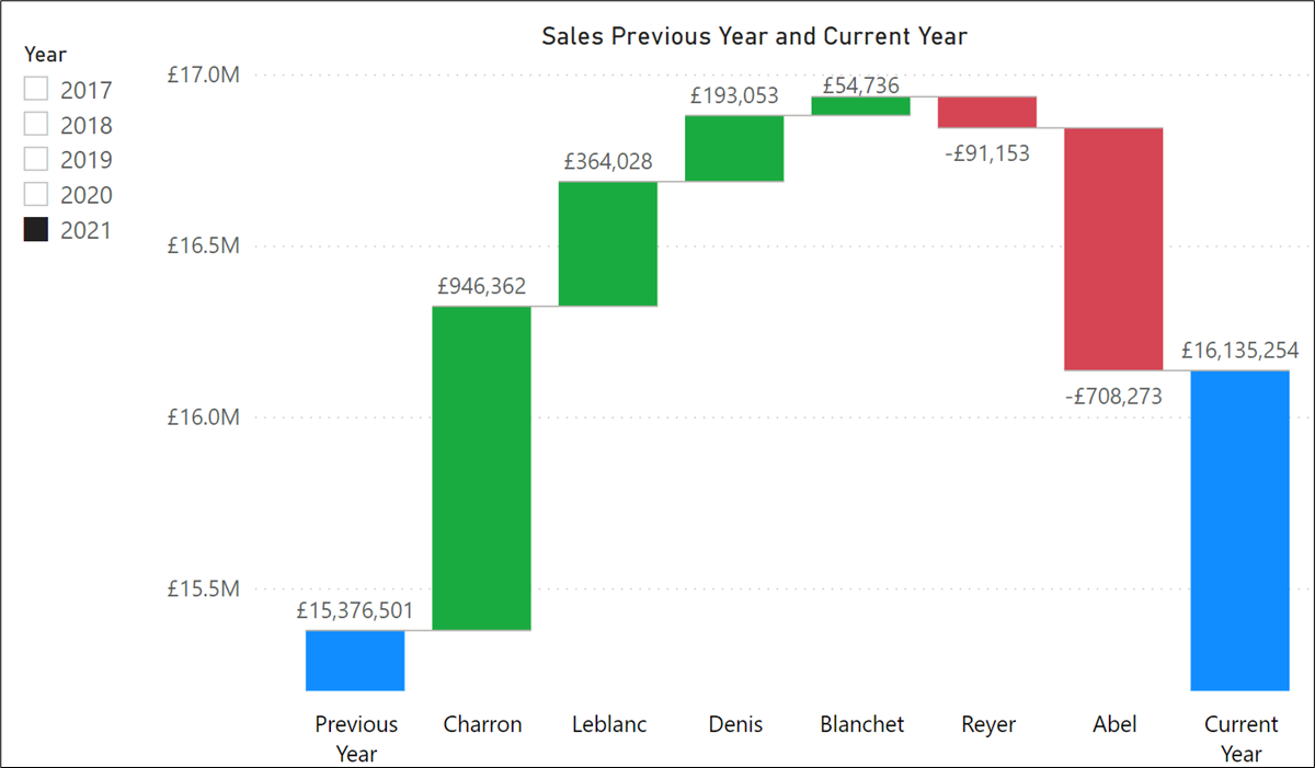
In the example above, the last year and current year figures are calculated by DAX measures as are the values for the salespeople.
So how were these waterfall charts generated?
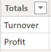
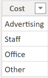
Let’s take the “Turnover & Profit” example. The first step is to generate measures that calculate all the values that will be plotted in the waterfall. For example, DAX measures that calculate turnover, profit, and each individual total cost. The next requirement is to generate tables that contains the labels you would like for the columns in the Waterfall. There are two sets of labels that are required; one set is for the “Category” and the other set is for the “Breakdown”. Therefore, these are the two tables that were required for the “Turnover & “Profit” visual-
“Main Category”
“SubCategory”
Then we need to create this measure that will be used by the visual:-
Turnover & Profit =
SWITCH (
SELECTEDVALUE ( 'Main Category'[Totals]),
"turnover",
SWITCH (
SELECTEDVALUE ( SubCategory[Cost] ),
"advertising",[Total Advertising],
"staff",[Total staff],
"office",[Total Office],
"other",[Total other],
[Turnover Total]
),
"profit",
SWITCH (
SELECTEDVALUE ( SubCategory[Cost] ),
"advertising",0,
"staff",0,
"office",0,
"other",0,
[Profit Total]))
We are now ready to put the “Totals” column from the “Main Category” table into the Category bucket of the Waterfall chart and the “Cost” column from the “SubCategory” table into the Breakdown bucket. Into the Y-Axis, of course, goes the measure:-
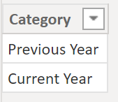
For the second example where we have the salespeople’s breakdown from a previous year to a current year, I only need to create one additional table that would label the category columns in the waterfall:-
“CategoryLabels”
I already had a Salespeople dimension where the names of each salesperson are recorded in the SALESPERSON field so I didn’t need a table to generate these labels. This is the measure that will drive this visual:
Previous & Current Yr =
SWITCH (
SELECTEDVALUE ( CategoryLabels[Category]),
"Previous Year",
SWITCH (
SELECTEDVALUE ( SalesPeople[SALESPERSON] ),
"reyer", CALCULATE([Previous Yr],SalesPeople[SALESPERSON]="reyer"),
"denis", CALCULATE([Previous Yr],SalesPeople[SALESPERSON]="denis"),
"blanchet", CALCULATE([Previous Yr],SalesPeople[SALESPERSON]="blanchet"),
"leblanc", CALCULATE([Previous Yr],SalesPeople[SALESPERSON]="leblanc"),
"charron", CALCULATE([Previous Yr],SalesPeople[SALESPERSON]="charron"),
[Previous Yr]
),
"Current Year",
SWITCH (
SELECTEDVALUE ( SalesPeople[SALESPERSON] ),
"reyer", CALCULATE([Total Sales],SalesPeople[SALESPERSON]="reyer"),
"denis", CALCULATE([Total Sales],SalesPeople[SALESPERSON]="denis"),
"blanchet", CALCULATE([Total Sales],SalesPeople[SALESPERSON]="blanchet"),
"leblanc", CALCULATE([Total Sales],SalesPeople[SALESPERSON]="leblanc"),
"charron", CALCULATE([Total Sales],SalesPeople[SALESPERSON]="charron"),
[Total Sales]))
The takeaway from these examples is that the “From” column values are subtracted from the “To” column values to generate the breakdown values. For example, the “Previous Year” values are subtracted from the “Current Year” values, or the “Turnover” values are subtracted from the “Profit” values. Knowing this means that you can design Waterfall charts that actually do what you want them to do which is to show variances from a starting position to an ending one.
Add new comment