My Top 10 Power BI Tips

I’ve just realised that in all the 7 years I’ve been writing blogs on Power BI, I’ve never written the most obvious blog of all and that is a “Top Tips” one! To remedy this situation, here are my 10 favourites. I hope you'll find these tips as useful as I have.
1. “Mix and Match” Visual Interactions
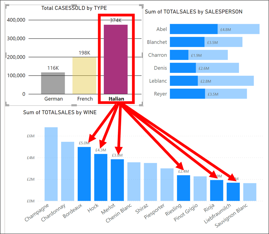
We all know that if we click on a category in a visual, e.g., a column in a column chart, this will interact with other visuals on the canvas. For example, in the visuals below I have clicked on the “Italian” column in the “Total CASESSOLD by Type” chart and this has highlighted the Italian wines in the “Sum of TOTALSALES by Wine” visual.
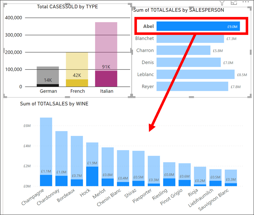
However, if I now click on “Abel” in the “Sum of TOTALSALES by SALESPERSON” bar chart, the interaction on the “Sum of TOTALSALES by WINE” chart will change to reflect “Abel’s” sales and I have lost the "Italian" sales:-
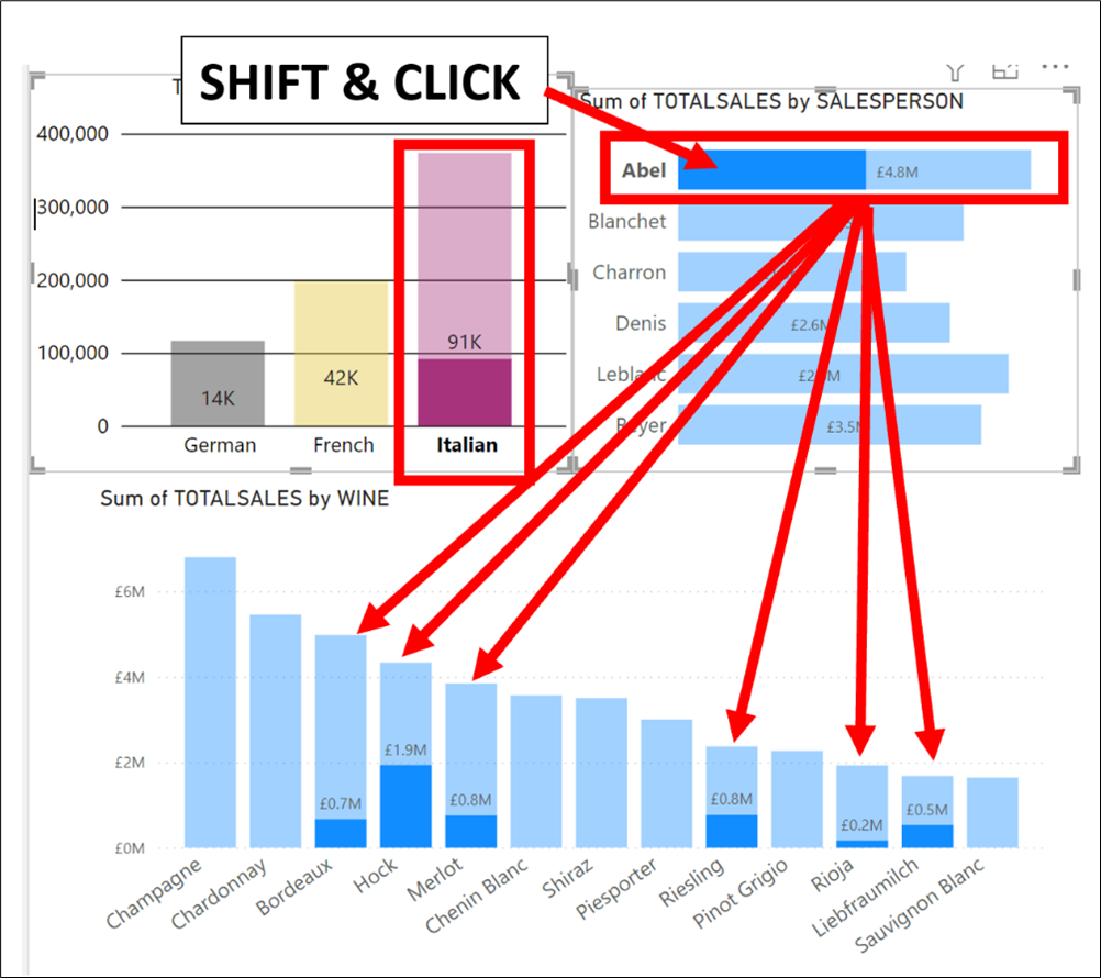
But what if I wanted to retain the Italian wine selection and show the sales for salesperson “Abel” AND “Italian” wines in the "Sum of TOTALSALES by Wine" column chart? All I need to do is first click on the “Italian” column, then hold down the SHIFT key and click on the bar for “Abel” as shown below:-
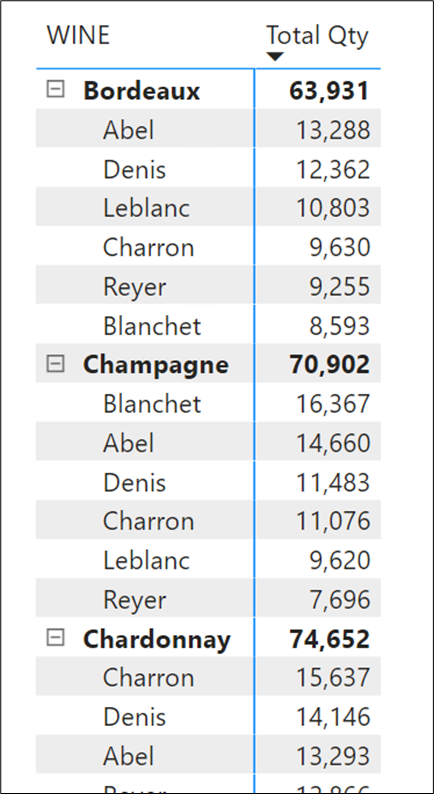
2. Multiple Sorting on a Table or Matrix
To perform sorting on multiple columns in a Table visual, first click on the Column header of the column you want to be sorted first. Now hold down the SHIFT key and click on the column you want sorted second:-
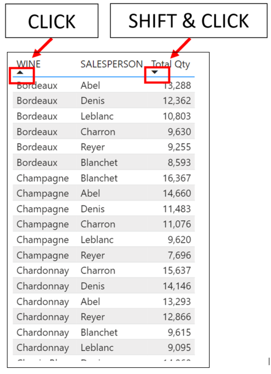
Of course, if you have more columns you want to be sorted in order, just keep holding down the SHIFT key as you click on the column headers in the Table visual. If you are using a Matrix, and you want to sort your “Row” fields and then “Value” columns, convert your Matrix to a Table and sort the columns in the Table. Then simply convert your Table back to a Matrix:-
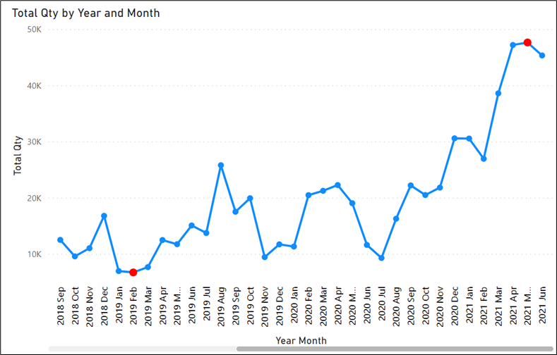
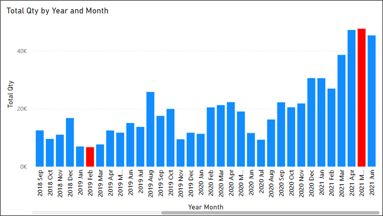
3. Conditionally Colour Markers on a Line or Area Chart
The secret here is that if you want to conditionally colour markers on a line chart, start with a column chart and apply the conditional colours to the columns. Then convert the column chart to a Line or Area chart. For example, ever wanted to show high points and low points on a line or area chart?
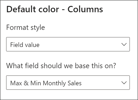
If the answer is yes, then the starting point is to create this DAX measure that assigns the colour red to the maximum and minimum values that will be used as the Conditional Formatting:-
Max & Min Monthly Sales =
VAR mymax =
MAXX (
ALL ( DateTable[Year], DateTable[Month], DateTable[MonthNo] ),
[Total Qty]
)
VAR mymin =
MINX (
ALL ( DateTable[Year], DateTable[Month], DateTable[MonthNo] ),
[Total Qty]
)
RETURN
IF ( [Total Qty] = mymax || [Total Qty] = mymin, "red" )
Now create a Column Chart that contains the same fields that you want eventually to end up on a line (or area) chart. Now on the “Columns” formatting card and using the Conditional Formatting “f of x” button, select “Field value” in the Format style drop-down and in “What field should we base this on?” dropdown, select the “Max & Min Monthly Sales” measure:-
Now simply convert your Column chart to a Line Chart:-
4. Quickly Navigate Page Tabs in Power BI Desktop
If you have many page tabs in your Power BI desktop file, to quickly navigate to a specific page, right-click on the navigation buttons at the far left of the page tabs:
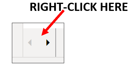
A pop-up list of all your pages will appear and you can simply click on the page you want to move to.
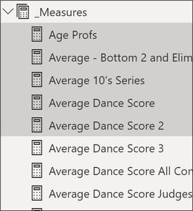
5. Delete Measures Using Multiple Selections
If you need to delete a number of measures, use Model View where you can hold down CTRL or SHIFT to make multiple selections of measures and then hit the delete key.

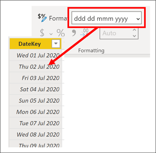
6. Create Custom Numeric Formatting on Date Columns
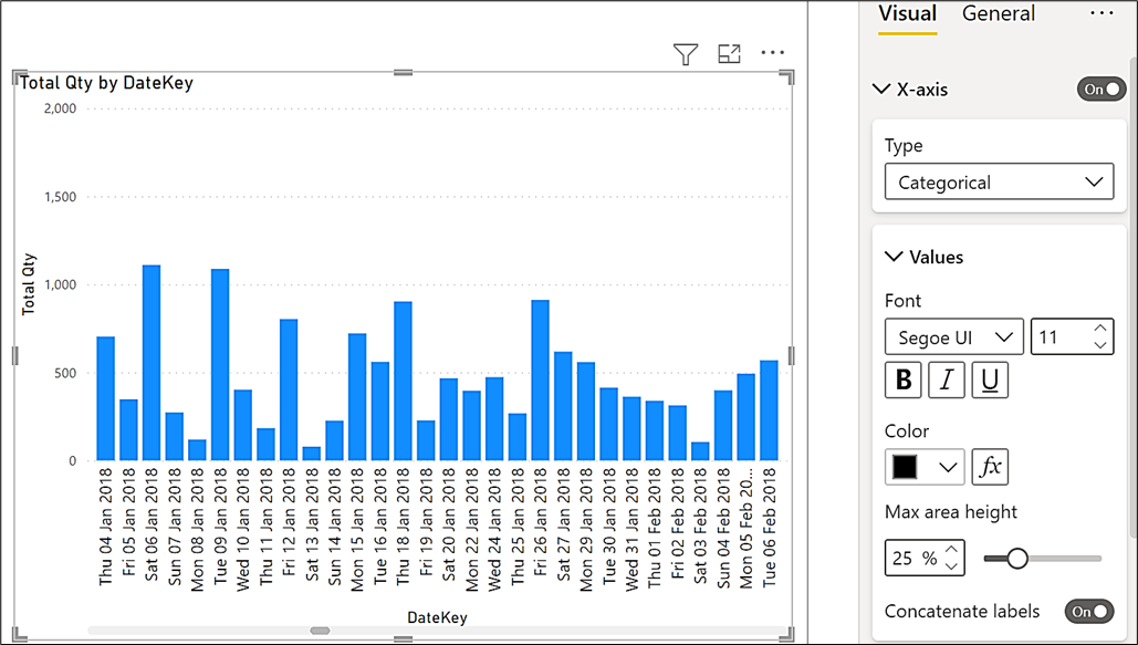
If you are using dates on a categorical x-axis, the dates will be formatted according to how they are formatted in Data View. To change the date format, you can use the “Format” dropdown in the Formatting group of the Column Tools tab. Did you know, however, that you can manually enter your own custom date format by clicking into the Format dropdown and typing a custom format string:-
7. Use a Chiclet Slicer to Stop Values in Slicers “Sticking”
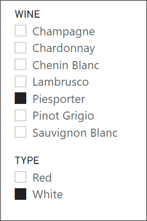
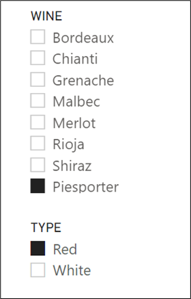
If you use default Slicers, selecting in one slicer may cause a filter in another slicer. If you then select one of the filtered items, the item will “stick” on a re-selection in the first slicer when it is now not part of the filter. For example, you can see below that I have chosen “White” in the TYPE slicer, and this has filtered white wines in the WINE slicer where I have selected “Piesporter”. If I then select “Red” in the TYPE slicer, red wines are now filtered in the WINE slicer, but “Piesporter” is also still listed:-
|
Image
|
Image
|
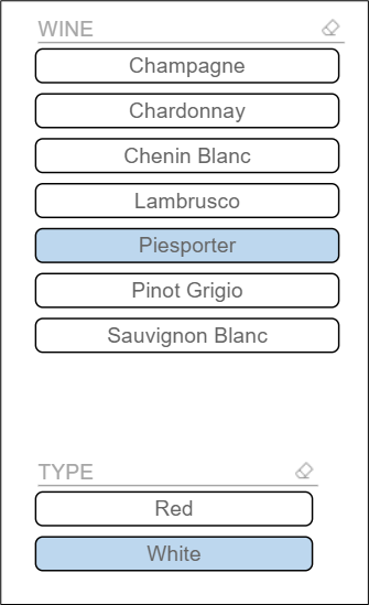
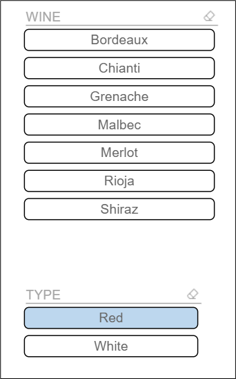
To avoid this, use a Chiclet slicer. This is a free custom visual available from the Microsoft Store and it won’t exhibit this behaviour:-
|
Image
|
Image
|
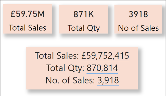
8. Use a Text Box Instead of Cards
You can see below that I have presented three measures, first in three cards and then in a single Text Box. Using the Text Box means I now just have one visual to manage on the canvas and you may feel that the values are easier to read.
To insert measures into a Text Box, use the “+Value” button and in the “How would you calculate this value”, simply type the name of your measure:-
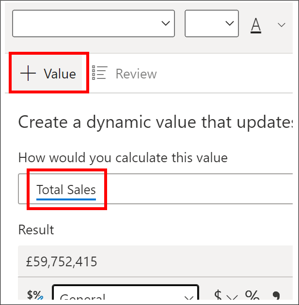
Then click on the Save button.
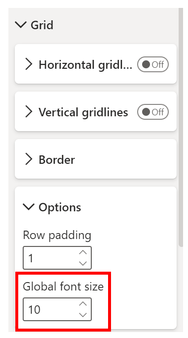
9. Globally Resize a Table or Matrix
You can, of course re-size Column and Row headers and Values separately using the relevant formatting card. However, if you want to just make the entire Table or Matrix bigger, use the Grid formatting card and the Options sub-card:-
10. Nudge Objects to Move
To move any object on the Canvas by tiny amounts, select it and use your arrow keys on your keyboard to nudge the object in any direction.
Add new comment