Using a Continuous X-Axis on Column Charts for Year and Month Labels
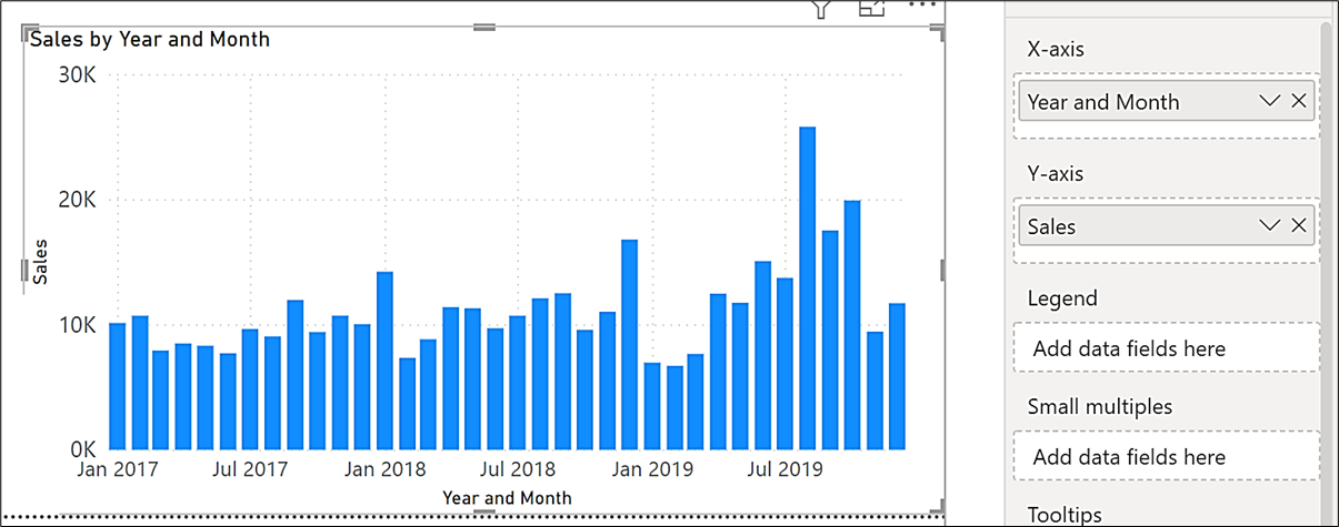
Ever wanted to do this on the x-axis of a Column chart…
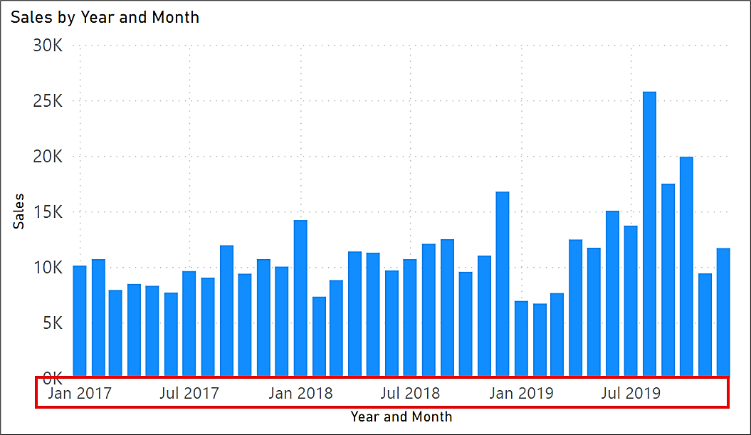
…that is use a continuous x-axis for Month and Year labels?
A continuous x-axis is used for date type data where Year and Month labels are incrementally spaced according to the number of data points plotted. This is compared to a categorical axis where there is a label for every data point.
Luckily, Power BI will provide you with a continuous x-axis if you use a Date Hierarchy in conjunction with a Line chart. Here you can “expand down all one level in the hierarchy” to see data for each level and the axis labels respond accordingly, generating a continuous axis for each level in the hierarchy: -
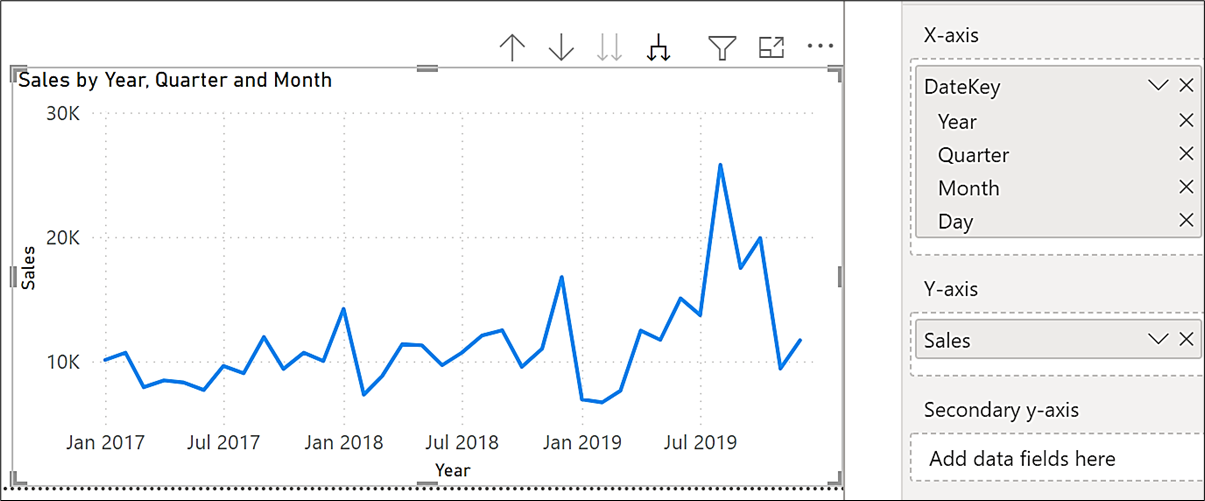
However, what if you don’t want a Line chart. What if you would prefer to plot your date data using a Column chart. If you convert the Line chart above to a column chart, you are given a categorical axis with no ability to change it to continuous: -
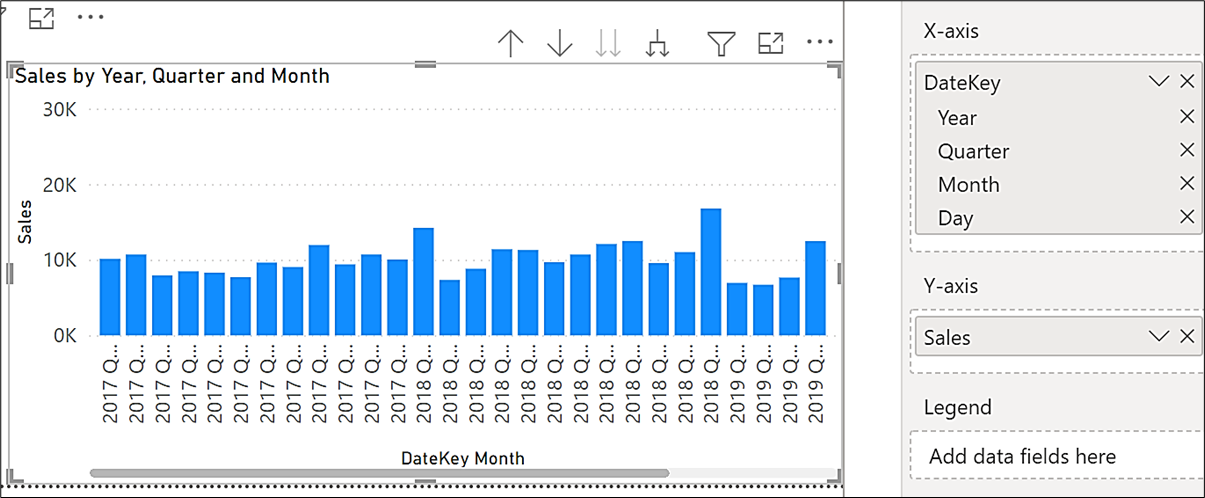
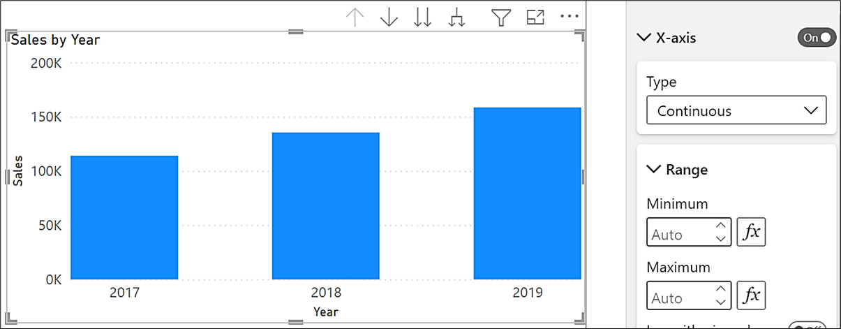
This is particularly frustrating. The rule is that if you are using a Column chart, only numerical data can be plotted on a continuous axis. At the Month level, the labels comprise both Quarter and Month names that are text values and so must be plotted on a categorical axis. However, if you drill back up to the Year level, you can change the axis from categorical to continuous because Year is a numerical value: -
Now that we have established that in a Column chart, we can only use numerical data on the x-axis to render a continuous axis, how can we include both month name and year in the labels? The answer is quite simple; you generate a calculated column in your Date dimension that returns the first of every month using the DAX STARTOFMONTH function:-
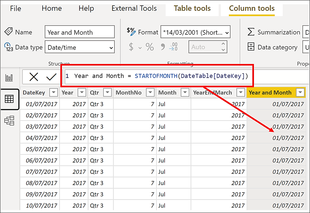
This column will have a date/time data type and can be formatted as a simple date. You can now use this calculated column on the x-axis of your column chart and because the column is a date, and therefore a numerical value, it can be plotted on a continuous axis.:-

Comments
Thanks
Date Table
I am struggling with the concept of the date table as it is visualized in the example. Why are there multiple rows that have the same value in the columns except the Date Key?
Add new comment